"Vue + Storybook에서 addon-docs를 사용한 설정법, docs 작성법을 소개합니다."
storybookjs/design-system repository
위의 멋진 Storybook example을 보고, 멋진 docs page를 제 프로젝트에도 추가하고 싶었습니다.
@storybook/addon-docs
addon-docs는 스토리북에서 docs를 만드는 것을 도와줍니다. docs를 만드는데에는 크게 두가지 방식이 있습니다.
- DocsPage
- 스토리의 정보를 기반으로 자동으로 docs를 만듭니다.
- stories, text descriptions, docgen comments, props tables, code examples 등을 참고하여 페이지로 만들어줍니다.
- MDX
- markdown 문법으로 docs를 작성합니다.
- 자동은 아니지만, 작성자 마음대로 커스터마이징이 가능합니다.
@storybook/addon-docs installation
yarn add -D @storybook/addon-docs
다음의 peer dependency를 가집니다. vue를 쓰지만 react를 설치해야 하는...
yarn add -D react react-is babel-loader
설치를 다 하고 난 후에 main.js에 다음을 추가해줍니다.
// .storybook/main.js
module.exports = {
  stories: ['../src/**/*.stories.@(js|mdx)'],
  addons: ['@storybook/addon-docs'],
};
그리고 나서 preview.js에 다음 코드를 추가하면, 모든 story에 대해 자동으로 DocsPage가 생성됩니다. 아래 코드를 지워도 기본적으로 Docs가 자동으로 생성됩니다.
// .storybook/preview.js
import { addParameters } from '@storybook/vue';
import { DocsPage, DocsContainer } from '@storybook/addon-docs/blocks';

addParameters({
  docs: {
    container: DocsContainer,
    page: DocsPage,
  },
});
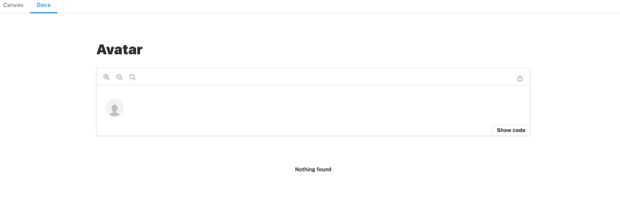
스토리를 기반으로, Docs 페이지가 생성되었습니다. 스토리에 정보가 별로 없어서, Docs에 들어가는 내용도 별로 없습니다. 저는 MDX를 이용해 저만의 docs를 작성하고 싶었습니다.
MDX Docs
MDX로 Docs를 만든 것을 적용하려면, 아래와 같이 코드를 작성하여, Docs 자동생성 기능을 꺼줘야 합니다.
// .storybook/preview.js
import { addParameters } from '@storybook/vue';

addParameters({ docs: { page: null } });
// Button.stories.mdx
import { Meta, Story, Props } from '@storybook/addon-docs/blocks';
import Button from '@/src/Components/Button/Button';

<Meta title='Button' component={Button}/>

# Button

**Button** 컴포넌트의 문서입니다.

<Story name='docs' height='100px'>
  {{
    components:{ Button },
    template: '<Button>Button</Button>',
  }}
</Story>
우리가 새로 만든 docs로 대체되었습니다!

@storybook/addon-controls
addon-controls는 사용자가 스토리북에서 직접 컴포넌트의 arguments를 바꿔볼 수 있도록 도와줍니다. 저는 단순 props table이 아니라 이 기능을 원했기 때문에 추가해주었습니다.
yarn add -D @storybook/addon-controls
// ./storybook/main.js
module.exports = {
  addons: ['@storybook/addon-controls'],
};
Doc Blocks
Storybook의 document page를 작성할 때 쓰입니다. 여기서 ArgsTable을 사용해볼 것입니다.
ArgsTable
Storybook docs는 컴포넌트의 args table을 자동으로 만듭니다. controls와 연동하여 사용자가 컴포넌트의 args를 직접 수정해볼 수 있습니다.
Button Component의 ArgsTable을 만들어봅시다. addon-controls 없이 만들면 아래와 같이 나옵니다.
// Button.stories.mdx
import { ArgsTable } from '@storybook/addon-docs/blocks';
import Button from '@/src/Components/Button/Button';

<Meta title='Button' component={Button}/>

<ArgsTable of={Button} />
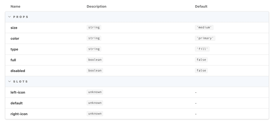
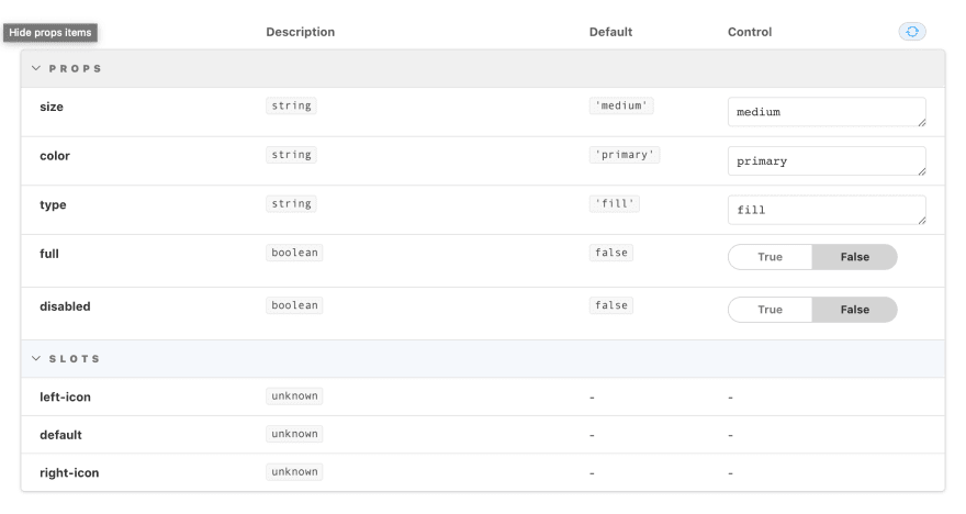
addon-controls 를 설치하고 만들면 아래와 같이 나옵니다. Control 열이 더 생겨서, 사용자가 직접 수정할 수 있게끔 도와줍니다. 이것은 Button 컴포넌트의 props를 읽어서 자동생성되었습니다.
// Button.vue
props: {
    size: {
        type: String,
        default: 'medium',
        validator(value) {
            return ['small', 'medium', 'large', 'xlarge'].indexOf(value) !== -1;
        },
    },
    color: {
        type: String,
        default: 'primary',
        validator(value) {
            return ['primary', 'success', 'gray'].indexOf(value) !== -1;
        },
    },
    type: {
        type: String,
        default: 'fill',
        validator(value) {
            return ['fill', 'outlined', 'text'].indexOf(value) !== -1;
        },
    },
    full: {
        type: Boolean,
        default: false,
    },
    // disabled
    disabled: {
        type: Boolean,
        default: false,
    },
},
size, color, type의 경우, String type이긴 하지만 사용할 수 있는 값들의 종류가 미리 정해져 있습니다. 그러면 굳이 text로 안바꾸고, select로 바꿀 수 있다면 스토리북을 사용할 때 편할 것입니다. 이걸 override하려면 따로 설정을 해줘야 합니다.
Meta에 argTypes를 작성하여, Template에 넘겨줍니다. 아래 ArgTypes 문서를 보면 어떻게 작성해야 할지 감이 오고, 이것저것 해보다보면 원하는 형태의 문서를 작성할 수 있습니다.
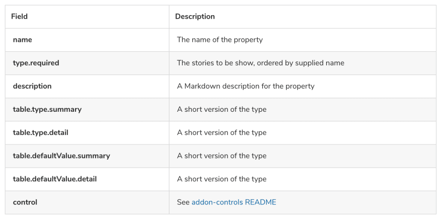
controls 작성법

두 문서를 바탕으로 작성한 문서입니다.
// Button.stories.mdx
import { ArgsTable, Meta, Story, Props } from '@storybook/addon-docs/blocks';
import Button from '@/src/Components/Button/Button';

<Meta title='Button' component={Button} argTypes={{
  label: {
    description: '버튼에 들어갈 텍스트',
    defaultValue: '답변 추가하기',
    control: {type: 'text'},
     table: {
      type: {
          summary: null,
      },
    },
  },
  size: {
    description: '버튼의 크기<br/>`String`',
     table: {
      type: {
          summary: '목록',
          detail: '"small" "medium" "large" "xlarge"'
      },
    },
    control: {
      type: 'select',
      options: ['small', 'medium', 'large', 'xlarge']
    }
  },
  color: {
    description: '버튼의 색상 타입<br/>`String`',
    table: {
      type: {
        summary: '목록',
        detail: '"primary" "success" "gray"'
      },
    },
    control: {
      type: 'select',
      options: ['primary', 'success', 'gray']
    }
  },
  type: {
    description: '버튼의 타입<br/>`String`',
    table: {
      type: {
        summary: '목록',
        detail: '"fill" "outlined" "text"'
      },
    },
    control: {
      type: 'select',
      options: ['fill', 'outlined', 'text']
    }
  },
  full: {
    description: '버튼의 너비가 부모컴포넌트의 100%를 차지할지<br/>`Boolean`',
    table: {
      type: {
        summary: null,
      },
    },
  },
  disabled: {
    description: '버튼의 disabled 상태<br/>`Boolean`',
    table: {
      type: {
        summary: null,
      },
    },
  },
  }}
/>

export const Template = (args, { argTypes }) => ({
  props: Object.keys(argTypes),
  components: { Button },
  template: '<Button :size="size" :color="color" :type="type" :full="full" :disabled="disabled">{{label}}</Button>',
});

# Button

**Button** 컴포넌트의 문서입니다.

<Story name='docs' height='100px'>
    {Template.bind({})}
</Story>

<ArgsTable story="docs" />
해당 작업까지 완료되었다면 제가 원했던 원하는 docs를 만드실 수 있습니다. 아래 ArgsTable에서 arguments를 마음대로 수정하여 컴포넌트의 상태를 변경할 수 있습니다.


Top comments (0)