Spend a day working with designers, and you'll get an earful of their specialized UX terminology: wireframes, mockups, interface, grids and more. But there’s nothing mystical about what they’re saying. To collaborate successfully with your design team, you need to speak a common language. This article, tailored to non-designers, will cover design principles, explain their importance, and define essential terms. If you’re a designer, show this article to your clients when launching a new project.
What Can UX Terminology Make Clear?
You might have heard this story. A king takes his most-trusted advisors and puts a blindfold on each one, so they can’t see anything. Then he brings them into a dark room. The king says to his advisors, “I have been to a faraway land, and I have brought back something unlike anything you have ever known. It is called an elephant.”
What is an elephant?” the advisors ask. The king says, “Touch the elephant and describe it to me.” The first advisor rubs a leg and says, “The elephant is a pillar.” Another advisor feels the tail and says, “The elephant is a rope.” The third advisor strokes the belly and declares, “The elephant is a wall.” And the last advisor touches the tusk and announces, “The elephant is a solid pipe.” “You are all wrong, and all correct at the same time,” says the king. “For you are each touching just a part of the elephant.”
People with different backgrounds, education and experience have different views about design. They all resemble the king's advisors from this story. A visual designer approaches design from one point of view, the interaction designer from another. Then there is the business owner, the information architect, the manager, the programmer and so on.
Basic UI / UX Terms for Design Communication
When you talk to designers, it may often feel like they're speaking a completely different language. And even when you can follow along in context, the precise meaning of the vocabulary they use might elude you. So let’s translate some designer-speak.
This UX glossary will give managers an honest summary of what designers do and a deeper understanding of usability and web design issues. It also provides clients with a standard for usability for their designers.
- Sketching
A type of drawing designers use to propose, explore, refine and share ideas. UX designers use sketching as a first line of attack to crack a design problem.
-
Wireframe
 A simplified sketch of the important information in a page. Also known as the page architecture, page schematic, or blueprint. It’s a skeleton of the design that should contain all the important elements of the final product.
Though the wireframe may look just like a set of grey blocks, it is a low-detail presentation of a design. This design skeleton contains all the important elements of the final product. It shows the main groups of content, the data structure, and a description of the user interaction with the interface. The developers, designers, copywriters, managers who work on the team all need a well-crafted wireframe.
- Visibility
The system should always keep users informed about what is going on, through appropriate feedback within a reasonable time.
- Visualization
Illustration of information objects and their relationships on a display. Strategic visualization graphically illustrates the strength of relationships by the proximity of objects on the display.
- Mockup
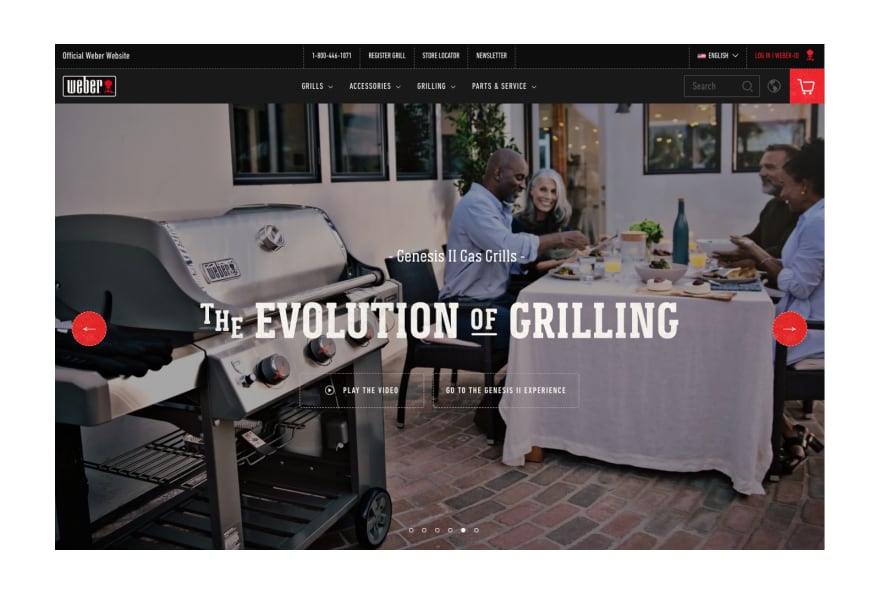
A medium- or high-detail static representation of the design. A good mockup demonstrates the information structure, content and basic functionality in static form. Mockups make it easy to convey the design, and the process of mockup creation is less time-consuming compared to prototypes.
- Prototype
Often confused with a wireframe, a prototype is a medium or a highly detailed representation of the final product. It simulates user interaction with the interface. It should allow the user to rate the content and interface and test the primary options for dealing with the app. It may not look exactly like the final product, but it definitely should not be sketched in shades of gray. Interactions must be modeled closely enough to the final product.
The term ‘prototype’ means a sample model of the product that can be tested to confirm whether the solutions are efficient. Prototypes should not be seen as an analogue of the final product. Their main aim is to enable a designer, a client and a user to see if the design planning is correct.
The value of prototypes vs. wireframes in web design and app development has skyrocketed in the past couple of years. Even a low-fidelity prototype gets the designer, client and tester much closer to the appearance of the future product.
Prototyping is an efficient and useful step between UX design and UI design. When you want to feel the efficiency of these elements and check if nothing has been lost in the design process, the prototype will be a great help.
- User Interface (UI)
What the user sees; this can be a set of commands or menus through which a user communicates with a program. It is also the space where interactions between humans and machines occurs.
- User Experience (UX)
A broad term for several disciplines that study the effect of design on the ease of use and level of satisfaction with a product, site or system. The term UX was invented by Dr. Donald Norman, a cognitive scientist.
Note : UI and UX are not interchangeable! UI is what your users interact with; UX is how they feel while they’re doing it.
The user interface could be a finalized interactive field in which the user interacts with the product. It includes all the tools to speed up usability and meet the users’ needs and wishes. All the visual features, as well as sound and tactile elements, should be analyzed and optimized. For example, color palette, types and animation will affect the performance of the final product.
In general terms, the UX research and wireframing stage is about how the website or application works, while the UI is what it looks like. User experience deals more with logic, connections and user behavior. The user interface provides a visual representation of the concept. The designer should first work on the UX part with a concentration on layout, to make it powerful, well thought out, clear and easy to use. Without this important work, you risk making a mess of the user interface.
After the UX part is tested through a prototype, and the layout, transitions and other features are accepted, the designer starts the UI design part. This is when the newborn heart and brain of your product is clothed with skin and bones. Here the product gets its real color scheme, forms and features of the layout, styles, animations and so on.
All the user interface solutions directly influence the user experience. Hence, the processes of UX wireframing and UI design should reciprocally support each other.
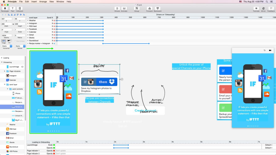
- Onboarding
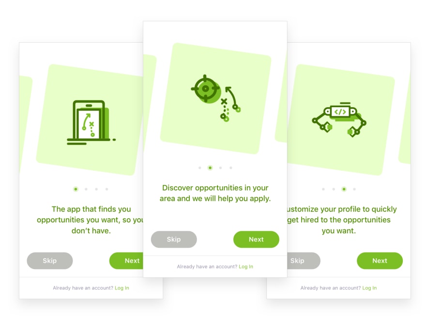
Designing a welcoming experience for new users by easing them in. The design of the onboarding process for your site is usually limited to a first-time use scenario.
-
Landing Page

The location on a website where a user goes after clicking a link. Also called the Target page or Destination page.
This concept was coined more than 10 years ago by internet marketers in the US. The landing page is a webpage with the best navigation possible and a single call to action. Its main goal is to increase the number of requests from potential clients and stand out in the competition among web companies.
How to Avoid Mistakes in Design Communication

Terminology plays a large role in the user’s ability to find and understand information. Many terms are familiar to designers and content writers, but not to users, managers and clients.
Designers use words in special ways when they know they are talking to other designers. In this case, they are communicating design concepts that they either know or assume will be shared territory.
To build an efficient relationship with a design team, always create and review a design brief with the designer. In this way, you will enter the design territory. A UX Glossary may be helpful to clients who are new to a topic and want to build a technology roadmap for their project.
Common Mistakes in Design Communication
There’s often clumsy communication gap between the two parties who need each other. Clients are sometimes overly demanding. In contrast, the client-designer relationship is nourished by empathy and understanding. Everyone has a right to make mistakes. Designers and clients are all in the same boat.
Therefore, if you don’t tell a designer that something must be changed, they won’t know what’s bothering you. Take time to carefully look at the first draft your designer hands you. Make a list of the corrections you would like to see, and recall all of them at the followup meeting.
"I like it / I do not like it"
Phrases like “I do not like it” or “This looks weird” are frustrating for a designer to hear. Without describing exactly what you find weird, saying things like this doesn’t help the designer solve the problem.
Feedback needs to be as specific as possible. Explain how you would like the product to look and feel. Point to specific elements, styles, fonts, color palettes or layouts. Provide the designer with a few samples of designs you like.
"Can you move that button up and to the left? And make it smaller?"
Second-guessing and dictating to designers how they should do their job diminishes their trust. Designers can’t read your mind, so don’t expect them to have paranormal abilities. Your job as the client is to define the problem for the designer. The designer’s job is to find the solution. Avoid giving too many detailed instructions. Instead, tell the designer what issue you or your audience might have, and trust the designer to fix it.
Remain open to the designer’s ideas, even if they don’t align with your vision. Allow the designer to use his or her brain.
Factors Affecting Design Communication
You have a limited time or budget;
You’ve had a bad experience with designers before;
You always consult with your personal design authority;
You feel compelled to criticize.
The best way to get the most out of your graphic designer or illustrator is to give them honest feedback. Unfortunately, feedback from clients often sounds like, “Jane in accounting likes this, but Sarah in marketing said that, and my boss wants something completely different.” Nothing is worse than hearing conflicting input from several different people.
The best way to present feedback to your designer is to write a list of issues. Together with the designer, you can go over it to discuss the appropriate changes to the product.
People in visual arts and design are used to meticulous criticism. But if you are harsh when suggesting changes, it may trigger designer’s block. It resembles writer’s block, when you feel stuck and aren’t sure how to proceed.
Approach your relationship with your graphic designer with discretion and tact. For example, when talking about changing a font, don’t point to your designer’s work and say, “This typeface is kitschy.” Rather, say, “I would like to try a different font here.” Then specify the next step you’d like to take.
Tips for Preventing Communication Gap
Ask Simple Questions to Understand the Problem
Give feedback early and often. Asking designers about issues saves them time and results in a better project, as elements don’t have to be altered at the last minute.
Ask More Questions
It’s easy to blame an unsatisfying final product on the designer. Instead, give the designers all the tools they need to succeed. Your job as the client is to help the designer understand exactly your idea and goals of the product. It’s up to the client to ask more questions to facilitate effective communication.
Answer Your Designer’s Questions Without Delay
Try to provide all the necessary information requested by the designer on time. Explain the message you want to convey. Give an overview of your business or product. Remember that your procrastination slows down the design process.
Good Feedback About Design
Try asking the designer what they would suggest. Here are some examples of how to ask a designer for their professional opinion:
“What can we do to deal with that?”
“What do you think will be the most effective solution for our company?”
“In your professional opinion, which one do you suppose will resonate more with our audience, and why?”
“Are you able to render that a bit more to make it clearer?”
“We would like more emphasis on the logo. It seems to be getting lost at the moment.”
“I’m worried that people won’t see the button. What would you recommend to make it more prominent?”
“Can you explain the distinction between RGB and CYMK again?”
“This is a smart start. Yet I’m worried that this appearance resembles some of my competitors’ visuals. Is it possible to differentiate ourselves better?”
“The font you used is a nice choice. It’s very clear and will charm our younger audience.”
It’s not uncommon for designers to feel as if they are being micromanaged, especially if the client provides too many details about the design. When a designer works with too many demands, the ultimate product looks like it was created by checking off boxes on a checklist. Be flexible, grasp what’s necessary for your product and what isn’t, then let your designer use their skills to create your vision.
How the Knowledge of UI/UX Terms Benefits You
Hopefully, you feel confident enough to engage in more of these design conversations. Ask open questions about the design process, and practice giving smart feedback without delay.
To speak with designers, you have to understand how they think. Designing anything from scratch is difficult, especially when you’re new to working with a designer or a design team. Turning a concept into a product is laborious work, and the client needs to be involved in the design process right from the start.
To make a long story short, being more aware of communication gap in design will help you better understand your design team – and maybe even think like a designer yourself.
The article is written by Sergey Gladkiy. This article about digital product development is originally published on Django Stars blog. You can also visit our content platform Product Tribe created by professionals for those involved in a product development and growth processes.
You are always welcome to ask questions and share topics you want to read about!



Top comments (1)