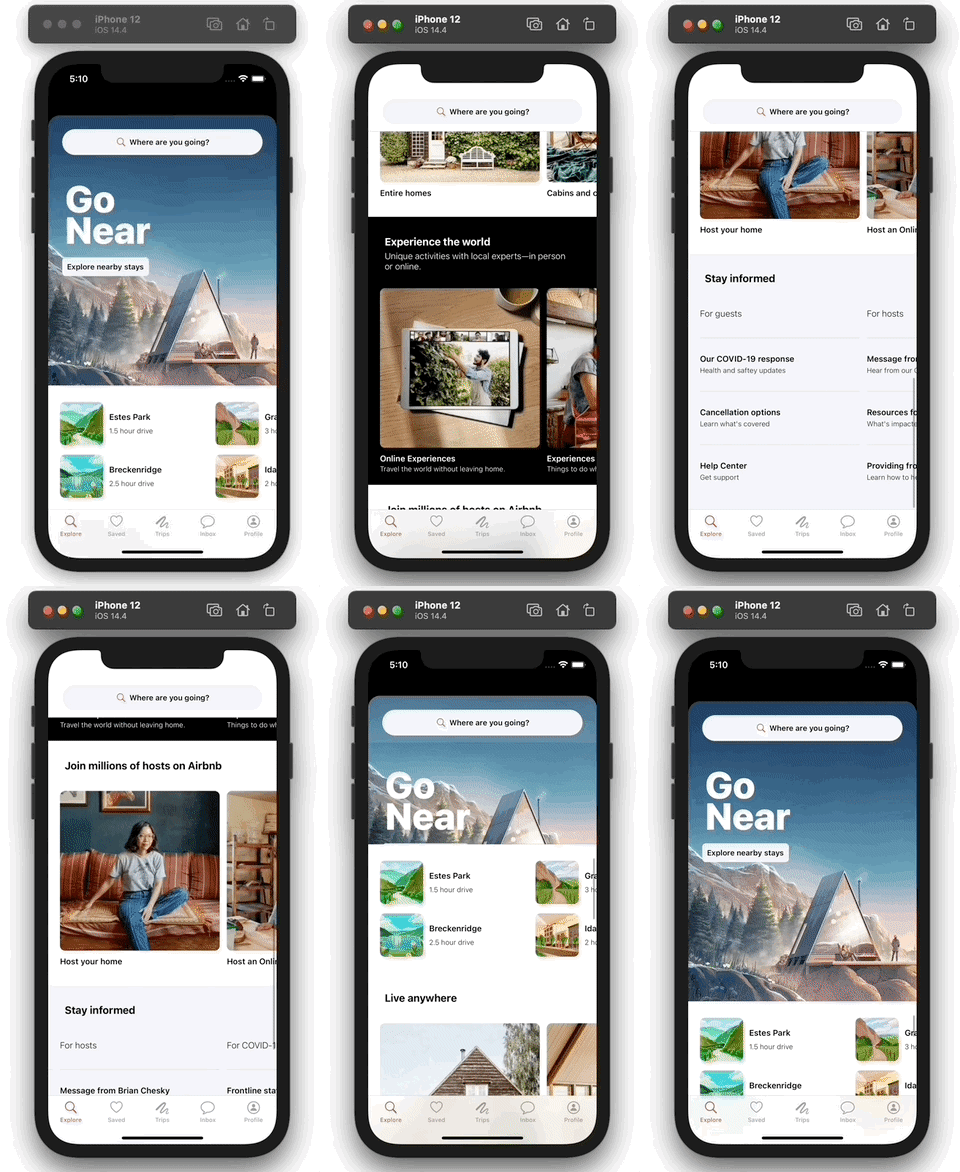
In this series of posts I am going to be building out the UI for Airbnb's "Explore" tab from scratch. This is an exercise in figuring out how to achieve the different layouts and effects you find in popular apps and I chose Airbnb because I thought it had several great examples. It is not intended to be used for anything other than for educational purposes and all my code will be available at this repo if you want to follow along and build it yourself. A few disclaimers:
- For all the illustrations in the app I just took screenshots of the actual app and cropped them to size. They are not the full versions of the illustrations and they are not really even formatted correctly for use in an iOS app. I tried to spend as little time as possible on that prep.
- We will get the fonts, colors and icons as close as we can with just using the system versions. I am pretty sure the font and icons that Airbnb actually uses would require a license and I don't care that much about making this exact. With the way we organize it, it would be pretty easy to swap in the real ones if you want to take that step yourself.
- We will not do any business logic. We will hard code all the data and not handle any user actions. Again, this is not meant to be production code, just an exploration of some UI techniques.
- There is a good chance that Airbnb will look different by the time you see this. Honestly, there's a non-zero chance that it will change before I finish writing this, so the live app will probably look different than what you see me build, but the layout/principles should be pretty much the same. (Editorial note: it has already changed before I was able to finish writing this series, but I have a few screenshots of what the app looked like before, and we'll just build up to the spec that I created.)
Here's what our final product will look like:
With all that said, let's go.
Filling Out The Collection View
We're going to be adding a couple of different cells for this app and even though they will all use the same Content struct to render data on screen, they will use different views to do that. So what I want to do is make the SmallSquareCell wrapper that we wrote last time into a generic ContentCell wrapper that will have some view it will configure with content. So let's add a new file and start by adding a protocol that the view will need to conform to:
// In Collection View Elements/ContentCell.swift

import Anchorage
import UIKit

protocol ContentConfiguringView: UIView {
    func configure(with content: Content?)
}
Then we'll just cut/paste the SmallSquareCell class from last time into this file and make some changes to it:
// In Collection View Elements/ContentCell.swift

// change name and make it generic
final class ContentCell<View: ContentConfiguringView>: UICollectionViewCell {

    // change the view to be View instead of SmallSquareView
    private lazy var view: View = .init()

    // other stuff...

    // change registration so it returns its type is <ContentCell<View>, Content>
    static func registration() -> UICollectionView.CellRegistration<ContentCell<View>, Content> {
        UICollectionView.CellRegistration { cell, indexPath, content in
            cell.configure(with: content)
        }
    }
}
And with that our cell wrapper is generic! It won't compile yet, because we our view doesn't conform to the protocol and we no longer have a class called SmallSquareCell, so let's fix both of those:
// In Collection View Elements/SmallSquareCell.swift

// add a type alias for convenience
typealias SmallSquareCell = ContentCell<SmallSquareView>

// make the view adopt the new protocol,
// which it already conforms to
final class SmallSquareView: ProgrammaticView, ContentConfiguringView {
Now the app should run again and will look the same as before.
Second Cell
Now that we have a generic cell, we can just write our view and toss it in there. It is pretty similar to the SmallSquareView, with a slightly different layout, so I'm not going to go into too much detail. Here's what it looks like:
// In Collection View Elements/LargeSquareCell.swift

typealias LargeSquareCell = ContentCell<LargeSquareView>

class LargeSquareView: ProgrammaticView, ContentConfiguringView {

    private let mainStack = UIStackView()
    private let imageView = UIImageView()
    private let labelStack = UIStackView()
    private let titleLabel = UILabel()
    private let subtitleLabel = UILabel()

    override func configure() {
        mainStack.axis = .vertical
        mainStack.spacing = 10

        imageView.backgroundColor = .secondarySystemFill
        imageView.layer.cornerRadius = 8
        imageView.layer.masksToBounds = true

        labelStack.axis = .vertical
        labelStack.spacing = 2

        titleLabel.font = .custom(style: .headline)
        titleLabel.textColor = .label
        subtitleLabel.font = .custom(style: .subheadline)
        subtitleLabel.textColor = .label
    }

    override func constrain() {
        addSubviews(mainStack)
        mainStack.addArrangedSubviews(imageView, labelStack)
        labelStack.addArrangedSubviews(titleLabel, subtitleLabel)

        mainStack.edgeAnchors == edgeAnchors

        imageView.widthAnchor == imageView.heightAnchor
    }

    func configure(with content: Content?) {
        titleLabel.text = content?.title
        subtitleLabel.text = content?.subtitle
        imageView.image = UIImage(named: content?.image)
    }
}
Second Section
We'll also need a new layout for this new cell type. Again, it is basically the same as the last one just with only one item per group this time.
// In Collection View Elements/NSCollectionLayoutSection+Layouts.swift

static func sideScrollingOneItem() -> NSCollectionLayoutSection {
    let itemSize = NSCollectionLayoutSize(widthDimension: .fractionalWidth(1),
                                          heightDimension: .estimated(312))
    let item = NSCollectionLayoutItem(layoutSize: itemSize)

    let groupSize = NSCollectionLayoutSize(widthDimension: .fractionalWidth(0.7),
                                           heightDimension: .estimated(312))
    let group = NSCollectionLayoutGroup.horizontal(layoutSize: groupSize,
                                                 subitems: [item])

    let section = NSCollectionLayoutSection(group: group)
    section.orthogonalScrollingBehavior = .groupPaging
    section.interGroupSpacing = 12
    section.contentInsets = .init(top: 20, leading: 20, bottom: 20, trailing: 20)
    return section
}
Using The New Stuff
Now it is time to uncomment all of the remaining sections except the last one. We'll also need to uncomment the related stub data:
// In Models/Content.swift

enum Section: Int, Hashable, CaseIterable {
    case nearby, stays, experiences, hosting//, info
}

// in stubData()
case .stays:
    return [
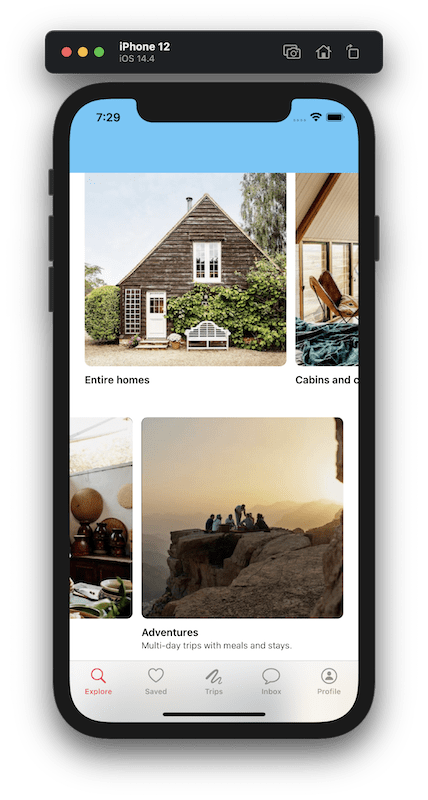
        .init(title: "Entire homes", subtitle: nil, image: "entire-homes"),
        .init(title: "Cabins and cottages", subtitle: nil, image: "cabins-cottages"),
        .init(title: "Unique stays", subtitle: nil, image: "unique-stays"),
        .init(title: "Pets welcome", subtitle: nil, image: "pets-welcome"),
    ]
case .experiences:
    return [
        .init(title: "Online Experiences",
              subtitle: "Travel the world without leaving home.",
              image: "online-experiences"),
        .init(title: "Experiences",
              subtitle: "Things to do wherever you are.",
              image: "experiences"),
        .init(title: "Adventures",
              subtitle: "Multi-day trips with meals and stays.",
              image: "adventures"),
    ]
case .hosting:
    return [
        .init(title: "Host your home",
              subtitle: nil,
              image: "host-your-home"),
        .init(title: "Host an Online Experience",
              subtitle: nil,
              image: "host-online-experience"),
        .init(title: "Host an Experience",
              subtitle: nil,
              image: "host-experience"),
    ]
Then we'll also need to update makeDataSource and makeCollectionView to account for those new sections:
// In HomeView.swift

// in the switch statement in makeCollectionView()
default:
    return .sideScrollingOneItem()

// in the switch statement in makeDataSource()
default:
    let registration = LargeSquareCell.registration()
    return view.dequeueConfiguredReusableCell(using: registration,
                                              for: indexPath,
                                              item: item)
Now, if you run the app, you'll see three new sections full of content!
Adding Headers
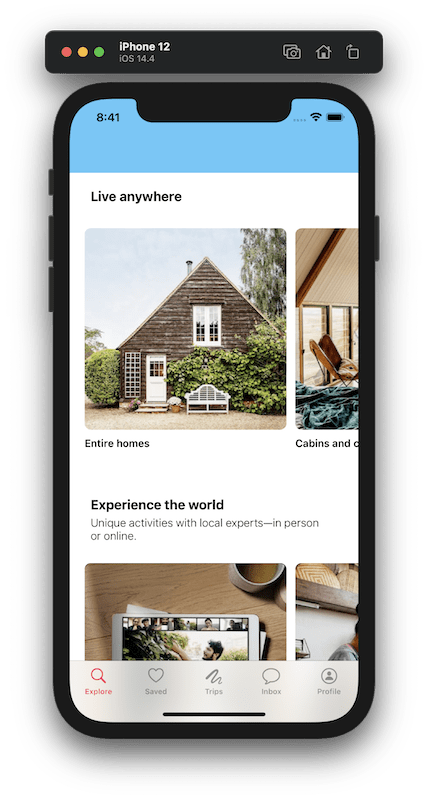
If we look at the spec we're going off of, we'll find that these subsequent sections all have a header. In collection views we add those with a UICollectionReusableView. To keep things consistent, I'm going to follow the same pattern we used with the cells, making a generic wrapper for that which holds a view where we will define the actual layout.
// In Collection View Elements/SectionHeader.swift

import Anchorage
import UIKit

protocol ContentConfiguringHeader: UIView {
    func configure(with content: Content?)
}

class ContentHeader<View: ContentConfiguringHeader>: UICollectionReusableView {

    private lazy var view: View = .init()

    override init(frame: CGRect) {
        super.init(frame: frame)
        constrain()
    }

    required init?(coder: NSCoder) {
        super.init(coder: coder)
        constrain()
    }

    private func constrain() {
        addSubview(view)
        view.edgeAnchors == layoutMarginsGuide.edgeAnchors
    }

    func configure(with content: Content?) {
        view.configure(with: content)
    }

    static func registration(headers: [Content?]) -> UICollectionView.SupplementaryRegistration<ContentHeader<View>> {
        UICollectionView.SupplementaryRegistration(kind: .header) { header, string, indexPath in
            let content = headers[indexPath.section]
            header.configure(with: content)
        }
    }
}
The supplementary registrations use a String to keep track of the element kind, and I try to keep things a little more tightly reined than that, so I'll add an enum which will have a case for each kind of supplementary view that my app will use, and I'll add a convenience initializer for UICollectionView.SupplementaryRegistration which takes that enum and passes it on as a String.
// In Collection View Elements/SectionHeader.swift

extension UICollectionView {
    enum ElementKind: String {
        case header
    }
}

extension UICollectionView.SupplementaryRegistration {
    init(kind: UICollectionView.ElementKind,
         handler: @escaping UICollectionView.SupplementaryRegistration<Supplementary>.Handler) {
        self.init(elementKind: kind.rawValue, handler: handler)
    }
}
Then we need to add the view:
// In Collection View Elements/SectionHeader.swift

typealias SectionHeader = ContentHeader<SectionHeaderView>

class SectionHeaderView: ProgrammaticView, ContentConfiguringHeader {

    private let titleLabel = UILabel()
    private let subtitleLabel = UILabel()

    override func configure() {
        directionalLayoutMargins = .init(top: 24, leading: 0, bottom: 0, trailing: 0)
        titleLabel.font = .custom(style: .title2)
        titleLabel.adjustsFontForContentSizeCategory = true
        titleLabel.numberOfLines = 0
        titleLabel.textColor = .label
        subtitleLabel.font = .custom(style: .title4)
        subtitleLabel.numberOfLines = 0
        subtitleLabel.textColor = .label
    }

    override func constrain() {
        let stackView = UIStackView(arrangedSubviews: [titleLabel, subtitleLabel])
        stackView.axis = .vertical
        stackView.spacing = 4

        addSubview(stackView)
        stackView.edgeAnchors == layoutMarginsGuide.edgeAnchors
    }

    func configure(with content: Content?) {
        titleLabel.text = content?.title
        subtitleLabel.text = content?.subtitle
    }
}
You'll notice that we're using a couple new font styles in this view, so we need ot add those as well.
// In Extensions/UIFont+Custom.swift

private static var title2: UIFont {
    UIFontMetrics(forTextStyle: .title2)
        .scaledFont(for: .systemFont(ofSize: 18, weight: .bold))
}

private static var title4: UIFont {
    UIFontMetrics(forTextStyle: .title3)
        .scaledFont(for: .systemFont(ofSize: 15, weight: .light))
}

// in Style
case title2
case title4

// in switch statement in custom(style:)
case .title2: return title2
case .title4: return title4
Using The Headers
Now we need to content for the headers. Let's uncomment the headerContent property on Section:
// In Models/Content.swift

var headerContent: Content? {
    switch self {
    case .nearby: return nil
    case .stays: return .init(title: "Live anywhere", subtitle: nil, image: nil)
    case .experiences: return .init(title: "Experience the world",
                                    subtitle: "Unique activities with local experts—in person or online.",
                                    image: nil)
    case .hosting: return .init(title: "Join millions of hosts on Airbnb", subtitle: nil, image: nil)
// case .info: return .init(title: "Stay informed", subtitle: nil, image: nil)
    }
}
Then we need to update makeDataSource to take that header content and stick it in header views.
// In HomeView.swift

// at the end of makeDataSource()
let headers = Section.allCases.map { $0.headerContent }
let headerRegistration = SectionHeader.registration(headers: headers)
dataSource.supplementaryViewProvider = { collectionView, string, indexPath in
    collectionView.dequeueConfiguredReusableSupplementary(using: headerRegistration,
                                                          for: indexPath)
}
return dataSource
Finally, we'll add another couple of helpers that set some default values for us and let us use element types that are constrained by an enum. Then we just need to add the layout information to our section definition.
// In SectionHeader.swift

extension NSCollectionLayoutBoundarySupplementaryItem {
    convenience init(layoutSize: NSCollectionLayoutSize,
                     kind: UICollectionView.ElementKind,
                     alignment: NSRectAlignment) {
        self.init(layoutSize: layoutSize,
                  elementKind: kind.rawValue,
                  alignment: alignment)
    }

    static func header(layoutSize: NSCollectionLayoutSize) ->
    NSCollectionLayoutBoundarySupplementaryItem {
        .init(layoutSize: layoutSize, kind: .header, alignment: .top)
    }
}

// In Collection View Elements/NSCollectionLayoutSection+Layouts.swift

// in sideScrollingOneItem()
let headerSize = NSCollectionLayoutSize(widthDimension: .fractionalWidth(1),
                                        heightDimension: .estimated(100))
let header = NSCollectionLayoutBoundarySupplementaryItem.header(layoutSize: headerSize)

let section = NSCollectionLayoutSection(group: group)
section.boundarySupplementaryItems = [header]
And with that, you can run the app and we'll see headers in the sections that have them!
Wrap Up
In this part we really took advantage of the groundwork we made in the last part. We made our cell wrapper more reusable by making it generic. We defined a new cell layout and used it with the next several sections of content. And we added headers for the sections that have them. In the next part we'll take a look at adding backgrounds and dark mode support.
Check out the code up to this point in this repo.
If this has been helpful buy me a coffee!


Top comments (0)