Mr Saturday’s performance is actually just an excuse for me to mess with this package

WRITER'S NOTE: This blog was posted in August of 2022 on Medium but I republished it to Dev.to as I planned to my future writing here
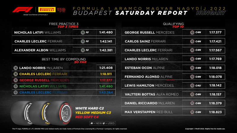
George Russell finally got his first pole in Hungary a week ago, I am Happy for him sure finally he got his pace transferred in a top team car (well, even though Merc is a bit on a hiccup phase atm), but that’s not what I want to do, what I want to do is comparing him with 3 cars from 3 teams, which is Mercedes, Ferrari, and Mclaren which is in first, second, and fourth respectively. I will exclude Charles Leclerc’s Ferrari since I want to compare car-wise.
Also, I'm not gonna just use words and things like that, I'm gonna use python and a package called FastF1, it's a neat package to enable us to access and analyze Formula 1 results, schedules, timing data, and telemetry. We hope we can learn anything from the quali.
Disclaimer: I'm not an expert in this package, also not an expert in Race Engineering at all, im just a fan try to learn and also nerding out with Python so any mistake is welcome(no toxicity please, this is not Twitter)
Important Note
I use Jupyter Notebook in VScode for this “mini-project”, also an important point is to use Python 3.8 or 3.9 since the package won't work for versions below that, so sorry Google Colab User.

Sorry Buddy Oops GIF - Sorry Buddy Oops Condolences - Discover & Share GIFs
Click to view the GIF
1. Setup
First, check your python versions, and make sure to have the correct version, then import the needed packages.
If you haven't installed it, just simply download it with pip install fastf1
The reason I enable cache is so I don't have to download it over and over again, it's all gonna be saved locally, but at cost of a longer initial run, and it's also gonna be a bit fat in size.
2. collecting the quali data
since we only need the qualification data, and mostly the fastest which is the final Q3 session, we only need the fastest lap data of each driver that we want
you actually can disable the parameter to weather=True I was just curious about the weather that day, but I digress
after the quali data has been loaded, we pull the fastest lap of each driver so we can use the function above.
3. get car data and add additional data
What I want to take a look at in the telemetry is the Throttle Position, engine RPM, and gear shift, since that’s the behavior that is accurately recorded in the FastF1 package, from the documentation itself said:
Speed (float): Car speed [km/h]
RPM (int): Car RPM
nGear (int): Car gear number
Throttle (float): 0–100 Throttle pedal pressure [%]
Brake (bool): Brakes are applied or not.
DRS (int): DRS indicator (See **fastf1.api.car_data()** for more info)
I want to see how hard they abuse their braking systems since brake pressure varies from corner to corner, but anyway…. let's extract their car data
after that, you’ll be greeted with this data frame
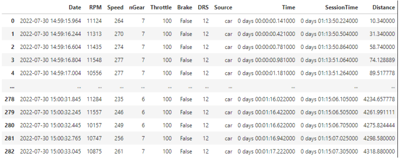
looks menacing at first I know, but not really. The good thing about quali lap data from this package is because they have a similar amount of data for all driver’s data we can stack them one another to see their difference.
4. Plotting
Then what’s left is to plot it together, and prepare this one this snippet is a bit bigger than the previous one.
I spaced a few functions from each other and comment on them so you can understand them a bit.
extract data for plotting
The first three functions are similar to one another, we need individual data from the dataframes we just extracted previously since what we want is RPM, Throttle, Distance, and Gear then we extract those, let’s one example
#plot george russell qualiRPM
rus_rpm = rus_car_data['RPM']
rus_tps = rus_car_data['Throttle']
rus_distance = rus_car_data['Distance']
rus_gear = rus_car_data['nGear']
This function is just pandas built-in function to extract one column so we can use it to plot the data.
adding color
Then we make 3 variables for plotting color, luckily we have a built-in function from FastF1 to make color depend on the team, let's take a look at one line
fer_color = fastf1.plotting.team_color('FER')
plotting itself
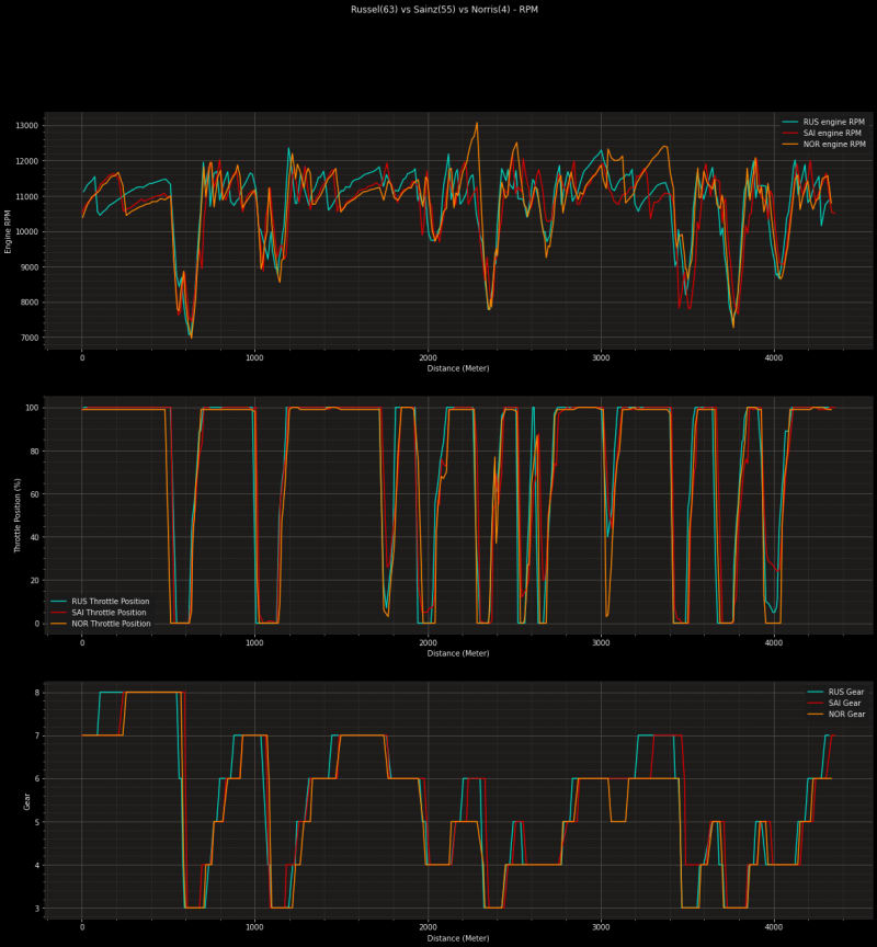
The rest of the function is to plot the data that we have extracted earlier, from the function in the snippet, I want to make 3 plots, the first plot is a plot to compare the RPM of 3 cars, with the X axis representing the distance they took and the Y axis representing the RPM of their engine.
the second plot is comparing their throttle position, same stuff, distance on X, and Throttle on Y.
Third also the same, X for distance, Y for Gear.
Then…..voila!
Let’s use the video provided by the F1 youtube channel to compare George’s performance to others.
5. Nerding Time
so we can see on some occasions where both Mercedes and Mclaren have RPM exceeding 12k, even Mclaren hit 13k on one occasion after turn 5–6.
George, the pole sitter in his Gear shift graph shows that he always shifts earlier whether it's downshifting or upshifting, also his throttle is always lifted hard slam harder, like in one occasion in the second sector graph where the others barely go 80 percent, he floors it to 100.
Also, I saw an interesting thing in Carlos’s second sector, he barely lifts the throttle and since his fastest lap in that sector is yellow(which means slower than his best attempt in that sector) can be interpreted that he’s a bit nervous
the last thing I found interesting is Lando on either turn 10/11 he lift his throttle almost completely and even downshift to 5th gear, but managed to goes green in that sector anyway.
Conclusion
In the end, does it mean anything?? I don't know, the point of this post is to see interesting things from their quali run. If we had steering angle or even wheel speed we might get the bigger picture.
you can see the full code in my Github repo, hope it's interesting to see the data that we don't always see on TV.
This post is just me messing around with the package if you have any questions or maybe you see other interesting things from the graph let me know
cheers


Top comments (0)