
I’m not as young as I once was, and years of staring at a screen for work, for coding, for games, and for TV have really taken a toll on my eyes. Because of this, I’ve grown extremely appreciative of sites with dark mode since it causes a lot less eye strain. One of the side-benefits of learning code was that I can now make ANY site dark mode by going into the developer tools and changing a few values. This got me thinking about how to best implement a dark mode in my own websites.
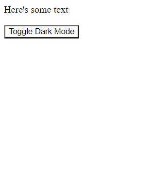
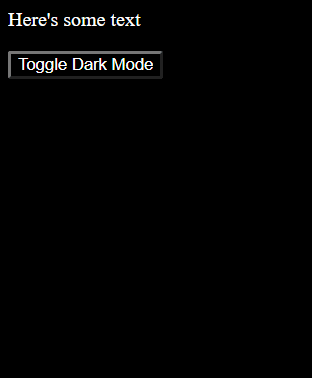
The first thing I tried was to create a totally separate “dark mode” CSS stylesheet. I created 3 separate CSS files: main.css, lightmode.css, and darkmode.css. Anything color-related went onto lightmode.css, and then I copy/pasted into darkmode.css and essentially inversed everything (white = dark and so on). By using an onclick function on a Dark Mode button I could change the script tag in my site’s header to toggle the active file back and forth.
function toggleDarkMode() {
    // grab the script that controls colors (either darkmode.css or lightmode.css)
    const scriptTag = document.getElementById("colorScheme");
    // break the href into array
    const splitHref = scriptTag.href.split("/");
    // determine if scheme is currently light or dark, then switch the value within href array
    splitHref[splitHref.length-1] == "darkmode.css" ? splitHref.splice(-1, 1, "lightmode.css") : splitHref.splice(-1, 1, "darkmode.css");
    // combine altered array back into string and set as new href
    scriptTag.href = splitHref.join('/');
}
| Light Mode | Dark Mode |
|---|---|
 |
 |
Success!! Hey that was actually pretty simple.
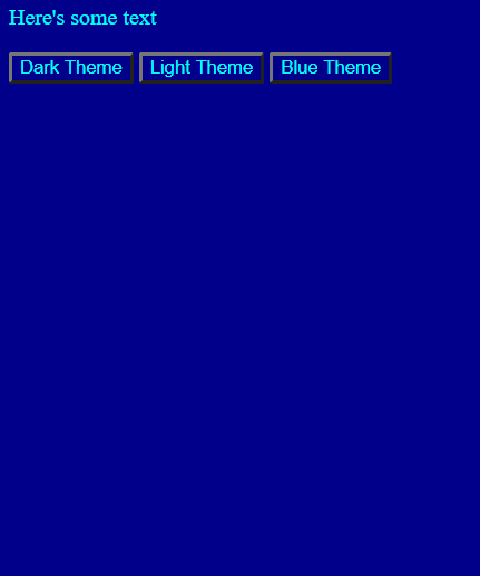
At this point though, I started to think about how cool it would be if my site had several themes for a user to choose from. No problem, I'll just create another theme file, maybe bluetheme.css for example. I'll also need to tweak my function and my buttons to support more than two cases:
function changeTheme() {
    // grab the script that controls colors (either darkmode.css or lightmode.css)
    const scriptTag = document.getElementById("colorScheme");
    // break the href into array
    const splitHref = scriptTag.href.split("/");
    // case statement based on which button was clicked
    switch(event.target.id) {
        case "darkThemeBtn":
            splitHref.splice(-1, 1, "darkmode.css");
            break;
        case "lightThemeBtn":
            splitHref.splice(-1, 1, "lightmode.css");
            break;
        case "blueThemeBtn":
            splitHref.splice(-1, 1, "bluetheme.css");
            break;
    }
    // combine altered array back into string and set as new href
    scriptTag.href = splitHref.join('/');
}
| Light Mode | Dark Mode | Blue Mode |
|---|---|---|
|
|
 |
Ta-Da!! Piece of cake.
But now I want to add font type and weights too. Those buttons could really do with some customizing. Or how about some gradients or shadow effects? Plus 3 set themes is cool and all, but what if I want it to be really customizable? Maybe the user can choose elements from each. Now this is starting to get a little out of hand, we'll need separate files for each of the various background-colors, separate files for each font color, for font styles, button formats, and on and on and on. There HAS to be a better way to do this.
Enter CSS Variables
Where creating stylesheets can let me easily switch between set themes, variables should allow me to provide a much more flexible customization experience and it should scale much, MUCH better.
First thing's first - we don't need all these different CSS theme files, so let's remove everything except for main.css Now let's start out by changing the buttons from set themes, to theme elements instead:
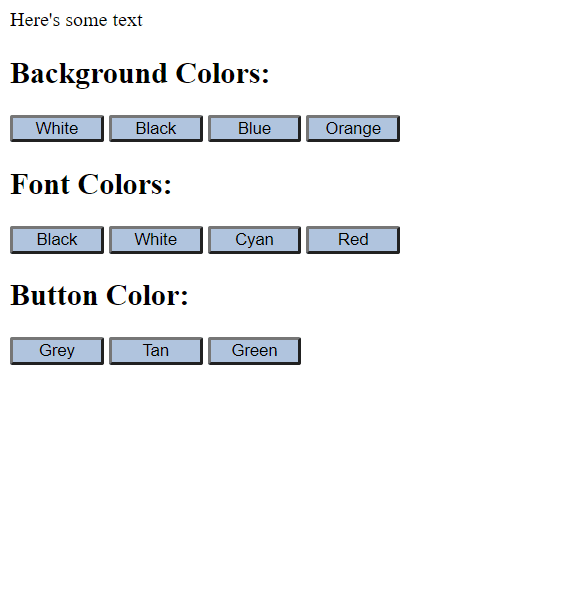
Next, it's time to declare the CSS variables and set them to my preferred defaults. Variables are declared using a "--variableName" syntax and, while they can be set inside any selector making them only available to that particular selector, they are typically set in the :root so that they can be used consistently throughout the entire site, and that works best for my use case so that's what I've done here. Once they're set up, I can set all my theme-related css properties to these variable values using a "var(--variableName)" syntax. Notice how my variables match up with the customization options above.
:root {
    --bg-color: white;
    --font-color: black;
    --btn-color: lightgrey;
}
body {
    background-color: var(--bg-color);
    color: var(--font-color);
}
button {
    display: inline;
    width: 75px;
    background-color: var(--btn-color);
    color: var(--font-color);
}
Great! Now I just need to write a script that will take input based on which button was pressed, and update the value of the correct variable. There are a bunch of ways to do this of course, but, since I'm only using buttons at the moment, I'll simply add an html data attribute to each one and draw on the className and data value of the clicked button.
function apply() {
    event.preventDefault();
    // get variable name
    const cssVar = event.target.className
    // get new value
    const input = event.target.dataset.value;
    // set variable name to new value
    document.documentElement.style.setProperty(`--${cssVar}`, input);
}
And voila!! This site is now using a 'build-it-yourself' theme. You can imagine going a lot deeper with this by adding custom font options, sizing, effects, etc.
| Black & Green | Orange & Grey | White & Tan |
|---|---|---|
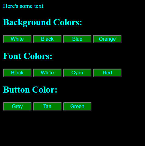 |
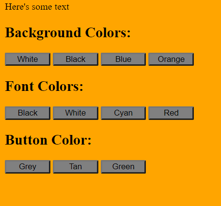 |
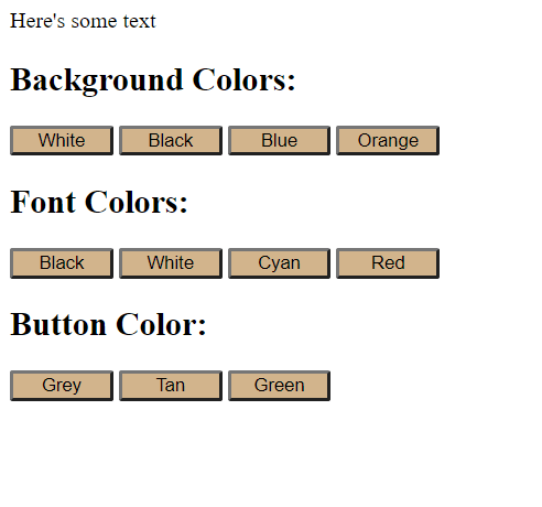 |
What a fun, easy way to make your site more interactive for your users!
And here's the demo on Codepen so you can play around with it:


Top comments (0)