What are charts and uses?
Data in its raw form is usually hard to comprehend and make meaning off. To make use of data or be able to read meaning from it, it needs to be presented in a way that is easy to understand, and this is where Charts come in.
A chart is basically a graphical representation of data, they
summarize large data or information in a visual easy-to-understand manner. With Bootstrap charts we can easily figure out and make sense of data just by glancing and looking through a single page of well prepared data.
In this article we are going to discuss and in this article, we’ll be looking at how to add charts to our webpage using chartjs and Contrast.
Prerequisites
To properly understand this tutorial it is important that you have the following:
- Basic HTML Knowledge
- Basic CSS Knowledge
- Basic Bootstrap knowledge
Bootstrap chart Setup(using chartjs and Contrast)
Bootstrap 5 allows you to create your very own Bootstrap charts, to do this, the first thing you need to do is create a folder that will hold all our files for this tutorial.
In this tutorial , I named my file bootstrap-chart, however, you can choose whatever name of your choice. Next, we create an index.html file. The index.html file that will contain a large chunk of our code. Our Bootstrap Chart would be built using chartjs and Contrast.
CONTRAST
Contrast is an elegant bootstrap 5 UI kit featuring over 2000+ essential components. Contrast can be integrated with any project to build mobile-first, responsive and elegant websites and web apps. You can read more about the UI Kit here. We will be using some styles from the UI Kit to build our bootstrap chart
Chartjs
Chartjs is a simple, flexible community managed open-source JavaScript charting library for creating different types of charts in the browser. Chartjs features an extensive collection of charts and configurations to build different functionalities and customizations in your charts.
With Chartjs designers and developers can draw out clean, engaging and different kinds of charts using HTML5 canvas element. We opt to use the Chartjs charting JavaScript library because it is easy to learn, easy-to-use, and extremely customizable with different options of the kinds of charts you are looking to build ( line, bar, radar, polar etc.)
To use Contrast and chartjs in our project, we have to add the CDN links to <head> section of our HTML code.
After adding the required CDN links, our index.html file should look like this.
<!DOCTYPE html>
<html lang="en">
  <head>
    <meta charset="UTF-8" />
    <meta name="viewport" content="width=device-width, initial-scale=1.0" />
    <meta http-equiv="X-UA-Compatible" content="ie=edge" />

    <link rel="stylesheet" href="https://cdn.jsdelivr.net/npm/cdbootstrap/css/bootstrap.min.css" />
    <link rel="stylesheet" href="https://cdn.jsdelivr.net/npm/cdbootstrap/css/cdb.min.css" />
    <script src="https://cdn.jsdelivr.net/npm/cdbootstrap/js/cdb.min.js"></script>
    <script src="https://cdn.jsdelivr.net/npm/cdbootstrap/js/bootstrap.min.js"></script>
    <script src="https://kit.fontawesome.com/9d1d9a82d2.js" crossorigin="anonymous"></script>

    <title>How to create bootstrap charts using bootstrap 5 and Contrast</title>
  </head>

  <body></body>

  <script src="https://cdnjs.cloudflare.com/ajax/libs/Chart.js/2.7.2/Chart.js"></script>
</html>
Now, let’s go-ahead to create our charts.
Line Chart.
The first type of chart we will be discussing is the line chart. This is the simplest chart that we can use on our website.
A line graph, or line chart is a chart that uses lines to connect individual points. Lines do not have to be straight ( linear ), we could also have curved lines connecting the individual dots. It is usually on a 2-dimensional graph.
To create our Chart, in the body of our HTML page, we use a div element with a class of chart-container this container will house our actual chart which we will create using the HTML5 canvas element, by passing the element an id with the value of chart.
<div class="card chart-container">
  <canvas id="chart"></canvas>
</div>
To style add styling to our charts, we use a style tag in which we define the CSS styling for our chart.
<style>
  .chart-container {
    width: 50%;
    height: 50%;
    margin: auto;
  }
</style>
Now let’s add a script tag where we select the chart canvas and apply the chart settings to it.
<script>
      const ctx = document.getElementById("chart").getContext('2d');
      const myChart = new Chart(ctx, {
        type: 'line',
        data: {
          labels: ["sunday", "monday", "tuesday",
          "wednesday", "thursday", "friday", "saturday"],
          datasets: [{
            label: 'Last week',
            backgroundColor: 'rgba(161, 198, 247, 1)',
            borderColor: 'rgb(47, 128, 237)',
            data: [3000, 4000, 2000, 5000, 8000, 9000, 2000],
          }]
        },
        options: {
          scales: {
            yAxes: [{
              ticks: {
                beginAtZero: true,
              }
            }]
          }
        },
      });
</script>
In the code above, the first thing we do is select the chart element. Then, we create a new chart instance using chartJs and give it the properties we need, such as the type of chart, data we want to use, and other options that will help us customize the chart.
understanding the props
- The
typeproperty indicates what kind of chart we are trying to create. In the block of code above thetypevariable is set to line. - The
labelsproperty indicates the variables on the y-axis ( horizontal ) side of the chart. - The
labelproperty acts like the chart tag, or title. - The
backgroundColorproperty is used to set the background color of the chart. - The
borderColorproperty is used to set the color of the line in the line chart. - The
dataproperty indicates where the points should be located on the vertical axis.
Now our code should look like this.
<!DOCTYPE html>
<html lang="en">

<head>
  <meta charset="UTF-8">
  <meta name="viewport"
    content="width=device-width, initial-scale=1.0">
  <meta http-equiv="X-UA-Compatible" content="ie=edge">

  <link
    rel="stylesheet"
    href="../contrast-bootstrap-pro/css/bootstrap.min.css" />
  <link
    rel="stylesheet"
    href="../contrast-bootstrap-pro/css/cdb.css" />
  <script
    src="../contrast-bootstrap-pro/js/cdb.js"></script>
  <script
    src="../contrast-bootstrap-pro/js/bootstrap.min.js"></script>
  <script
    src="https://kit.fontawesome.com/9d1d9a82d2.js"
    crossorigin="anonymous"></script>

  <title>How to create bootstrap charts using bootstrap 5</title>
</head>
<style>
  .chart-container {
    width: 50%;
    height: 50%;
    margin: auto;
  }
</style>

<body>
  <div class="card chart-container">
    <canvas id="chart"></canvas>
  </div>

</body>

<script
src="https://cdnjs.cloudflare.com/ajax/libs/Chart.js/2.7.2/Chart.js">
</script>
<script>
      const ctx = document.getElementById("chart").getContext('2d');
      const myChart = new Chart(ctx, {
        type: 'line',
        data: {
          labels: ["sunday", "monday", "tuesday",
          "wednesday", "thursday", "friday", "saturday"],
          datasets: [{
            label: 'Last week',
            backgroundColor: 'rgba(161, 198, 247, 1)',
            borderColor: 'rgb(47, 128, 237)',
            data: [3000, 4000, 2000, 5000, 8000, 9000, 2000],
          }]
        },
        options: {
          scales: {
            yAxes: [{
              ticks: {
                beginAtZero: true,
              }
            }]
          }
        },
      });
</script>

</html>
With this, we have a chart that looks like it.
Bar Chart.
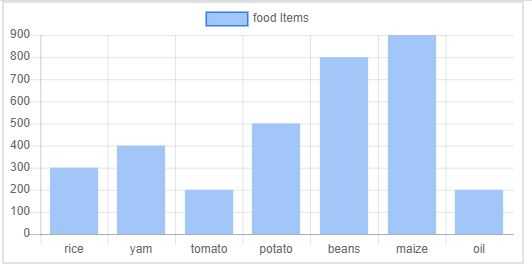
A bar chart is a type of chart that represents values as vertical or horizontal bars of equal width. They are usually used to compare multiple data or show the distribution of data points.
The code for our bar chart is shown below. Taking a good look, the only things that change are the type of chart option, data and labels.
<script>
      const ctx = document.getElementById("chart").getContext('2d');
      const myChart = new Chart(ctx, {
        type: 'bar',
        data: {
          labels: ["rice", "yam", "tomato", "potato",
          "beans", "maize", "oil"],
          datasets: [{
            label: 'food Items',
            backgroundColor: 'rgba(161, 198, 247, 1)',
            borderColor: 'rgb(47, 128, 237)',
            data: [300, 400, 200, 500, 800, 900, 200],
          }]
        },
        options: {
          scales: {
            yAxes: [{
              ticks: {
                beginAtZero: true,
              }
            }]
          }
        },
      });
</script>
Pie Chart
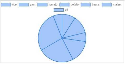
A pie chart is a type of chart or graph that represents data or displays data in a circular graph. The circular graph ( circle ) is divided into sectors in which each sector represents a piece of the data or information we are trying to represents.
<script>
      const ctx = document.getElementById("chart").getContext('2d');
      const myChart = new Chart(ctx, {
        type: 'pie',
        data: {
          labels: ["rice", "yam", "tomato", "potato",
          "beans", "maize", "oil"],
          datasets: [{
            label: 'food Items',
            backgroundColor: 'rgba(161, 198, 247, 1)',
            borderColor: 'rgb(47, 128, 237)',
            data: [30, 40, 20, 50, 80, 90, 20],
          }]
        },
      });
</script>
The code above translates to the pie chart in the image below.
Doughnut Chart
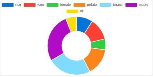
This chart is similar to the pie chart except that in the pie chart the data occupies the entire chart ( which is a circle as we have discussed above ) while in the doughnut chart the chart center would be cutout making it resemble a doughnut, hence is name.
The major difference between a pie chart and a doughnut chart is that a doughnut chart can be used to represent 2 different data series while in a pie chart you would have to create two different pie charts to represent two different data series.
<script>
      const ctx = document.getElementById("chart").getContext('2d');
      const myChart = new Chart(ctx, {
        type: 'doughnut',
        data: {
          labels: ["rice", "yam", "tomato", "potato", "beans",
           "maize", "oil"],
          datasets: [{
            label: 'food Items',
            data: [30, 40, 20, 50, 80, 90, 20],
            backgroundColor: ["#0074D9", "#FF4136", "#2ECC40",
            "#FF851B", "#7FDBFF", "#B10DC9", "#FFDC00",
            "#001f3f", "#39CCCC", "#01FF70", "#85144b",
            "#F012BE", "#3D9970", "#111111", "#AAAAAA"]
          }]
        },
      });
</script>
In the doughnut chart, we add change the background color option from a single value to an array of values so that each segment in the doughnut will have its own color as shown in the image below.
There are a lot of other variations and options for charts which can not all be covered in this article but you can check them out in the official chart.js documentation.With this, we now know how to create and use charts in our projects.


Top comments (0)