
Introduction
Devexperts Quality Assurance team is happy to update you about our latest news: we are beginning to open-source our internal projects with SUITCase – a great tool for screenshot testing of iOS and iPadOS apps1.
The main idea of SUITCase is to provide many different comparing strategies. It does not only support testing with pixel by pixel accuracy. Also, it can tolerate minor color differences or completely ignore the color hue. The way to calculate the color difference and the light intensity is not as obvious as it might seem. In this article, we will tell you about the different approaches to calculating the color difference between two colors and why it is important in screenshot testing.
Problem
Let’s suppose we test Apple’s Health application. We have recorded the reference screenshots on iOS 13.0 and want to run screenshots tests a few versions later – on simulators running iOS 13.5. The next screenshots show the Health app on these two versions. How many user interface changes can you see?

Some changes are more noticeable than others. For example, the Browse button in the tab bar became bigger to match the Summary button. The little arrows to the right of the category cells are thinner while retaining their color. Speaking of color, have you noticed the Mindfulness icon’s different hue?
The next image shows all of the changes made. The pixels that do not match are displayed with #000000 color, while the remaining are #FFFFFF.
![]()
The texts in the navigation bar slightly changed their position. While it is hard to see on the side-by-side comparison, we can notice it if we position one screenshot on the top of the other and change their order repeatedly. There are also minor changes to some of the other icons. The last significant difference is the Activity icon’s hue.
![]()
Let’s compare the Activity and Mindfulness icons’ color changes.
The difference between Vermillion and Orange is barely visible, while Robin’s Egg Blue is easy to distinguish from Malibu. We don’t want to treat minor color differences the way we pay attention to much more noticeable changes. Also, we don’t want to receive false-negative test results because of nearly invisible changes.
So, how should we calculate the color difference?
Color difference
Let’s quickly refresh the things we know about RGB pixels. The colors of RGB spaces are relatively easy to display because the majority of modern screens (including iOS and iPadOS devices) use physical RGB pixels. All you have to do is to mix three additive primary colors (red, green, and blue). The 24-bit RGB model allows us to create about 16.7 million colors mixed with the 256 discrete levels of each color component2.
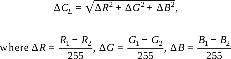
What is the difference between the two colors in the 24-bit RGB model? We have two points in a three-dimensional space (called the color cube), so the Euclidian distance (ΔCE) should be alright.
The problem is the human eye does not perceive colors the way electronic devices display them. We differentiate shades of green more effectively than shades of blue and red3 (even if it is hard to name them4). Our ancestors lived in a green world, and our eyes have not adapted to the modern world yet. To improve the color components’ contribution, we should use a weighted sum instead of a simple sum before calculating the square root.
There is a great article in CompuPhase5 that suggests two ways to calculate weighted Euclidean distance functions. The first one (ΔC1) uses two fixed sets of weights depending on the mean of the red components’ values. If the mean is less than a half, the function adjusts the blue components’ difference more than the red components’. If the mean is high, it values the red components’ contribution more.

The difference between the green components is the top priority in both cases.
There is another explanation to this approach – we can use a simple Euclidian distance but in the modifications of the color cube. The color cube stretches to form two color parallelepipeds.

The second way to calculate the color difference (ΔC2) transforms the color cube smoothly. Instead of using two fixed sets of weights, it applies more precise weights.

Let’s compare the three approaches mentioned above. The next image shows five colors.
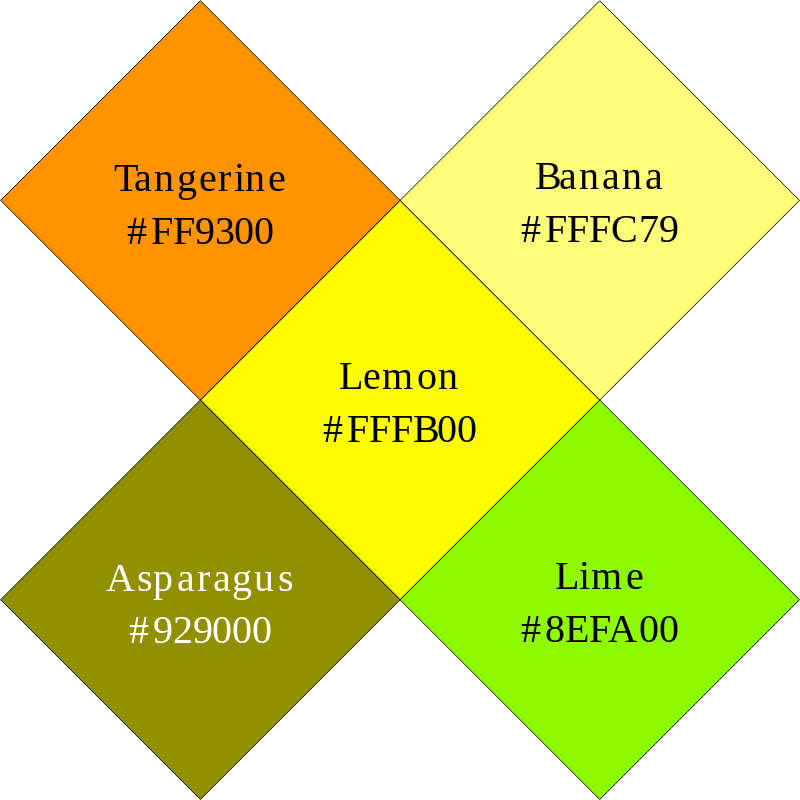
We will calculate the color difference between Lemon and four other colors – Tangerine, Banana, Asparagus, and Lime. Which color do you think is the closest to the Lemon? And which one is the least similar?
The next image shows the color differences calculated by three methods. The results are normalized to make the differences between #000000 and #FFFFFF equal to 1.

According to results, all three formulae tell us that Asparagus is the most distant color to Lemon. But what about the closest? The simple Euclidian distance (ΔCE) is the least for the Tangerine, and the first weighted distance (ΔC1) says the Lime is the most similar to Lemon. The limes and lemons are greatly similar in the matter of taste, but according to the majority of our QA team, the two most similar colors are Lemon and Banana. The second weighted distance (ΔC2) proves it.
There are other more precise methods, but they require converting RGB pixels to other representations6. Such conversions lead to more calculations, so we chose ΔC2 as a color difference calculation method for SUITCase.
Result
Let’s go back to the example in the beginning.
Now we know how to calculate the difference between Orange and Vermillion which equals 0.08, while the difference between Malibu and Robin’s Egg Blue is much higher and equals 0.193. Let’s see how choosing the color difference threshold (T), that separates matching and non-matching pixels, affects the testing stability. The next image shows non-matching pixels for T ∈ {0.05, 0.1, 0.2}.

You can see how increasing a threshold leads to a smaller amount of non-matching pixels. Our screenshot testing tool SUITCase allows users to configure this threshold which equals 0.1 by default.
Conclusion
Ignoring minor color differences allows us to increase our screenshot testing stability. You can try this feature right now as the code is available on GitHub1, and we will be happy for your feedback.
We hope this article will help you to improve your screenshot testing, even if you develop tests for other target platforms.
Take our little quiz to know how good you are in differentiating colors:
https://forms.gle/ZBjRVqd1P7VVv2mz8
Which tools do you use to automate screenshot testing? How do you treat minor color differences?
References:
1. Devexperts team. “devexperts/suitcase”. A Public Repository on GitHub, Devexperts LLC, 2020, github.com/devexperts/suitcase
2. Michael Stokes, Matthew Anderson, Srinivasan Chandrasekar, and Ricardo Motta. “A Standard Default Color Space for the Internet: sRGB”. International Color Consortium, ICC, 1996, color.org/sRGB.xalter
3. Adeel Mahmood Javaid. “Why does the human eye see more shades of green than any other colour?”. A Personal Blog on LinkedIn, Adeel Mahmood Javaid, 2016, linkedin.com/pulse/why-does-human-eye-see-more-shades-green-than-any-other-adeel-javaid
4. Randall Patrick Munroe. “Color Survey Results – xkcd”. xkcd Blog, Randall Patrick Munroe, 2010, blog.xkcd.com/2010/05/03/color-survey-results
5. Thiadmer Riemersma. “Colour Metric”. CompuPhase Website, 2019, compuphase.com/cmetric.htm
6. Charles Poynton. “Frequently Asked Questions about Color”. Charles Poynton’s Website, Charles Poynton, 1999, poynton.ca/ColorFAQ.html
The post Getting to the bottom of the RGB pixels. Part 1: Color difference appeared first on Devexperts Blog.

Top comments (0)