My Final Project!
The motivation for me creating a personal website is to show to potential employees and find a graduate job in my area. I wanted a platform to showcase some of my finest work that I have made throughout university. I went for the NextJS/Now approach for a couple of reasons.
- It has pre-rendering capabilities.
- React was my strongest front-end framework.
- NextJS have support for most headless CMS'.
Tech Stack
- NextJS
- Prismic CMS
- React JS
- Now server
Some features that I've implemented on my website:
- Dark/Light mode using React Hooks
- Styled Components to implement consistent styling and CSS in JSX.
- CSS Animations for the Gradient text, hover and responsive changes.
- Headless CMS integration with Prismic to host my images and blog posts.
- Font-pairing with Google fonts.
- Mobile-first design.
- Basic SEO.
- Meets basic accessibility criteria.
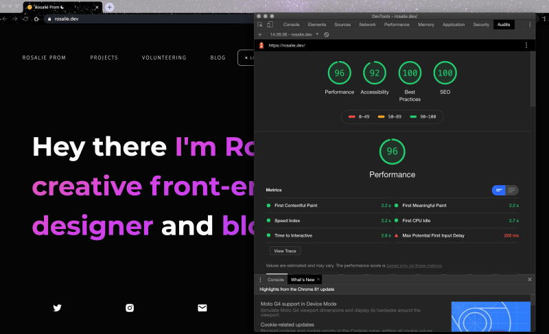
Just take a look at the latest Lighthouse report:

I'm still working on this now, but I'm pretty happy with what's on there. There's still some areas of improvement on my website:
Accessibility
Need to add options for alternative text, aria-labelling and a better colour scheme that is suitable for colour blind viewers.
Performance
I need to change the sizes of images and find a way to compress the sizes so that it can be loaded quicker on both mobile and desktop.
SEO
Although I'm not too keen on fixing SEO because this is a portfolio page, I'd like to learn more about Google Tag Manager and use tools to view metrics. I am trying to not rely on Lighthouse for the scores, but I believe there is a lot of learning to be done in this area (A+B Testing, marketing, etc).
Write more blogs!
I've been trying to find the motivation to write more, but I've been working a lot so when I do find the time and topic, I'll be writing more.
I'm open to suggestions to improve my website so please, let me know in the comments!


Top comments (4)
This looks great, I like it
Thank you for checking it out!
Not a fan of dark theme, but the home page looks great. :)
The gradient really shins on dark mode.
Yeah I'm aware of the dark mode not being everyones cup of tea, thank you for taking a look :)