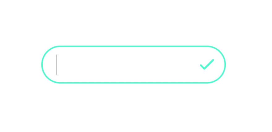
HTML
For HTML we need a container with input and button with "edit" svg.
Click on button will trigger the toggle.
<div class="container">
    <input type="text" class="input">
    <button onclick="toggle()" class="edit">
        <svg
            xmlns="http://www.w3.org/2000/svg"
            height="15"
            fill="none"
            viewBox="0 0 24 24"
            stroke="#02a8f4"
            stroke-width="2">
            <path
                stroke-linecap="round"
                stroke-linejoin="round"
                d="M15.232 5.232l3.536 3.536m-2.036-5.036a2.5 2.5 0 113.536 3.536L6.5 21.036H3v-3.572L16.732 3.732z" />
        </svg>
    </button>
</div>
Javascript
For javascript, we'll have a variable that stores the button state (edit mode or not) and we'll create a toggle function.
First we'll select all elements (button, input and container) and set edit mode to opposite of what it was (edit = !edit).
Now, if edit is true, we'll change button's svg to check icon, we'll focus the input and set "active" class to it and we'll change container's border color to light green.
If edit is false, we'll set button's svg back to edit icon and remove the "active" class, and set container's background color back to blue.
let edit = false

function toggle() {
    let btn = document.getElementsByClassName('edit')[0]
    let input = document.getElementsByClassName('input')[0]
    let container = document.getElementsByClassName('container')[0]

    edit = !edit

    if (edit) {
        btn.innerHTML = `
            <svg xmlns="http://www.w3.org/2000/svg" height="15" fill="none" viewBox="0 0 24 24" stroke="#32ffcc" stroke-width="2">
                <path stroke-linecap="round" stroke-linejoin="round" d="M5 13l4 4L19 7" />
                </svg>`
        input.focus()
        input.classList.add('active')
        container.style.borderColor = '#32ffcc'
    } else {
        btn.innerHTML = `
            <svg xmlns="http://www.w3.org/2000/svg" height="15" fill="none" viewBox="0 0 24 24" stroke="#02a8f4" stroke-width="2">
                <path stroke-linecap="round" stroke-linejoin="round" d="M15.232 5.232l3.536 3.536m-2.036-5.036a2.5 2.5 0 113.536 3.536L6.5 21.036H3v-3.572L16.732 3.732z" />
            </svg>`
        input.classList.remove('active')
        container.style.borderColor = '#02a8f4'
    }
}
CSS
For CSS, first we'll style the container. We'll set border to blue with radius of 15 px.
Then we'll align elements inside using flexbox, and add some paddings.
.container {
    border: 1px solid #02a8f4;
    display: flex;
    border-radius: 15px;
    padding: 5px;
}
For button, we'll set paddings to 0 and remove the default border by setting border property to none.
We'll also remove default background color and set it to transparent.
Now, we'll set cursor to pointer and display the svg in the center of the button using flexbox.
button {
    padding: 0;
    border: none;
    background-color: transparent;
    cursor: pointer;
    display: flex;
    justify-content: center;
}
Now we'll style the input. We'll set paddings and width to 0. This is the style of inactive button.
We'll set background property to transparent and remove default border and set it to 15 px radius.
Also, let's remove the outline and add a little transition.
.input {
    padding: 0;
    width: 0;
    background-color: transparent;
    border: none;
    border-radius: 15px;
    outline: none;
    transition: 0.5s;
}
Now the "active" class. This class will be appended to input element when button is active.
We'll set width to 100px (remember before we set this to 0) and add some X paddings and right margin (a little space between input and svg).
And we'll add a little transition.
.active {
    width: 100px;
    padding: 0 5px;
    margin-right: 5px;
    transition: 0.5s;
}
And that's it.
You can find video tutorial and full code here.
That you for reading. ❤️


Top comments (0)