
Web design is ever-evolving. Nowadays, ensuring responsiveness should become every site owner’s priority as mobile phones steadily dominate the internet traffic.
Responsive web design enables websites, blogs, and web apps to adjust their layout based on different screen sizes and resolutions. Apart from improving readability, a responsive web design helps boost mobile users’ engagement, conversion rates, and return on investment.
While creating a mobile-friendly website doesn’t require advanced technical expertise, many website owners don’t know where to start. This article covers eight tips to create an excellent responsive web design. Let’s get started.
1. Make Your Design Fluid
In the past, web designers used pixels as the measurement unit for their websites. In today’s web design standards, however, percentages play a crucial role.
Web pages consist of layout containers, which include:
- Header.
- Navigation bar.
- Content section.
- Sidebar.
- Footer.
For example, a 500-pixel header suggests a fixed web layout, maintaining its size across all mobile devices. Using percentages, on the other hand, enables a web page’s elements to adjust sizes depending on the screen.
As a result, a responsive web page’s display looks distinct on different devices. For example, the navigation bar can automatically change to the drop-down form on mobile phones. Meanwhile, it displays the extended content on wider screen sizes like tablets and desktops.
To apply this fluid grid system, modify your website’s CSS. You can always contact your WordPress hosting provider if you ever need some technical help to guide you through the process.
2. Consider Your Content
Besides making a website visually pleasing, website design should enhance visitors’ experience when browsing the site’s content. Therefore, content and web design should be integrated.
As content is the core of any website, implementing a content-first policy should be a priority. Here are some tips for ensuring content-first, responsive design:
Don’t make a separate mobile site. Typically, an M-Dot website contains less content than the desktop version. This can lead to confusion and even frustration as visitors get varying search results from different devices.
Ensure easy access to your other content pieces. Provide a Next button or a Related Articles section to ensure site visitors can browse through content easily.
Be wary of the content’s readability across the different devices. This comes down to the choice of layout, typefaces, colors, and font sizes.
3. Use Responsive Images
Not only design but image sizes should also be adjustable based on different screens. When images are not optimized, they may look good on desktop computers but not on mobile devices.
This step is about making sure your images scale correctly on different devices. One of the most popular ways for this is to add these lines of CSS:
img {
width: 100%;
}
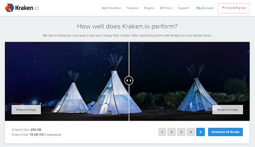
Source: Kraken.io
In addition, site owners should always compress their images before uploading to ensure that they won’t overload a page. Use a compression tool, like Kraken.io, to reduce image size without losing quality. That way, your images can load seamlessly on any device and network.
Alternatively, site owners can also hide images and other web page elements when users load their websites through their mobile phones.
4. Design for Touchscreens
Google has gone mobile-first since July 2019, and today, mobile devices account for 54.8% of internet traffic. For these reasons, develop a web design that caters to both trackpads and touchscreens.
Here are some tips to consider:
Check the button size. For pages that contain a call to action (CTA) button, make sure it’s visible and easy to tap. As a reference, the current standard for a touch target size is 44x44 pt.
Avoid clutter. If you have a long list of menus, check the space between them to ensure users don’t click the wrong button.
Minimize gestures. Reconsider before incorporating elements like swipes and zooms. While users can easily carry out the actions on larger screens, it might be challenging for users on smaller screens.
Don’t force a delay. Although it can be a great way to double-check if a user’s click is intentional, a delay can also harm user experience (UX) as users might feel like the website is less responsive or not working correctly.
5. Take Typography into Account
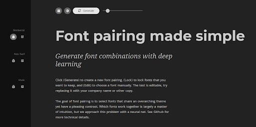
Source: FontJoy
Using different typefaces helps highlight important information and create context throughout web pages. The latter is vital to help introduce a business’s identity, brand, and values.
On the other hand, choosing the wrong typography combination can make a website look unprofessional or harm a site’s readability.
One of the most common problems with typography and responsiveness is that some typefaces are only compatible with specific devices. Using a tricky font can cause some texts to appear as square boxes.
Other problems include fonts that are too difficult to read on smaller screens and those that add unnecessary HTTP requests. To avoid such issues, let’s see some tips below:
Stick with legible fonts. These include Helvetica, Verdana, and Georgia. Using such fonts ensures compatibility across devices.
Avoid custom fonts. They often cause layout shifts when loading, which can be bad for UX.
Limit your typefaces. Three is the maximum number of fonts a site should have. If you’re having trouble choosing the right combination, font generating tools such as Fontjoy can be a big help.
Adjust font sizes appropriately. To improve readability, match fonts with the screen size using media queries.
6. Avoid Using Pop-Ups
Pop-ups refer to elements that appear when someone is viewing a web page. They can be contact forms, promotional messages, and paid advertisements. While using pop-ups helps increase conversion rates, site owners should reconsider utilizing them.
For mobile users, seeing pop-ups can be irritating because they can take up the whole screen and interrupt the browsing experience. Sometimes pop-ups are not responsive, making it harder for users to find the Close button.
Site visitors may also have a pop-up blocker installed on their browsers. Therefore, site owners may not yield the expected conversion numbers.
That’s why many website owners choose to disable pop-ups for mobile devices. Nowadays, many opt for lead magnets, hello bars, and banners to engage their target audience.
7. Utilize Mobile Responsive WordPress Themes
Using a responsive WordPress theme is among the easiest methods for ensuring a fluid design.
The content management system offers dozens of mobile-friendly, pre-designed templates in its directory. You can also check if it is Mobile Responsive in the theme’s description box.
Regardless, check that your chosen responsive theme works well across different devices. This ensures consistency and provides the same UX no matter what device visitors use to access the content.
Website owners can also create their own responsive WordPress theme. To do this, create a local WordPress environment, prepare a folder for your first responsive theme, and put together a CSS style sheet. Then, start adding some code and play around with the page layout.
8. Take A Responsiveness Test
With the various screen sizes and resolutions, every site owners’ best bet is to test website responsiveness using a tool.
Google’s free mobile-friendly testing tool is among the most reliable ones to utilize. Users will only need to input their site’s address and click Enter to start the analysis.

Source: Google free mobile-friendly testing tool
After a few minutes, the tool will tell users whether they have a responsive website by displaying a green checkmark with a Page is mobile-friendly statement.

Source: Google free mobile-friendly testing tool
On the other hand, a red exclamation mark with a Page is not mobile-friendly description will appear if the tool identifies some responsiveness problems with a website. It will also offer a list of factors on how site owners can better optimize their web design.
Conclusion
Responsive web design enables a WordPress site to adjust its layout based on a given screen. Having one can bring many benefits to a business, from improved user experience and engagement to higher conversion rates and return on investment.
Here’s a quick recap of how to have a responsive website:
1. Make your design fluid. Opt for percentages over the pixel measurement. This will help a site’s elements to adjust based on the various sizes of mobile device screens.
2. Consider your content. Keep in mind to always design a website around its content to ensure visitors can read it with ease.
3. Use responsive images. Apart from making sure they render correctly on different screens, images can also help improve overall performance.
4. Design for touchscreens. Some tips include taking care of the button size and spacing, minimizing gestures, and not forcing delays.
5. Take typography into account. Consider avoiding custom fonts to ensure compatibility across mobile devices. Also, don’t use more than three typefaces to maintain consistency and professionalism.
6. Avoid using pop-ups. As they can take up the whole mobile screen, it’s best to disable it when your site is accessed through a mobile device.
7. Utilize mobile responsive WordPress themes. Take advantage of pre-designed templates to save time and effort, but be sure to check their responsiveness.
8. Take a responsiveness test. Once you’ve settled on a design, check if your website is mobile-responsive using Google’s testing tool.
By taking the above steps, you will get your site ready for mobile users. As a site’s design may frequently change to match with different marketing campaigns, remember to always test your new design before launching.
Good luck with your responsive web design initiative!

Top comments (0)