Beauty is in the eye of the beholder.
Are you in the camp that feels these borders are beautiful?
These designs are increasingly seen in modern design and in the design community, they are known as Neumorphism. They add extra polish to dashboards and dark mode mobile app designs. I certainly feel these are gorgeous. Let's take a closer look at these.
A tale of two shadows
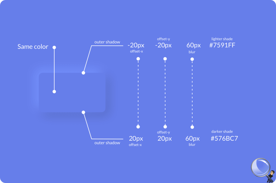
These borders are created using two complimentary shadows. One lighter and one darker having complimentary offsets. They are professionally hand-crafted to give this soft UI look. The offset and blur of the shadow depend on the size of the element.
For example,
- To create a pressed surface create two inset shadows with the slightly darker and lighter surface shades
- To create an elevated surface create two shadows again with slightly darker and lighter surface shades
Start here
A great starting point is https://neumorphism.io/
Use in moderation.
Next time you see a neomorphic design, you know they are nothing but, the play of 2 shadows.
Please find my other writings here:


Top comments (0)