
What is Seaborn?
Seaborn is a matplotlib-based Python data visualization library. It provides a sophisticated interface for creating visually appealing and instructive statistical visuals. It has beautiful default styles, and it is also designed to work very well with Pandas data frame objects.
Installation
To install Seaborn on your system, you have to run this code on your command line:
>> pip install seaborn
Importing
To use seaborn in our code, first, we have to import it. We will import the seaborn module under the name sns (the tidy way):

Data
Now, where can we find our data to visualize? The good thing about Seaborn is that it comes with built-in data sets.
Let's talk about some plots that help us see how a set of data is spread out. These plots are:
1. displot

Now, the displot is showing our data in histogram form. We only need to pass a single column from our data frame to displot.
2. jointplot
jointplot() lets you match up two scatterplots for two sets of data by letting you choose wh*ich* parameter to compare:
- “scatter”
- “reg”
- “resid”
- “kde”
- “hex”

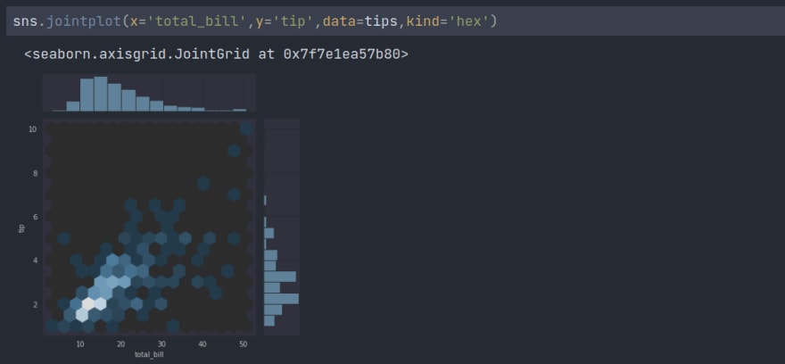

Here are different kinds of plots we can create by changing the value of the kind attribute.
3. pairplot
pairplot will plot pairwise relationships across an entire data frame (for the numerical columns) and supports a color hue argument (for categorical columns). We just have to pass the data through the method.

4. kdeplot
kdeplots are Kernel Density Estimation plots. These KDE plots replace every single observation with a Gaussian (Normal) distribution centered around that value.

Categorical Data Plots
5. B*arplot and Countplot*
B*arplot*
These extremely similar plots enable the extraction of aggregate data from a categorical feature in the data. The barplot is an all-purpose plot that aggregates categorical data based on a function, by default the mean. We can use an estimator attribute to change the default. Here we are using standard deviation.

Countplot
This is essentially the same as a barplot except the estimator is explicitly counting the number of occurrences. Which is why we only pass the x value:

6. B*oxplot and Violinplot*
Boxplots and violinplots are two types of graphs that can be used to demonstrate the distribution of categorical data. A box plot, also known as a box-and-whisker plot, is a type of graph that displays the distribution of quantitative data in a manner that makes it easier to make comparisons between different variables or between different levels of a categorical variable. The whiskers extend to show the rest of the distribution, with the exception of points that are determined to be "outliers" using a method that is a function of the interquartile range. The box displays the quartiles of the dataset, while the whiskers show the rest of the distribution.
B*oxplot*

Violinplot
A violin plot plays a similar role as a box and whisker plot. It shows the distribution of quantitative data across several levels of one (or more) categorical variables such that those distributions can be compared. Unlike a box plot, in which all of the plot components correspond to actual data points, the violin plot features a kernel density estimation of the underlying distribution.

Top comments (0)