If you already know what Alpine.js is, you can skip to here, otherwise let me introduce it to you.
From the docs: Alpine.js is
a rugged, minimal framework for composing JavaScript behavior in your markup.
I like to think of it as a lighter and lower cost Vue.js mixed with TailwindCSS. The syntax is very similar to Vue.js and you sprinkle it in your HTML just like TailwindCSS.
I found out about Alpine.js while following Caleb Porzio, an active member of the Laravel community. At the time I checked out the Github link and to be honest didn’t care too much or was skeptical about it: “Ok, it’s just another JS framework, next week a new one comes out”.
Then I heard him talk about it in his podcast No Plans To Merge and it started to spark my interest. I took another look at the docs and was like: “well, I could just use Vue.js or plain JS, no need to do it with something else”. It was not until I heard him and Adam Wathan discuss it in the Full Stack Radio podcast that I finally took Alpine.js for a ride.
In the episode, they discuss the use cases for the framework and it made sense to me. Here’s what made me want to use it: let’s say you are building a website that does not need too much JavaScript. There’s only one thing here and there, like a modal, a dropdown menu or tabs navigation. Of course, you could just write the JavaScript for that and don’t worry about it. It will be a bit of a pain to switch contexts and think about the imperative way of doing it with JS (get elements, toggling classes, etc…) or you could add Vue.js and create a component and all that. Seems a little overkill for just a simple interactive element. Or you could use Alpine.js and do it in a declarative way all in the HTML.
In the documentation, the author states that the framework’s syntax is entirely borrowed from Vue.js, so you will find things like x-on:click, x-bind, x-show, x-for which are basically the same as v-on:click, v-bind and so on. If you know Vue.js, it’s a breeze to learn Alpine.js, but even if you don’t, I think it is simple enough to pick up and understand the concepts.
What are we going to build?

It's a simple tab navigation component. It's not the most exciting thing to do with JS, but it will be great to show you what Alpine.js can do. We are going to add TailwindCSS just so we don't have to worry too much about CSS and focus on Alpine's features. We get the framework form a CDN, so it's as easy as pasting the link in the HTML and be ready to go. You can go to this Github repository to get the code and follow along, or use the develop branch to get the final result.
The initial HTML body looks like this:
<div class="bg-gray-100 text-gray-800">
  <nav class="bg-gray-300">
    <ul class="flex">
      <li class="px-4 py-2 bg-gray-100">
        <a href="#option-1">Option 1</a>
      </li>
      <li class="px-4 py-2">
        <a href="#option-2">Option 2</a>
      </li>
      <li class="px-4 py-2">
        <a href="#option-3">Option 3</a>
      </li>
    </ul>
  </nav>

  <div class="p-4">
    <h2 class="text-xl mb-4">Here, you have the content of <strong>Option 1</strong></h2>
    <p class="mb-2">Qui ipsorum...</p>
  </div>

  <div class="p-4">
    <h2 class="text-xl mb-4">Here, <strong>Option 2</strong> contents are shown</h2>
    <p class="mb-2">Qui ipsorum...</p>
  </div>

  <div class="p-4">
    <h2 class="text-xl mb-4">And here, only <strong>Option 3</strong> contents should be displayed</h2>
    <p>Qui ipsorum...</p>
  </div>
</div>
If you open this with your browser, the styles will be there, but all the content (for all tabs) are shown at the same time. Now let's sprinkle some Alpine.js to only show a single tab's content:
<div class="bg-gray-100 text-gray-800" x-data="{ selected: 'option-1' }">
  <nav class="bg-gray-300">
    <ul class="flex">
      <li class="px-4 py-2 bg-gray-100">
        <a href="#option-1" x-on:click="selected = 'option-1'">Option 1</a>
      </li>
      <li class="px-4 py-2">
        <a href="#option-2" x-on:click="selected = 'option-2'">Option 2</a>
      </li>
      <li class="px-4 py-2">
        <a href="#option-3" x-on:click="selected = 'option-3'">Option 3</a>
      </li>
    </ul>
  </nav>

    <div x-show="selected === 'option-1'" class="p-4">
      ...
    </div>

    <div x-show="selected === 'option-2'" class="p-4">
      ...
    </div>

    <div x-show="selected === 'option-3'" class="p-4">
      ...
    </div>
</div>
Here we are greeted by three directives: x-data, x-on:click and x-show.
x-data declares a new component scope. You can pass a JS object to it, and every element that is wrapped by the element which contains the x-data declaration, will have access to the JS object you passed to it. So, for example, if I had declared x-data in the nav element, only nav, ul, li and a would have access to that data. Since we want to use selected in the tab's content elements, we wrap everything with another element and use x-data there. You can have multiple x-data declarations in your page, just remember what each component has access to.
x-on:click attaches a click event listener to that element. The directive part is actually only x-on, the second part (click) is what event you want to listen to. You could for instance use x-on:keydown.escape to listen for presses on the escape key. Take a look at the docs to learn all the other events you can listen to. So, x-on:click can receive a function or an expression. Since we only want to change the state of selected, we can add this short expression directly, like x-on:click="selected = 'option-1'". This will change the selected value in the x-data directive.
Finally, we have x-show. You can pass an expression that resolves to true or false and it will toggle the display: none; style on the element.
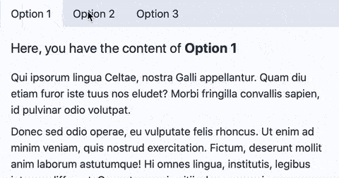
Ok, so with that, we should already have a basic tabs functionality:
Wait, I mean, it's working but the tabs' styles are not changing to reflect their state. Well, let me present you x-bind:class (if you know Vue.js, this is not going to be a big surprise):
<ul class="flex">
  <li class="px-4 py-2" x-bind:class="{ 'bg-gray-100': selected === 'option-1' }">
    <a href="#option-1" x-on:click="selected = 'option-1'">Option 1</a>
  </li>
  <li class="px-4 py-2" x-bind:class="{ 'bg-gray-100': selected === 'option-2' }">
    <a href="#option-2" x-on:click="selected = 'option-2'">Option 2</a>
  </li>
  <li class="px-4 py-2" x-bind:class="{ 'bg-gray-100': selected === 'option-3' }">
    <a href="#option-3" x-on:click="selected = 'option-3'">Option 3</a>
  </li>
</ul>
Here, we pass an object to the x-bind:class directive where the key is the class that should be applied and the value should be an expression that resolves to true or false. If it is true, the class is applied, else it is not. With that, this component is done.
Now let's add some fluff. First, just like Vue.js, we can use a shorter syntax, where x-on can be replaced by @, and x-bind can be replaced by ::
<li class="px-4 py-2" :class="{ 'bg-gray-100': selected === 'option-1' }">
  <a href="#option-1" @click="selected = 'option-1'">Option 1</a>
</li>
Now, for the grand finale let’s add some transitions to the content boxes, so it’s easy on the eyes:
<div x-show.transition.in.opacity.duration.750ms="selected === 'option-1'" class="p-4">
  ...
</div>

<div x-show.transition.in.opacity.duration.750ms="selected === 'option-2'" class="p-4">
  ...
</div>

<div x-show.transition.in.opacity.duration.750ms="selected === 'option-3'" class="p-4">
  ...
</div>
Yep, that’s it. It’s that easy. You can basically chain several options to make your transition look better. By default, if you only add x-show.transition it will add an in and out opacity plus scale transition with 200ms of duration. I changed that in this demo to only transition in, only change opacity and to last 750ms. If you want to take a look at other options, check out the docs.
That’s it. With that little amount of code we were able to add tabs navigation to the application. Alpine.js is great when you want to make simple stuff like this, but it can also be used to create more complex interactions such as forms. In a future post I’ll show you how 😎.


Top comments (0)