Author(s): Thibauld Braet
There is no doubt that there resides a lot of value in your data! There is probably lots of it in your company, together with some smart people to analyze it. These people went down the rabbit hole of explorative research and are eager to present their work towards higher management to have a positive impact on the company. However, sometimes their insights remain unheard. The problem is usually not a lack of information but rather a lack of communication. Converting large datasets into catching stories leading to business decisions is an important art to master. Hopefully this blogpost will help you with that.
It's not what you say, it's how you say it
Context
Before even thinking about presenting any insight, you have to know who you'll present them to. You should know the interests of your audience, both professional as well as personal. Everybody is expected to act in the best interest of their job and company but touching that personal nerve in your story might give you an edge so it's not to be neglected.
Once the audience is defined, it's important to tailor the presentation in a way that best suits their interests while making sure all crucial information is included. Is the audience too diverse, try to identify the decision maker and choose them as your main audience to personalise the presentation. How personal the presentation should be made also depends on the relationship the presenter has with their target group. If you present to your product owner, whom you have regular contact with, including some jokes could be appropriate to lighten the mood but if the main stakeholder is C-level management, you probably first need to establish some credibility towards them.
Besides the audience, the second important part that defines context is the set-up. If you present your results orally, less details should be added to the slide deck because you will have a chance to answer questions on the spot. However, when sending out a written document over mail, you'll need to think of and answer possible questions up front. A mistake often made is to go for something in between, called slideument. It's those slidedecks used to present a live presentation but that need to be forwarded to people who could not attend. Neither of those groups will be satisfied by slideument. It's much better to make two distinct documents, one for each purpose.

Building a narrative
Having defined the context, and having done explorative research, there are probably a thousand things you want to tell. Don't! You might have explored your datasets in a thousand different ways, don't brag about all the work but solely tell what actually could help explaining the point you want to make. Think about it like an oyster hunt where you open a 100 oysters to find that one oyster holding a pearl. It are only these pearls which should be presented.

For your presentation, you need a strong message, more specifically you want to go from insights to actions. It could very well be that your stakeholders have much more business knowledge and so you feel like you're not in the right position to recommend action. However, you have analysed their data for days and weeks, you know their data extremely well by now, you're the data expert!
A tool that can be used is the so called Big Idea where the whole presentation is summarized in one complete sentence. If you had discussions with business before, the conclusions should of course be reflected in your Big Idea. If this is the first time business hears about your data insights, even then try to propose an action and if business has another point of view, you just gave everybody a fact-based starting point for an open discussion. So start from this Big Idea to build the complete narrative.
A more extended version of the Big Idea is the 3-minute story aka elevator pitch. It allows to include a bit more details while still remaining concise. It forces you to think in headlines, rather than explaining the nitty gritty details. These headlines can be used as slide titles which you then write on post-its, order them and stick them on a wall. This process is what is called Storyboarding

Storyboarding is a powerful way to build presentations before creating slides. It allows you to build your storyline and easily iterate over it before putting a lot of effort in pretty slides which then might have to be thrown away because you decided to change your narrative. When working with multiple people on a presentation, Miro is a great tool to take storyboarding online.
Data visualisation
You know who you'll present to, you know what to present to them, now it's time to actually convert these large datasets into beautiful charts. There are tons of courses, books and online resources about data visualisation so we won't go into too much detail here but merely discuss the basic steps common to the creation of visualisation of every dataset.
Choosing the right chart: The first step is choosing the right chart. This largely depends on the data at hand, the insight you want to emphasize and the medium available to tell this insight to your audience. To know which chart to use when, definitely consult this resource which explains this in much more detail. In general it's essential to minimize the time needed to interpret the graph. This goes better when consulting the visual system (graphics) which is faster than the verbal system (tables). Humans also typically have difficulties interpreting information in multiple dimensions so it goes without saying that 3D-charts are not to be done! One final advice is to avoid using pie charts!
Minimizing cognitive load: Once you've chosen the right chart, make it as attractive as possible. Every element added to the chart, requires cognitive load from your audience. You thus want to maximize the information told while minimizing the amount of pixels needed to display it. Luckily, our brain helps us there by making associations, automatically adding elements to our chart while not explicitly being displayed. This is called Gestalt principles

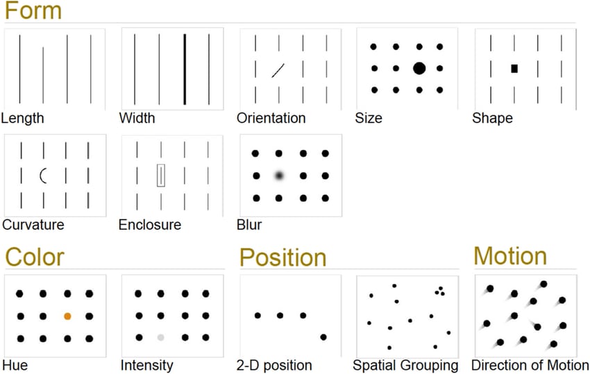
Drawing attention: Now all clutter has been removed, it is essential to focus the attention of your audience to the parts you want them to focus on. We'll make use of the iconic memory to do this. It's the fastest one you have. It originates from our hunter-gatherer times when some visual cues had to baked into our brain in order to act in a fraction of a second so we could avoid danger. These reflexes are triggered by preattentive attributes. These are small quirks that stand out from the rest and immediately draw our attention before going elsewhere.
Now that you've created the perfect visual, ask a friend or colleagues to analyze it out loud. See how much time it costs them and where they focus to. This way, you'll receive some useful feedback to even further improve your charts.
Hopefully this blogpost taught you a thing or two about how to present data insights. Feel free to reach out if you have any comments, would love to discuss!
Recommended resources
- Storytelling: Storytelling with data
- Data visualisation: The works of Edward Tufte
- Creating presentations: slide:ology


Top comments (0)