
One of the most popular design system Material-UI is integrated to Data Driven Forms to make building React forms as fast as possible with the least amount of boilerplate. Via Data Driven Forms mui-component-mapper users can start using Material React components to write complex forms just in seconds.
About Data Driven Forms
Data Driven Forms is a open source React library that uses a data driven approach for building React forms. This approach is based on rendering JSON schemas as React forms with all needed functionality provided by the renderer. It includes features such as validation, conditional fields and many more. It helps web developers to write forms much quicker, simpler and to achieve a consistency across the whole application.
About mappers
A mapper is a set of components integrated with Data Driven Forms API. This set allows users to write forms without any need to implement their own components, so they can immediately write fully working forms with a wide range of features (displaying errors, wizard forms, etc.) You can also check the other mappers including components from Semantic UI React, Ant Design or BlueprintJS.
About Material-UI
Material-UI with more than 61k stars is one of the most popular React libraries and it provides tens of flexible components for building all types of UIs following Google's Material Design.
Provided features
- Form state management, validation, conditions and much more.
- Treeshaking: select between CommonJS, ESM or UMD packages to achieve the minimal bundle size.
- Typescript definitions for all components.
- Additional components and additional props.
- Wizard forms (see below.)
- Dual list selector.
- All inputs properly show errors.
Provided components
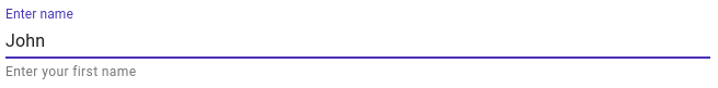
TextField
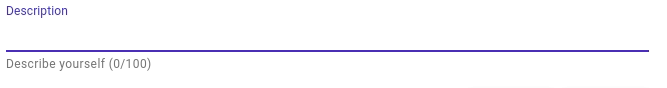
Textarea
Textarea using resolveProps to dynamically change the helper text
Radio

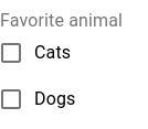
Checkboxes

Single variant checkbox
Multiple variant checkbox
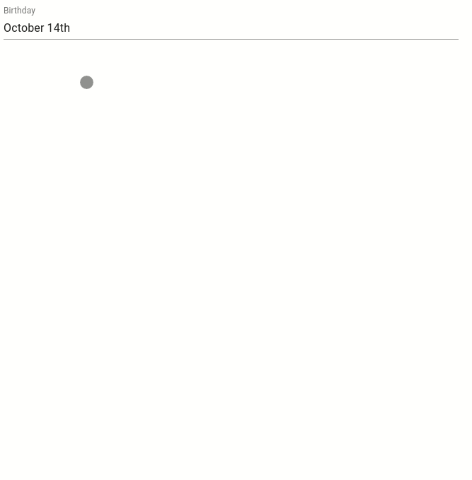
DatePicker
DatePicker
TimePicker

TimePicker
Switch

A switch with on text and off text
Select/Multiselect
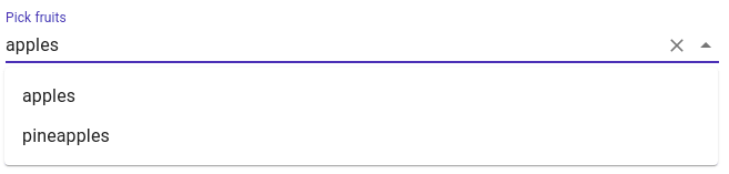
Single select
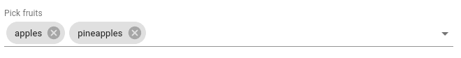
Multi select
SubForm
- allows to divide forms into sub groups
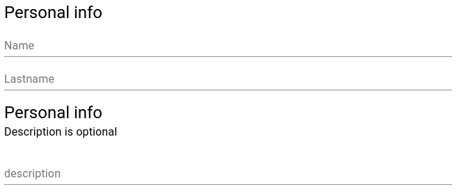
A form splitted to two groups
PlainText

Header and overline variants
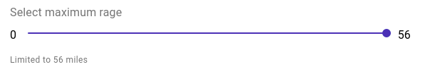
Slider
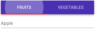
Tabs
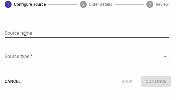
Wizard
- branching paths
- submits only visited values
DualListSelect (custom component)
- allows to move options between two lists
- filtering, sorting
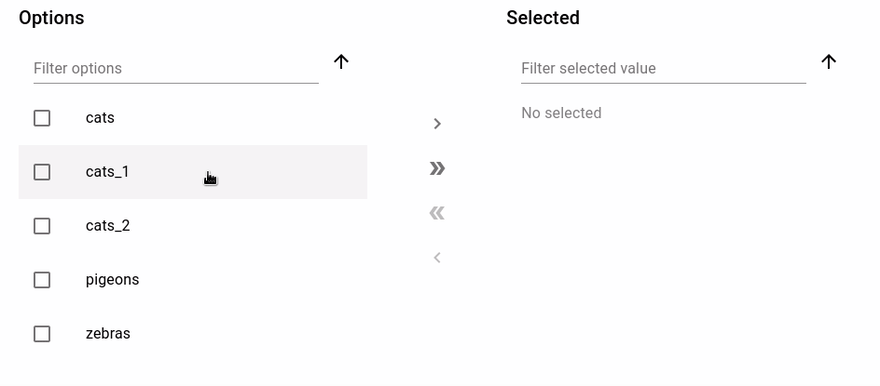
A dual list component lets users to move values between two lists
FieldArray (custom component)
- allows to dynamically add form fields into forms
- i.e. registering multiple users at once
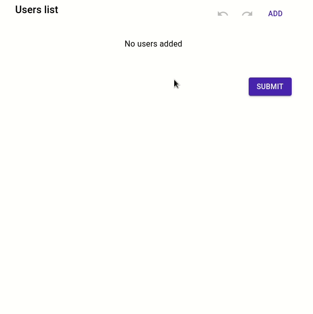
FieldArray component allows to add another fields into the form. In the GIF, you can see that this form is allowing to add more users to a users list and these users' groups can be then changed via using conditions to verify/not to verify the email.
FormTemplate
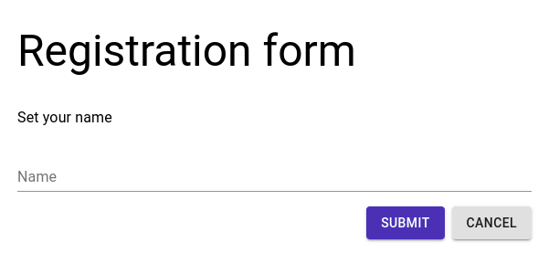
FormTemplate component provides title, description and buttons.
Error example

Using validate is it simple to set any kind of inline validation.
Installation
npm install --save @data-driven-forms/mui-component-mapper
or
yarn add @data-driven-forms/mui-component-mapper
Material-UI components and icons have to be installed separately. Please follow their guide.
For more information, please reach the documentation page.
Contribution
Data Driven Forms is an open source project, all community contributions are welcomed. If you encounter any issue, please let us know on GitHub issues page or open a PR. You can also follow the project on Twitter @DataDrivenForms or reach us on our Discord server.

Latest comments (0)