In this post you will learn about a very beautiful CSS framework, halfmoon css that you will rarely see someone using but is perfect for any person who wants to use a CSS framework.
We often see people talking about bootstrap, Tailwind CSS or Bulma CSS when it comes to CSS frameworks. Once I wanted to use some css framework for one of my projects, and I tried to find some new ones, and in a blog post I saw the mention of halfmoon css, I just saw it and I was really surprised, like such a beautiful framework and no one talks about, no one uses it, or only few use it, but you rarely hear or read about it!
What I like about it is that having dark mode, a very difficult task for people who are not very good at front end, but want to develop a full stack app with a good front end having both light and dark modes! It is very easy to learn as well because its look and css classes are highly inspired from bootstrap. Its documentation as well is very easy to understand, so let's now go ahead and try to create a simple tip counter app in pure html and javascript, with a dark mode.
Building the tip calculator
Full source code for this app available on Github:
 Darshan-Bajeja
/
halfmoon-tip-calculator
A tip calculator using the halfmoon css framework for the design
Halfmoon CSS Tip Calculator
This is a tip caluclator made in pure html and javascript and uses the halfmoon css framework for the UI. This was built for a blog post on dev.to, demonstrating the halfmoon css framework.
Link to the post: https://dev.to/darshanbajeja/halfmoon-the-forgotten-css-framework-4g44
Firstly let's create an empty directory for the project, and create 2 files inside it- index.html and script.js:
Let's open it up in any code editor, and as most of you would have guessed, I am going to open it up in VS Code.
Using emmet, let's add the html boiler plate code, and then link the javascript file to the html file. Also replace the title to Tip Calculator:
<!DOCTYPE html>
<html lang="en">
  <head>
    <meta charset="UTF-8" />
    <meta http-equiv="X-UA-Compatible" content="IE=edge" />
    <meta name="viewport" content="width=device-width, initial-scale=1.0" />
    <title>Tip Calculator</title>
  </head>
  <body>
    <script src="script.js"></script>
  </body>
</html>
Now let's add an h1 tag just for testing purpose- which says our dear old Hello, World!:
<h1>Hello World</h1>
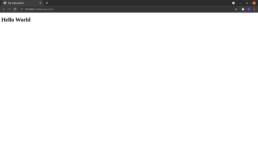
And then open the html file in a browser. I am using Live Server extension to get hot reload.
You would see and old school hello world there:
Now let's visit half moon css website and move to the docs page. Click on 'Download' link on the sidebar, and scroll down to cdn section. Copy the link tag and paste in the head section and add script tag above the script tag which we added before. Now your code should look like this:
<!DOCTYPE html>
<html lang="en">
  <head>
    <meta charset="UTF-8" />
    <meta http-equiv="X-UA-Compatible" content="IE=edge" />
    <meta name="viewport" content="width=device-width, initial-scale=1.0" />
    <title>Tip Calculator</title>
    <!-- Halfmoon CSS  -->
    <link
      href="https://cdn.jsdelivr.net/npm/halfmoon@1.1.1/css/halfmoon-variables.min.css"
      rel="stylesheet"
    />
  </head>
  <body>
    <h1>Hello World</h1>

    <!-- Halfmoon JS  -->
    <script src="https://cdn.jsdelivr.net/npm/halfmoon@1.1.1/js/halfmoon.min.js"></script>
    <script src="script.js"></script>
  </body>
</html>
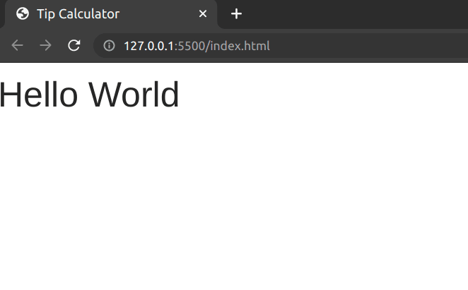
Ok so now in the browser you can see the difference in font in the html page.
Ok so let's start making our tip calculator. Now I want everything to be in center, so let's create a div, which will be placed in the center of our web page, and give it the following classes:
- h-half (For giving a half height, that is 50%)
- w-half (For giving a half width, that is 50%)
- border (For giving it a border)
- rounded (For giving it border-radius)
- shadow-lg (For giving it a shadow of large size)
If you have experience with bootstrap, you can see that these classes are very similar to it.
Now to center this div, wrap it inside another div, with classes:
- h-full (To give 100% height)
- w-full (To give 100% width)
- d-flex (To give a display: flex; property)
- flex-column (To give a flex direction of cloumn)
- justify-content-center (To justify the content center vertically (note that flex column makes the justify-content and align-items opposite))
- align-items-center (To align the items center horizontally)
So now you will have this code:
<div
      class="
        h-full
        w-full
        d-flex
        flex-column
        justify-content-center
        align-items-center
      "
    >
      <div class="h-half w-half border rounded shadow-lg"></div>
    </div>
(Please ignore the formatting done by prettier)
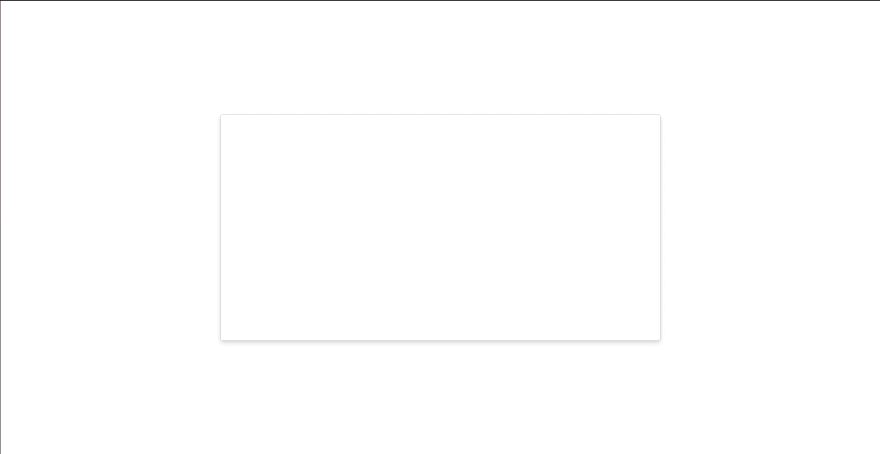
and the output would be like this:
Now let's give a header to our centered div. So create another div element with an h1, and a button with the text- toggle dark mode.
To make this beautiful let's add some halfmoon classes.
DIV:
- d-flex
- justify-content-around
- align-items-center
H1
- font-weight-bolder
BUTTON
- btn
- btn-primary
This will give us a beautiful header with a blue button.
Now let's have another div below the header div, with classes d-flex, flex-column, h-three-quarter (for 75% height), align-items-center, justify-content-around, and add 2 input boxes, with type number, with placeholders total bill amount and tip percentage, and ids bill and percentage and a paragraph tag with the text: Tip amount is 0 and put the number '0' in a span with id of tip-amount.
Next, to give it a good style let's add some classes. To the input boxes give the classes of form-control, form-control-lg and w-three-quarter. You pretty much now understand how the class names work in halfmoon. Also add the classes: font-size-24 and font-weight-semi-bold to the paragraph tag to make it look good. Now finally your code inside the body tag should look like this (excluding the script tags):
    <div
      class="
        h-full
        w-full
        d-flex
        flex-column
        justify-content-center
        align-items-center
      "
    >
      <div class="h-half w-half border rounded shadow-lg">
        <div class="d-flex justify-content-around align-items-center">
          <h1 class="font-weight-bolder">Tip Calculator</h1>
          <button class="btn btn-primary">Toggle Dark Mode</button>
        </div>

        <div
          class="
            d-flex
            flex-column
            align-items-center
            h-three-quarter
            justify-content-around
          "
        >
          <input
            type="number"
            id="bill"
            placeholder="Bill amount"
            class="form-control form-control-lg w-three-quarter"
          />
          <input
            type="number"
            id="percentage"
            placeholder="Tip percentage"
            class="form-control form-control-lg w-three-quarter"
          />

          <p class="font-size-24 font-weight-semi-bold">
            Tip amount is <span id="tip-amount">0</span>
          </p>
        </div>
      </div>
    </div>
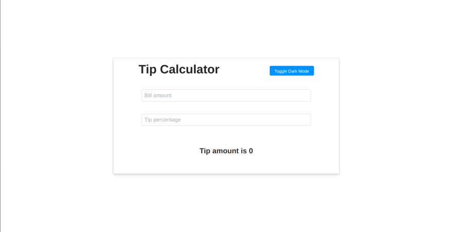
and the webpage should look like this:
Now we have a beautiful UI. We now have to more goals to accomplish here.
- Make our calculator functional
- Make the Toggle Dark Mode button to work
So let's do the first part, that is make our calculator functional,
To do that, let's go to our javascript file and grab the html elements by their ids:
const billInput = document.querySelector("#bill");
const percentageInput = document.querySelector("#percentage");
const tipSpan = document.querySelector("#tip-amount");
Next, let's create a function to calculate the tip and render it in the tip-amount span.
const calculateAndRenderTip = () => {
  const billValue = Number(billInput.value);
  const percentageValue = Number(percentageInput.value);
  const tip = (percentageValue / 100) * billValue;
  tipSpan.innerHTML = tip;
};
And let's add the change event listener to billInput and percentangeInput, and run the function.
billInput.addEventListener("change", calculateAndRenderTip);
percentageInput.addEventListener("change", calculateAndRenderTip);
So now our calculator is functional, but note that as we have mentioned input type as number, you need to use arrow keys for incrementing and decrementing the number to trigger the change event, or if you prefer to type in the number, then you need press enter key after typing in the number to trigger the change event, otherwise browser won't detect the change event just when you type.
Now the final part is to adding the darkmode toggling functionality. And in fact it is the easiest to do!
So first in the button we created for toggle darkmode, add an onclick listener for a function which you might call, suppose, toggleTheme.
<button class="btn btn-primary" onclick="toggleTheme()">
            Toggle Dark Mode
</button>
and in javascript file, let's create this function which just uses the halfmoon variable which we get from the javascript cdn of halfmoon to call the toggleDarkMode function from it, and that's all you need to do for toggling dark mode in your website, really!
const toggleTheme = () => halfmoon.toggleDarkMode();
To get the full source code of this app visit the github repository provided above the section where we started writing the code for this app.
So did you see how easy and cool is Halfmoon CSS. I hope you enjoyed using halfmoon and will use it in your future projects.
If you make a project using halfmoon css, be sure to link it down below in the comments of this post, I will have good time looking at them!


Top comments (24)
Thanks for giving a shout-out to lesser known frameworks. For anyone wondering why Halfmoon exists and what sets it apart, here's the original intro:
css-tricks.com/halfmoon-a-bootstra...
that tip calculator could do with some rounding 😆
Hey I didn't get what you mean by rounding? But from the emoticon I think that's something funny...
I mean rounding up to like 2 decimals or so; nobody tips 0.0000000000001 xD
Oh Got It!
I know too late to reply, but yes, you may just use the
Math.round(x)function for that. No decimal places better than 2!It's about rounding the tips (we can't tip 0.0000001 🤣)
Probably rounded corners.
But I think it was just a friendly jab.
I have used this CSS framework for a dashboard project (developed with Django), and it's quite good. I love the design and I agree that it's beautiful. Hope one day this project will be resurrected. Even for the dashboard, it's still need so many components to make a powerful dashboard. Furthermore, JavaScript framework (Vue, React, Angular) support will make this framework has much more user in the future. Let's hope !
Yeah true! I am too waiting for the support for React | Vue | Angular | etc...
I love this framework but if I remember the creator stop working on this project... 😭
I already create some little project with halfmoon like alexis-guay.fr/
Your projects really show how nice halfmoon is!! Your portfolio is wonderful, even though I don't get much what you have written because its not English!
That's strange - I saw it in French for a split second, and then my Android phone immediately translated it into halfway decent English (I think most desktop browsers will ask if you want to do this).
But yes, it all looks great!
I thought just the other day that the community should fork it and pick it up 😊.
It'd be a real shame to relegate such beautiful work to the dustbin...
Good but I think Bulma is better. 🤷♂️
Ya! Every framework is cool, but Halfmoon gets lesser attention I believe
True
Looks like tailwind
This is great but I don't see the deal here. It's just like bootstrap from the looks of it, except, it's also abandoned now
Esta super, mil gracias DEV
I was planning to write something about HalfmoonUI, but here you are.
Oh!
But u can still write about it and put it here in comments so readers of this post can know more about it from your post as well!
Please put the link here and I will add it in the post above as well!