
Now that we have our basic layout let's spend this article on styling the header and footer to resemble the design.
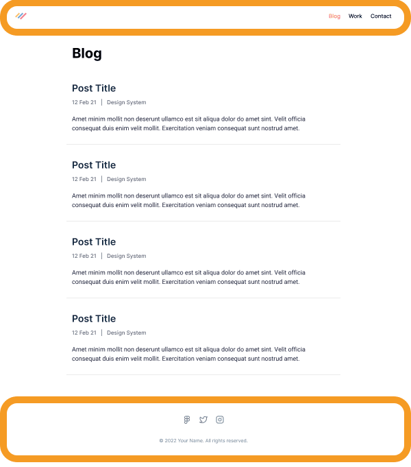
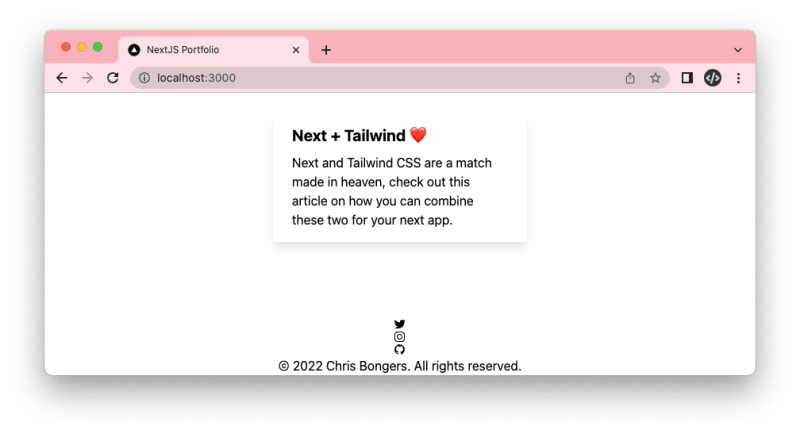
As a reminder, the design I picked looks like this. You can see the circled header and footer.
Styling the header
Let's start with the header.
Before we start jamming away, let's create a new component that will help make our code look cleaner.
You can add the header.js file to the components directory.
I like to work based on mock values, which helps me first set up the rough outline.
export default function Header() {
  return (
    <header>
      <a href='/'>
        <svg
          aria-label='Daily Dev Tips logo'
          xmlns='http://www.w3.org/2000/svg'
          width='30'
          height='24'
        >
          <path
            d='M 13.073 23.977 L 10.214 23.147 C 9.914 23.063 9.746 22.748 9.83 22.448 L 16.228 0.406 C 16.312 0.106 16.626 -0.063 16.926 0.022 L 19.785 0.851 C 20.085 0.936 20.254 1.25 20.17 1.55 L 13.772 23.592 C 13.683 23.892 13.373 24.066 13.073 23.977 Z'
            fill='rgb(255,188,61)'
          ></path>
          <path
            d='M 9.769 16.542 C 9.985 16.312 9.971 15.946 9.732 15.735 L 5.485 11.999 L 9.732 8.263 C 9.971 8.052 9.989 7.686 9.769 7.457 L 7.73 5.281 C 7.519 5.056 7.163 5.042 6.933 5.258 L 0.179 11.587 C -0.06 11.807 -0.06 12.187 0.179 12.407 L 6.933 18.74 C 7.163 18.956 7.519 18.947 7.73 18.717 Z'
            fill='rgb(218,0,96)'
          ></path>
          <path
            d='M 23.066 18.745 L 29.821 12.412 C 30.06 12.191 30.06 11.812 29.821 11.591 L 23.066 5.253 C 22.841 5.042 22.485 5.052 22.27 5.277 L 20.231 7.452 C 20.015 7.682 20.029 8.047 20.268 8.258 L 24.515 11.999 L 20.268 15.735 C 20.029 15.946 20.01 16.312 20.231 16.542 L 22.27 18.717 C 22.48 18.947 22.837 18.956 23.066 18.745 Z'
            fill='rgb(0,185,232)'
          ></path>
        </svg>
      </a>
      <nav>
        <ul>
          <li>
            <a href='#'>Blog</a>
          </li>
          <li>
            <a href='#'>Work</a>
          </li>
          <li>
            <a href='#'>Contact</a>
          </li>
        </ul>
      </nav>
    </header>
  );
}
This will roughly be our main structure. I added the logo as an SVG, but you can also use an image tag.
Let's also change the layout we created yesterday to use this component.
import Header from './header';
export default function Layout({ children }) {
return (
<>
<Header />
<main>{children}</main>
<footer>© 2022 - Our portfolio</footer>
</>
);
}
If you now run the project, you'll see the header doesn't look like anything, but all the elements are there.
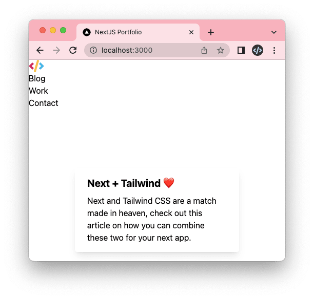
Let's make it a bit more attractive by adding some Tailwind classes.
We can add the container by using the following classes on the header element.
<header className="container mx-auto"></header>
Then we want to split the logo to the left and the menu to the right using a flexbox.
<header className="container mx-auto flex justify-between"></header>
And lastly, we want to set the height and center the elements vertically.
<header
  className="container mx-auto flex justify-between h-24 items-center"
></header>
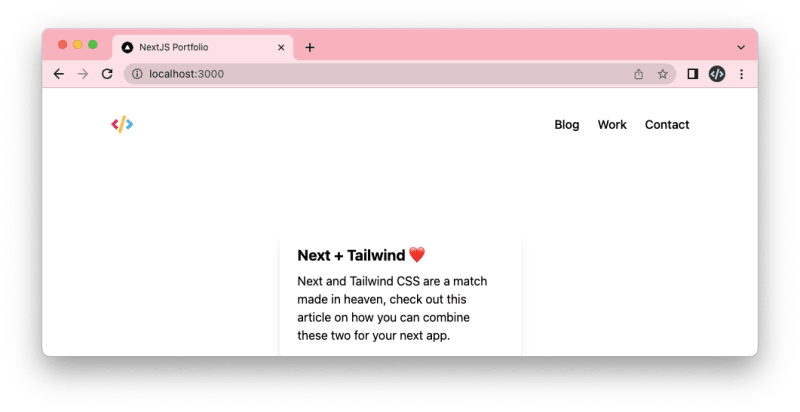
This already looks pretty good!

The logo looks in a good spot. We, however, need to style the menu items a bit better.
The first thing we want to change is to have the items next to each other instead of below each other.
<ul className="flex"></ul>
Yep, it's as simple as using a flexbox.
The next part is to give them a bit more space. For this, we have several options, but the easiest one is to use a gap.
<ul className="flex gap-6"></ul>
And lastly, we see it's a medium font size so let's add that to our ul.
<ul className="flex gap-6 font-medium"></ul>
And yes, it's minimal styling, but our header already looks great!
Note: We haven't done responsive styling yet, which we'll tackle later.
Styling the footer
Alright, with the header done, let's move on to the footer.
Start by creating the footer.js file.
export default function Footer() {
return (
<footer>
<nav>
<ul>
<li>
<a href='#'>
<svg></svg>
</a>
</li>
<li>
<a href='#'>
<svg></svg>
</a>
</li>
<li>
<a href='#'>
<svg></svg>
</a>
</li>
</ul>
</nav>
<p>© 2022 Chris Bongers. All rights reserved.</p>
</footer>
);
}
Note: I found these SVGs online on icons8 website. You can find the full SVG code in the GitHub repo.
Now import this footer into your layout.
import Header from './header';
import Footer from './footer';

export default function Layout({ children }) {
  return (
    <>
      <Header />
      <main>{children}</main>
      <Footer />
    </>
  );
}
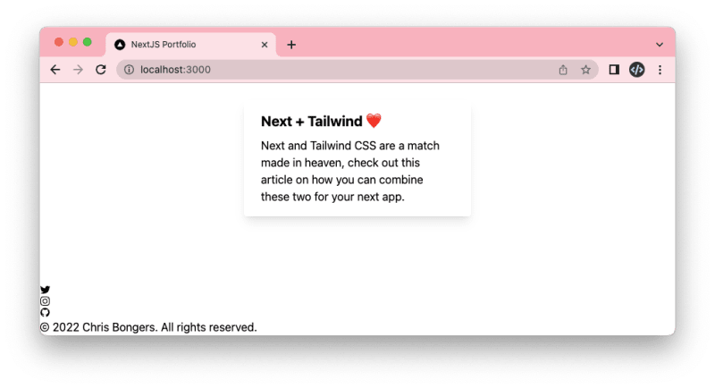
It also looks like everything is there but unstyled again.
The first thing we want to do is add the container and center everything inside of the footer.
I choose flexbox to center things as it gives us more freedom later.
<footer className="container mx-auto flex justify-center"></footer>
Now let's make sure the social icons are above the text. We can achieve this by setting the flex-direction.
<footer
  className="container mx-auto flex justify-center flex-col items-center"
></footer>
This, again, looks pretty good already. Let's adjust and set a height for the footer to give it more space.
<footer
  className="container mx-auto flex justify-center flex-col items-center h-60"
></footer>
Now let's make sure the social icons are next to each other.
And while we are here, also add the gap again.
<ul className="flex gap-6"></ul>
Now let's go back to our footer element and also add a gap here to space between the icons and the text.
<footer
  className="container mx-auto flex justify-center flex-col items-center h-60 gap-10"
></footer>
And now, all that's left is to style the text differently.
We will change the color and size.
<p className="text-sm text-slate-500"></p>
And that's it. Our footer now looks similar to the design.
You can also find the complete code with all SVG markup on GitHub.
Thank you for reading, and let's connect!
Thank you for reading my blog. Feel free to subscribe to my email newsletter and connect on Facebook or Twitter

Top comments (0)