Things to remember
- Don't specify height for (parent)element unless it's necessary because if it has height value, there are more possibility that it might break the UI. (If content changes for example, when elements get added within the container that has height value, it will break the UI). It needs flexibility to maintain the code for future use. Think about the content that will be inside the element.
- If you give position: absolute or float to an element, it behaves like block element.
- Think about meaning of tags when writing code. for example, it's okay to use
ptag even if it's one sentence. If it's important, usestrong. Useemif it's less important than strong but you still want to stress it. Butspananddivhave no meaning. It's okay to use them if it's only for styling but avoid if not. - when
atag is empty, if you writea href="#", it reload the page and if youa href="#none", it can go to the element id none if id none get created. void(0) returns undefined, so you can use it like below foratag until you have link for it.
<a href="javascript:void(0)" class="link-signup">회원가입</a>
- Screen reader will treat it like it doesn't exist if an element is
display: none;
<a href="">
 <img>
</a>
- from above code, if you set the location of
imgto position,imgisn't normal-flow anymore.atag doesn't recognise it's child anymore and in this case, you cannot focus this element when using tab key. If you want to move the location, give position toatag instead.
Web Accessibility
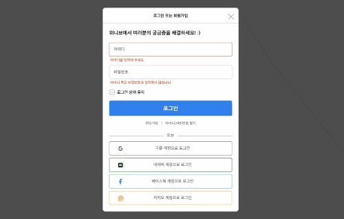
The close button on the top right is next to the heading but should think about web accessibility. It's more natural to be read after login button like the image above not right after the heading which doesn't consider the user.
If closing button is written after the login button, it will be read by screen reader after all of above elements are read by flow. (even if you write it under login button, you can move it to the top left using css) When writing html, think about user and web accessibility not only the layout!
Also, When you see the image above, you can see the blue border when checkbox is focused. But actually, it's an image that's placed on the top of checkbox input and input is taken away from screen using css. So if you don't style it, you can't see if it's focused or not when it's focused.
<input type="checkbox" id="inpHold" class="inp-hold txt-hide">
<label for="inpHold" class="labl-hold">로그인 상태 유지</label>
/* This takes away input.checkbox from the view */
.txt-hide {
  position: absolute;
  clip: rect(0 0 0 0);
  width: 1px;
  height: 1px;
  margin: -1px;
  overflow: hidden;
}

/* This displays the blue border around the checkbox. It's for web accessibility. */
.form-login .inp-hold:focus + .labl-hold::before {
  outline: 2px solid #2f80ed;
  /* 2px of space from outline to border */
  /* outline-offset: 2px; */
  border-radius: 50%;
}
calc()
calc() is good to use for responsive design.
width: calc(100% - 400px);
width: calc(80vw - 400px);
width: calc(70% - 400px);
/* use small one between them */
width: min(500px, 50vw);
min-width: 500px;
width: 200vmin;
width: max(500px, 50vw);
CSS Module
If you make css module, you can avoid repeating code and also, can reuse the code just by giving class name!
example
<!DOCTYPE html>
<html lang="ko">

<head>
    <meta charset="UTF-8">
    <meta http-equiv="X-UA-Compatible" content="IE=edge">
    <meta name="viewport" content="width=device-width, initial-scale=1.0">
    <title>Document</title>
    <link rel="stylesheet" href="login_style/reset.css">
    <link rel="stylesheet" href="login_style/style_module.css">
    <style>
        /* ul > li (reset.css 에서느는 ul안에 li 들어있어야 해당되서 따로 추가함) */
        li {
            list-style: none;
        }
    </style>
</head>

<body>
    <p>버튼 모듈</p>
    <li><a href="" class="icon-google link-sns-login">구글 계정으로 로그인</a></li>
    <li><a href="" class="icon-naver link-sns-login">네이버 계정으로 로그인</a></li>
    <li><a href="" class="icon-facebook link-sns-login">페이스북 계정으로 로그인</a></li>
    <li><a href="" class="icon-kakao link-sns-login">카카오 계정으로 로그인</a></li>

    <button type="button" class="btn-login">로그인</button>
    <button type="button" class="btn-close"><img src="images-login/close.png" alt="로그인 닫기"></button>

    <p>인풋 모듈</p>
    <fieldset class="module-inp module-inp-id error">
        <label for="inpId" class="txt-hide">아이디</label>
        <input type="text" class="inp-login" id="inpId" placeholder="아이디">
        <strong class="inp-error">아이디를 입력해 주세요.</strong>
    </fieldset>
    <fieldset class="module-inp error">
        <label for="inpPw" class="txt-hide">비밀번호</label>
        <input type="password" class="inp-login" id="inpPw" placeholder="비밀번호">
        <strong class="inp-error">아이디 혹은 비밀번호과 일치하지 않습니다.</strong>
    </fieldset>
</body>

</html>
.btn-login {
  width: 100%;
  padding: 17px 0 15px;
  font-weight: bold;
  font-size: 22px;
  line-height: 28px;
  background-color: #2f80ed;
  border-radius: 5px;
  border: none;
  color: #fff;
  cursor: pointer;
}

.btn-close {
  width: 16px;
  height: 16px;
  padding: 0;
  background-color: #fff;
  border: none;
  cursor: pointer;
}

.module-inp .inp-login {
  display: block;
  width: 100%;
  padding: 15px 0 15px 16px;
  border: 1px solid #c4c4c4;
  box-sizing: border-box;
  border-radius: 5px;
  font-weight: 500;
  font-size: 16px;
  line-height: 20px;
}
.module-inp.module-inp-id.error .inp-login {
  border: 2px solid #f4492e;
}

.module-inp .inp-error {
  display: none;
  margin: 6px 0 0 4px;
  font-size: 14px;
  line-height: 18px;
  color: #f4492e;
}

.module-inp.error .inp-error {
  display: block;
}

/* sibling 있을때만 margin 생김 */
.module-inp + .module-inp {
  margin-top: 10px;
}

.link-sns-login {
  display: block;
  padding: 15px 0 16px 15px;
  font-weight: 500;
  font-size: 16px;
  line-height: 20px;
  color: #767676;
  text-decoration: none;
  text-align: center;
  border: 1px solid #767676;
  box-sizing: border-box;
  border-radius: 5px;
  text-indent: -38px;
}

/* before은 first child after는 last child */
.link-sns-login::before {
  display: block;
  content: "";
  float: left;
  width: 22px;
  height: 22px;
  margin-left: 16px;
  background-image: url(../images-login/google.png);
  background-size: 22px;
}

.link-sns-login.icon-naver {
  border-color: #00bf18;
}
.link-sns-login.icon-naver::before {
  background-image: url(../images-login/naver.png);
}

.link-sns-login.icon-facebook {
  border-color: #2d9cdb;
}
.link-sns-login.icon-facebook::before {
  background-image: url(../images-login/facebook.png);
  background-repeat: no-repeat;
  background-position: center;
  background-size: 12px;
}

.link-sns-login.icon-kakao {
  border-color: #f2c94c;
}
.link-sns-login.icon-kakao::before {
  background-image: url(../images-login/kakao.png);
}

Top comments (3)
Little tip, if you actually care about accessibility, stop declaring things in PX. They're called EM (or REM), use 'em!
You might also find yourself more productive if you stop slopping classes onto things that don't need them. I know the mental midgetry of HTML/CSS frameworks and equally enfeebled practices like BEM can trick you into thinking that's how things should be done.
It isn't.
I actually had the same feedback about class when I asked for code review lately. I tried to give classes as much as I could because I thought if I don’t do that, I might give styles to the elements that I didn't want to but I realised it’s okay to select using tag name as long as it's selected with parent/container and there isn’t the same tag next to it. And also, I was repeating code way too much because of giving different classes to all of them. 😅
Thanks about tip by the way! Is it because em and rem are responsive? Do you recommend em over rem?
The EM/REM isn't so much about "responsive" as it is being "elastic". 1REM is the browser default size, something that the user or the OS can change. This is separate from zoom but allows for the content to auto-enlarge where and as needed.
1REM could be the normal 16px, or it could be the 20px windows XP/earlier 8514/"large" / Win v+ "medium" users expect, the 24px of modern Windows "large", or the 32px on my 8k media center.
By using EM/REM as much as possible, the font size and layout will scale to that preference without the user having to dive for zoom.
It's why IMHO all the best layouts are elastic (em/rem), semi-fluiid (auto-expand to width with a max limit, shrink to fit as needed) and responsive (stripping off classes / hiding extra elements where/as appropriate).
I used to prefer EM because they were broken in Firefox always reporting 1rem as 16px, but they fixed that shortly after quantum came out. The mis-handling of EM for elastic behavior is why a lot of dev's used to use PT instead.. but that's a physical measurement (point, 1/72th of an inch) that's pretty much meaningless on computers.
Nowadays REM can be the better choice. The nice thing about EM though is if you want to enlarge or shrink an entire section, you can just change the font-size on the outermost element.
I leverage this for styled checkboxes, wrote an article about that a year or so ago on Medium.
levelup.gitconnected.com/scalable-...
The size of the entire element can be scaled just by changing font-size. I also have an article from back in september that goes includes a font-size section as it relates to accessibility you might find of interest.
medium.com/codex/web-accessibility...
I'm an accessibility and efficiency consultant by trade, so I tend to put things like that front-and-center when looking at other's work. It's really sadly not that well taught or covered, and the fact that the HTML and CSS specifications aren't even written for those of us using them to write websites REALLY doesn't help. No joke, the documents describing the languages of HTML and CSS aren't even written for people like us, they're written for the people who write browsers.
Crazy.