
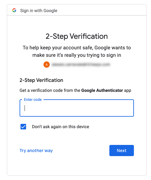
Recently I have been building the login/register section of a web site where, at some point, I had to implement an OTP component to confirm the account creation: a component similar to the one in the screenshot above.
The first thing I thought when I saw the UI design was: “Ok, I need to create an array of <input/> elements and then add one or two hundreds of JS lines to handle the internal state, allow the user to enter/edit the code and to handle values pasted from the clip-board.
But then this question came to me mind: why?
Why do we have to implement such a design and more importantly: what problem are we trying to solve here?
Why do we need to have 6 input boxes and write all the logic to make them behave as if they were just a single input box?
Functionally speaking all we need to do is to allow the user to type in a 6 character string, yet most (if not all) the implementations of this component I saw on NPM are all basically following the same pattern: an array of input boxes and a lot of JS to make them work together seamlessly.
It feels wrong, there’s something I am not getting.
After spending some time with these questions in my head I came up with the following explanation: it is an optical illusion!
The origin of that design pattern probably dates back to the times where forms were printed on paper and people had to fill them manually, with a pen in their hand:

Having basically no control over the form filling process (we didn’t have client-side validation at that time) we came up with graphical solutions that would help the user to provide the data in a way that was as clear and correct as possible, i.e. in the screenshot above we have:
- boxes to separate each character
- pre-formatted date fields to clarify the date format
In the example above it is clear that “DATE OF BIRTH” has been broken down to 8 boxes to suggest the user that we need the date to be in the dd/mm/yyyy format rather than dd/mm/yy.
It is just a graphical treatment meant to help the user to fill the form in correctly.
These days we have electronic forms and those things give us full control over the filling process. We no longer need to split the information into its atomic parts to help the user to provide the correct data… and even if we decide to do so we can do it just at the graphical level.
The OTP component is (or should) be just that. From a graphical perspective it looks like a bunch of input-boxes but from a technical perspective it should be implemented as just one.
Building it as an array of inputs doesn’t solve any issue: on the contrary it requires a lot of effort to make it work and to maintain.
It is my candidate to the “Worst spent 200 lines of JS” award of the year!
To get confirmation that the OTP can be a simple text box I looked around and saw that these two big guys have implemented it exactly as a simple input element:

Let’s implement it anyway
So, in case we desperately need to implement a design like the one we saw at the beginning of this article, we can try adding some CSS and a few lines of Js.
Quick interaction example: https://youtu.be/iHdUOPLdRCM
A live demo is available in here
In essence, we need to use a monospaced font in our component as this way each character has the same width. This allows us to create and position some <span/>in the background to give the illusion of multiple input-boxes.
The code is fairly simple and should be easily customisable by anyone familiar with CSS and JS.
Final words
I had to write this down and share it with someone: is the OTP an optical illusion or am I hallucinating 🤔 ???
Your feedback would be highly appreciated!

Top comments (1)
I implemented OTP input as number type input element and thought nothing of it.
You don't have to have separate boxes for each number.
On the other hand I don't think about looks, only usability.