
This guest post was written by Samuel Torimiro. Samuel is enthusiastic about software engineering, teaching and entrepreneurship. His goal is to build web and mobile applications to better serve hundreds of millions of customers. You can get in touch with him through his website.
visx is an open-source collection of expressive, low-level visualization primitives for React and is built on top of D3.js. It can be used to easily build interesting and unique visualizations for your web application. If you’re familiar with D3 and React, you can quickly get started with visx.
In this article, you’ll learn how to create a visx dashboard in React using Cube Cloud as a headless BI and REST API that links your data to your front end.
Cube is an open-source headless BI for building data apps and analytical web apps. It has a powerful interface that lets you create various visualizations by loading data from your database. In addition, it can be utilized as an API by all major front-end frameworks. It exposes 3 APIs in total, REST, GraphQL, and SQL.
By the end of this tutorial, you’ll have a completed pie chart that depicts total orders from one date to another. Additionally, as you mouse over each section, you’ll be able to see the exact order number for that particular month.

You can follow along with this tutorial on GitHub.
Why visx?
visx is one of many visualization libraries available, but it isn't simply another charting library; it's rather low level and provides you with basic elements that you can mix to create amazing visualizations. For example, to create a pie chart with some text inside you might have several combinations of React components created by visx like a pie component for drawing the pie shape, a text component for adding text that can be aligned properly, and so on.
visx was built by Airbnb, to combine the power of D3 with React, while also unifying their visualization stack. It's a popular visualization tool that outshines competitors like Recharts and nivo. Some advantages include:
- It’s modular and the bundle size is small. Because of code-splitting, you don’t have to install the complete visx package. Instead, you only have to install the particular element or component you want. This is in stark contrast to some of its competitors, like Recharts.
- It allows you to use another library with visx in your React application. It is, in other words, non-opinionated.
- It includes TypeScript support, which most developers prefer while working on medium to large projects.
- The documentation is fairly good, with plenty of practical examples.
- It gives you mock data. This can be used to quickly create a proof of concept, since you don’t have to use your own production database.
- It makes styling simple because it comes pre-packaged.
One of the more difficult aspects of working with visx is that it may take some time to grasp the architecture and learn how to combine the various pieces to produce unique visualizations.
But how do you bring visx and Cube together? Cube is front-end agnostic. As a result, Cube can be used with any front end, including React, Vue, Angular, and even plain vanilla JavaScript. In the next section, you'll learn a little more about Cube and create a Cube deployment.
Implementing a visx Dashboard with React and Cube
After you set up Cube, you’ll need access to a database. For this tutorial, you’ll be using a preconfigured database containing e-commerce information so that you can visualize total orders for a specific period, view orders by month, and then put this information into a pie chart.
Set Up Cube
There are two approaches to configuring Cube. You can configure Cube on your local machine using Docker, or you can use Cube Cloud as a hosted version, which is what you’ll be doing here.
First, sign up for a Cube Cloud account and choose a subdomain:

Then, select Create Deployments and give the deployment a name, cloud platform, and region:

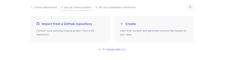
To set up a Cube project from scratch, click on + Create:
Then select Postgres as your database of choice and make a connection to it by giving it the credentials below.
In this tutorial, you’re using a preconfigured database to get your dashboard up and running quickly. Here are the credentials:
- Hostname:
demo-db.cube.dev - Port:
5432 - Database:
ecom - Username:
cube - Password:
12345
This can also be seen in the screenshot below:

Next, generate your data schema:

You can consider your data schema as a wrapper for your database, and it ultimately translates to SQL code and is used to interface with your database in a more robust, structured, and efficient manner.
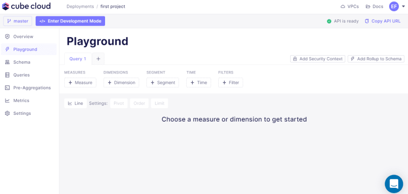
In a few seconds, Cube Cloud should start up the server for you. Inside Cube, you’ll find a developer playground, which is a web-based tool that’s used to view and edit the generated data schema, execute queries, build dashboards, and much more.
In the next phase, we'll create a new React application and install all of the project's dependencies.
Getting Started with visx
To get started with visx, you need to create a new React application:
$ npx create-react-app visx-dashboard-sample
Navigate into the folder visx-dashboard-sample:
$ cd visx-dashboard-sample
And, install the necessary visx packages:
$ npm i @visx/shape @visx/group @visx/text
Also, install the Cube JavaScript client and React client library:
$ npm install --save @cubejs-client/core @cubejs-client/react
After installation, run the development server using the following command:
$ npm start
Then, open the folder visx-dashboard-sample in a text editor like Sublime Text:
Once opened, inside the src/App.js file, delete the default content. You’ll write your code in this file.
You can find the complete code for this on GitHub.
First, start with the necessary imports:
import { useState } from 'react'
import { Pie } from '@visx/shape'
import { Group } from '@visx/group'
import { Text } from '@visx/text'

import cubejs from "@cubejs-client/core";

import { QueryRenderer } from "@cubejs-client/react";
In the code above, you import the dependencies that you need for the application. These include:
- the
useStatehook, which is used to store the state of the value which you can mouse over so that the UI displays the correct order for that month. -
Pie, which is provided by visx and used to draw a pie chart. -
Group, which is also from visx and used to group elements together. -
Text, which is used to add text to the shape. -
cubejswhich is used to connect to our server (headless BI REST API) provided by Cube. -
QueryRendererwhich is a React component that returns the data of a particular query.
Now, create an instance of the Cube API with the following code:
const cubejsApi = cubejs(
  'CUBEJS_TOKEN',
  { apiUrl: 'API_URL' }
);
To get your own Cube credentials, you need to return to Cube Cloud and select Overview from the left-hand panel. You should see the link How to connect your application located near the top of this section.

Select it, and a modal will appear. Then, click on the React tab and your credentials will be generated for you. Finally, replace 'CUBEJS_TOKEN' & 'API_URL' from the code above with your own credentials.
Using those credentials, you can also make a request to Cube using the QueryRenderer component that will curate order count on a month-to-month basis. For this database, you want to visualize the total number of orders for the duration of a specific period (2019-01-01 to 2020-01-01) as well as an individual month to better understand the e-commerce data.
To do this, add the following code:
function App() {
  return (
    <QueryRenderer
       query={{
         measures: ["Orders.count"],
         timeDimensions: [
           {
             dimension: "Orders.createdAt",
             dateRange: ["2019-01-01", "2020-01-01"],
             granularity: "month"
           }
         ]
       }}
       cubejsApi={cubejsApi}
       render={({ resultSet }) => {
         if (!resultSet) {
           return "Loading...";
         }

         console.log(resultSet)

         return (
           <div>
             <h1>Pie Chart with Visx and Cube</h1>
           </div>
         )
        }}
    />
  )
}
export default App;
In the code above, the QueryRenderer component has three properties: query, cubejsAPI, and render.
The query prop accepts an object which describes what data you want from Cube. Inside the object you’ll find the measure key which returns the number of orders in a particular time range. That time range is specified using the timeDimensions key.
The second prop is the cubejsApi where you need to pass the cubejsApi object you created earlier.
The final prop is the render function that is responsible for rendering the result. It receives a resultSet object that holds the data returned by Cube. Now let’s use the resultSet to render the chart.
After the console.log function, paste the following code:
let orders = resultSet.loadResponse.results[0].data
Here, you are traversing the resultSet object to get the result of the query and storing it in a variable called orders. Now that you have access to the data, you can begin constructing your pie chart with visx.
Inside the render function prop that returns the text Pie Chart with Visx and Cube, replace it with the following code:
 <svg width={width} height={width}>
      <Group top={half} left={half}>
          <Pie
            data={orders}
            pieValue={(data) => data["Orders.count"]}
            outerRadius={half}
            innerRadius={half - 20}
            padAngle={0.01}
          >
          </Pie>
     </Group>
</svg>
In the code above, you created an svg element and passed it a width and a height parameter.
Inside the Group component provided by visx, you'll find the Pie component. This component has many props that will help you configure the pie chart.
The data component takes in the orders variable you created earlier, and the pieValue prop determines how big each individual element of the pie is. It’s an arrow function that receives the data and returns the Orders.count value. This value shows the orders for a particular month and is used here to segregate each pie element.
You also have the inner and outer radius props to give definition to the pie. Without this prop, nothing will render in the browser. Finally, the padAngle prop is used to add padding to each pie element in order to differentiate where each individual section starts and ends.
Before you go back to your browser, define the width and the half variable that you used inside the svg so that the SVG is visible.
Add this code inside the App function component at the top:
const width = 400
const half = width / 2
When you visit your browser, you should see something like this:

To make the chart interactive, you need to configure each particular pie element by adding color and rendering the correct value (i.e. orders for that month). To do this, first add an array of colors, as seen below, after the definition of the width and the half variable:
const color = ["yellow", "orange", "green", "black", "red", "purple", "tomato"]
Then, inside the Pie component add the following code:
{pie => {
  return pie.arcs.map(arc => {
    return <g
              key={arc.data["Orders.createdAt"]}
              onMouseEnter={() => setActive(arc.data)}
              onMouseLeave={() => setActive(null)}
            ><path d={pie.path(arc)} fill={color[~~(Math.random() * color.length)]}></path></g>
  })
}}
This code is an arrow function that takes as argument the individual pie element letting you customize each one. You’ll find the individual pie data within the arc variable.
For each pie element, you have an eventListener called onMouseEnter and onMouseLeave. These two functions are used to store the current Pie element data in a state variable which you need to create.
At the top of of the App function component add the following code:
let [active, setActive] = useState(null)
Now, when you mouse over a particular pie, you store it in your state. Then, you use the fill property in the <path> element to add color to each pie element.
When the mouse hovers over an element, you want to display the orders count corresponding to that element. To do this, you need to see if anything is stored in the active state. If there is, the order count will be displayed.
Inside of the Group component and after the Pie component, add the following code:
{active ?
  <>
      <Text textAnchor="middle" dy={-20} fontSize={40}>
        {active["Orders.count"]}
      </Text>
      <Text textAnchor="middle" dy={20}>
      {active["Orders.createdAt"]}
      </Text>
  </>
      :
  <>
      <Text textAnchor="middle" dy={-20} fontSize={40}>
        {orders.reduce((acc, order)=> acc + parseInt(order["Orders.count"]), 0)}
      </Text>
      <Text textAnchor="middle" dy={20}>
      total orders
      </Text>
  </>
}
In the code above, you use the ternary operator to help you render the total orders and the orders for a particular month depending on the active variable. Then, to render text, you use the Text component in visx which has several props to position the text and set the size.
To calculate the total orders, you utilize a JavaScript higher order function called reduce.
Conclusion
In this tutorial, you learned how to build a data visualization dashboard using Cube, visx, and React.
Good visualizations can help you understand concepts and analyze data that would otherwise be easily lost in a sea of numbers. However, creating visualizations can be daunting without the help of good tools.
Cube is an open-source Headless BI tool that can help you quickly build analytics features and reporting tools on top of your cloud data warehouse. This means you can start quickly creating beneficial and unique visualizations that will add value to your organization. In this tutorial I used the hosted cloud version called Cube Cloud.
To proceed further, the database you connected still has some unexplored data. Try extending this dashboard by creating a visualization of your own.
I'd love to hear your feedback about using visx with Cube Cloud in the Cube Community Slack. Click here to join!
Until next time, stay curious, and have fun coding. Also, feel free to leave Cube a ⭐ on GitHub if you liked this article. ✌️


Top comments (0)