A status page is essential if you have a website, API or any internet-based service. It provides visibility into the current state of your software, and helps you communicate ongoing incidents and maintenance windows with your customers.
But not every status page is the same. That's why we've hand-picked various examples of what we consider great status pages to learn from.
Let's take a look at each of them.
Flare

Status page: status.flare.systems
What they do: Flare is a digital footprint monitoring solution. It monitors your systems for security threats, technical leaks, and provides visibility to external attack surfaces.
What makes it a great status page: Ease of use. Flare's status page is well-structured and is easy to understand. It clearly displays the current health of their services as well as historical uptime and performance, plus any past incidents.
These features help their customers quickly understand the impact of any ongoing outage, and expected resolution time. Additionally, potential customers are able to quickly assess how they handled past outages and understand the reliability of their services.
Discord

Status page: discordstatus.com
What they do: Discord is a hugely popular platform for chat, voice and video calls. They handle millions of concurrent connections for their users - every second of downtime has a big impact on their service.
What makes it a great status page: Branding. The custom domain "discordstatus.com" makes it super easy to find their status page and differentiate it from unofficial websites. Additionally, the in-page logo and brand colors help users know they're looking at the right status page.
Cloudflare

Status page: cloudflarestatus.com
What they do: Cloudflare is used by millions of websites around the world for its content delivery network and DDoS protection service.
What makes it a great status page: Their status page shows the current status for hundreds of server locations from around the world. As such, it can easily become complex and difficult to navigate. However, they group statuses by region and make it easy to collapse these groups so users can quickly find the relevant services.
Postmark

Status page: status.postmarkapp.com
What they do: Postmark is a transactional and marketing email SaaS. It makes it easy to send and receive emails via their API, and it's well known for its delivery success rates.
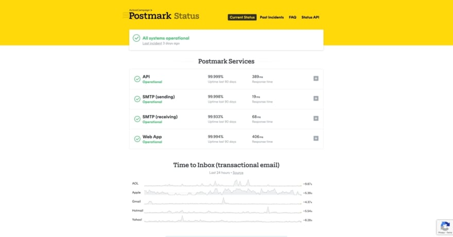
What makes it a great status page: From custom branding to ease of use, Postmark's status page gets many things right. Something to highlight about this example is that they include links to their FAQs and quick help. This makes it easy for users to find relevant information when they need it most.
GitHub

Status page: githubstatus.com
What they do: GitHub is a hugely popular version control platform for Git repositories. Millions of developers around the world rely on their service to store, build and deploy their software.
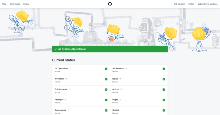
What makes it a great status page: GitHub's status page is quite minimalistic without sacrificing usability. Everything you need to know about their system status is presented in a one-page format. One detail we especially like is that you can hover over the service names to reveal useful contextual information about them. Additionally, their subtle use of branding and easy to find support links make it a great status page.
Amazon Web Services

Status page: health.aws.amazon.com
What they do: AWS is a major cloud provider which arguably handles a huge proportion of internet traffic. Their services are mission-critical to thousands of companies around the world, and as such transparency around incidents and SLAs is vital for any business relying on them.
What makes it a great status page: AWS has 27 regions, 87 availability zones and 400+ points of presence around the world. Without even considering the number of services available in each region, it's fair to say their status page contains a lot of information. But that doesn't mean it's difficult to understand. They've organized their services by region and provide search functionality so users can quickly find what they're looking for.
Twilio

Status page: status.twilio.com
What they do: Twilio is an API for sending and receiving calls and text messages. It's very popular among developers for their easy to use API and vast documentation.
What makes it a great status page: As the bridge between internet-based apps and countless network carriers around the world, there's plenty of moving pieces and ways in which the service performance can be temporarily degraded. Twilio presents their status page with a focus on active incidents by highlighting them at the very top of their page. This is valuable to developers looking to troubleshoot any issues in their integration, as they can quickly gauge if the outage is impacting their own apps and services.
Shopify

Status page: shopifystatus.com
What they do: Shopify is an e-commerce platform used by millions of businesses around the world. You can create an online shop, upload your product catalog, manage orders and sales from one central place.
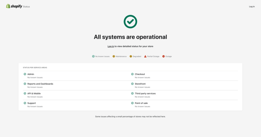
What makes it a great status page: As many businesses rely on Shopify as the center-piece for their operations, their uptime and performance is critical to them. Their status page is another great example of keeping it simple while providing all the relevant information in one place. If you're a customer, they also make it easy to subscribe for notifications whenever there's an outage or planned maintenance window.
DigitalOcean

Status page: status.digitalocean.com
What they do: DigitalOcean is a cloud infrastructure platform, popular for its focus in being easy to use and competitive pricing.
What makes it a great status page: As other cloud platforms, the number of services and locations they operate in makes for a lot of information to pack in one page. However, they present a summary of their services in a sidebar format, which makes it really easy to gauge the overall status of their platform.
Final words
In this article we took a look at a selection of real-world status pages and what makes them great examples. We hope the highlights mentioned in this list are useful to you when building your status page.
Looking to create your own status page? At Cronitor we've put together The Complete Guide to Status Pages so you can create a beautiful status page in minutes. Check it out!


Top comments (0)