
Background
I was really scratching my head trying to get CSS transitions to work with React.
I created most of a project using React’s create-react-app and CSS, and I really liked the way it looked, and I was proud to have done all the CSS by hand. With one feature left, I needed CSS transitions to make it perfect.
Most of the internet suggested using React Transition Group and had this been a larger project, I would have gone that way. However, I really didn’t want to bring in another library when I was so close to being finished.
My stubbornness prevailed and I researched my way into a solution. Thanks to this Joe Davis blog, I learned a clever trick for adding and removing classnames, allowing me to add CSS transitions and create a carousel in this gif.
By the way, this is a long one so thanks ahead of time if you read it. I believe the most clever part of the carousel is covered in the section called “Function for Setting Classes” if you want to skip to it.
The Meat
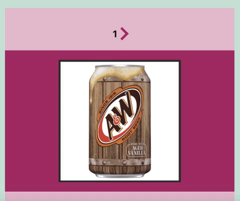
What follows is my strategy for putting five root beer pictures in a carousel. If you’d like to get the whole thing, here’s the GitHub.

Table of Contents
- Preliminary Junk
- Arrow Design & Functionality
- CSS Transitions
- Function for Setting Classes
- Conclusion
Preliminary Junk
File Structure & Design Pattern
First, I installed a create-react-app, deleted a bunch of default stuff, and set up the file structure and components.

Our two components are CardContainer.js and Card.js using Dan Abramov’s presentational and container design pattern from this blog.
CardContainer.js handles the logic and state which are passed down to its children, each displayed as a Card.js.
I threw my root beer images in a folder and created an index.js file to handle their export with the following code:
export const rootBeer1 = require('./root-beer-1.png');
export const rootBeer2 = require('./root-beer-2.png');
export const rootBeer3 = require('./root-beer-3.png');
export const rootBeer4 = require('./root-beer-4.png');
export const rootBeer5 = require('./root-beer-5.png');
Card.js Component
import React from 'react';

const Card = props => {
  const {imgSrc, classList} = props

  return (
    <div className={classList}>
      <img src={imgSrc}
        className="rootbeer-img"
        alt="root beer img"/>
    </div>
  );
}

export default Card;
The Card.js is a very simple component that takes props of an image source, imgSrc , and a string, classList that is returned by the function setClass().
setClass() changes the classList string will serve the dual purpose of selecting which classes are on each Card.js and triggering a render causing the CSS transition animation. More on this in a bit.
Card.js in CardContainer.js
Next, I added a Card for each image in the CardContainer.
// images
import {
  rootBeer1,
  rootBeer2,
  rootBeer3,
  rootBeer4,
  rootBeer5
} from '../images/index'
In the CardContainer.js return div:
      <Card imgSrc={rootBeer1} classList={setClass(1)}/>
      <Card imgSrc={rootBeer2} classList={setClass(2)}/>
      <Card imgSrc={rootBeer3} classList={setClass(3)}/>
      <Card imgSrc={rootBeer4} classList={setClass(4)}/>
      <Card imgSrc={rootBeer5} classList={setClass(5)}/>
Arrow Design & Functionality
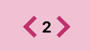
Arrow Design
I was a little extra with the arrow design. You could easily use buttons or links to control the carousel, but instead, I did some small scale CSS art.
/* ARROWS */
.arrow-container {
    padding: 1em;
}

.arrow {
    border-top: 0.5em solid #B1436E;
    border-right: 0.5em solid #B1436E;

    width: 1.5em;
    height: 1.5em;

    cursor: pointer;
}

.left {
    -webkit-transform: rotate(225deg);
    -ms-transform: rotate(225deg);
    transform: rotate(225deg);
}

.right {
    -webkit-transform: rotate(45deg);
    -ms-transform: rotate(45deg);
    transform: rotate(45deg);
}
I made two divs each with thick borders on the same corner and turned them in each direction — 45 degrees and 225 degrees.
Arrow Functionality
      <div className="arrow-container center-box">

        {/* card num is 1, arrow display is none  */}
        <div onClick={()=> setCardNum(cardNum - 1)}
          style={{display: cardNum === 1 ? "none" : "block" }}
          className="arrow left">
        </div>

        <h1>{cardNum}</h1>

        {/* card num is 5, arrow display is none  */}
        <div onClick={()=> setCardNum(cardNum + 1)}
          style={{display: cardNum === 5 ? "none" : "block" }}
          className="arrow right">
        </div>
      </div>
To flip through my five pictures, I set up a useState hook called cardNum with an initial state of 1.
On the arrow divs, I set a conditional style so the left arrow will not display if cardNum === 1 and the right arrow will not display if cardNum === 5.
Another possible design would be adding a clause that sets
cardNumto1if it hits6and setscardNumto5if it hits0, allowing for a full rotation of cards.
CSS Transitions
If you’re unfamiliar, the CSS transition property animates an element so when it renders, its style properties slide from the old values to the new ones.
/* CARD */
.Card{
    position: relative;

    background-color: #B1436E;

    padding: 2em;

    transition: 0.5s;
}

/* CARD TRANSITIONS */
.present{
    left: 0;
    opacity: 1;
    visibility: visible;
}

.next{
    position: absolute;
    top: 25%;
    left: 200vw;
    opacity: 0;
    visibility: hidden;
}

.previous{
    position: absolute;
    top: 25%;
    left: -200vw;
    opacity: 0;
    visibility: hidden;
}
First, I set up three CSS classes: present, next, and previous.
When a Card has the present class, it will be centered in our CardContainer. The previous class hides the picture off screen on the left, and the next class hides things off screen on the right.
transition takes a duration value in seconds(s). As the initial Card class properties change according to present, next, and previous, transition will smooth them into each other for my set duration.
In this case, the current present component will get shoved off screen and turn invisible while, based on cardNum, the next or previous component will become visible and be pulled to the center.
One of the weaknesses of my current set-up is the changing of
positionfromrelativetoabsolute. I added atopof25%to keep the element from awkwardly flying to the default,top: 0. It might be a minor issue, it will be inconsistent depending on screen size.
Function for Setting Classes
At this point, we can change our cardNum with the arrows, and our CSS is set up to employ our transitions. All That's left is to tie the cardNum to each Card's class.
Each Card receives a prop called classList which is the return value of setClass(), a string of classnames.
Here is the setClass() function:
  // sets class as present, next, previous in relation to cardNum
  const setClass = num => {
    const classArr = ['Card center-box']
    if (num === cardNum) classArr.push('present')
    if (num > cardNum) classArr.push('next')
    if (num < cardNum) classArr.push('previous')
    return classArr.join(' ')
  }
First, I set up an array called classArr with the string Card center-box.
This string will be plugged into the component's classNames and will be read as two classnames that give some general CSS, flex-box, background-color, etc. to our Card components.
Then, based on a series of conditionals, I push present, next, or previous into classArr.
If the num parameter is the same as cardNum, I push present. I push previous if num is greater than cardNum and next if num is less than cardNum.
That's it! Clicking the arrows causes the cardNum state to change. That triggers a render of the CardContainer. On that render, setClass() will be called on each Card component. The Cards will then have their classList prop changed so when they render, the appropriate Cards will transition off and on to the screen.
Conclusion
From top to bottom, that’s the whole thing. The nifty design concept I learned is using a function to set an array of classnames and hitting join() on that array. Then, it's easy to tie that to state of the parent component and manipulate that state.
As always, I hope this helps someone. If you have any suggestions or corrections, feel free to comment or email me at jason.melton2@gmail.com.
Don’t hesitate to hit me up, I love to be correct so I love to be corrected. Also, isn’t root beer great?


Top comments (0)