
Looking for the ideal gradient or a flawless blend of two colors? Introducing our latest creation, Colors in Between, a game-changer in the realm of color gradients. Tailored for graphic designers, digital artists, or anyone passionate about color play, this tool is crafted to ignite your creative flair and streamline your color choices.
Colors in Between is a cutting-edge tool designed to effortlessly generate a seamless gradient transition between any two chosen colors. It's the go-to solution for discovering intermediate shades that harmoniously merge, enabling you to craft eye-catching gradients for websites, digital artwork, or any project that benefits from a splash of coordinated colors.
Wondering how to find the perfect midpoint color between two shades? It's easy with 'Colors in Between':
- Select your starting and ending colors.
- Allow the tool to compute the in-between colors.
- Delve into the created gradient and incorporate these colors into your designs.
Features of "Colors in Between" include:
- Flawless Gradients: Forge exquisite, smooth transitions between any pair of colors.
- Adjustable Gradient Steps: Tailor the gradient's progression for precise control.
- User-Friendly Interface: Effortlessly choose colors with an intuitive design.
- Diverse Uses: Perfect for web design, digital art, interior decorating, and more.
Why Opt for "Colors in Between"?
- Elevate Your Designs: Infuse your work with depth and sophistication using the ideal gradients.
- Time Efficiency: Swiftly pinpoint the perfect color pairings, bypassing trial and error.
- Creative Exploration: Venture into new color territories and expand your artistic horizons.
Embrace the Color Revolution
At HEX Color, our mission is to equip you with tools that both inspire and simplify your creative process. 'Colors in Between' is our newest contribution to this mission. Give it a try and discover how it revolutionizes your color approach in projects. Remember, every hue has a story at HEX Color, and 'Colors in Between' is ready to narrate your next vibrant narrative.

Top comments (22)
It looks like you're interpolating between the colors in SRGB color space. Might be a nice enhancement to offer different color interpolation modes, as SRGB can give kinda "muddy-looking" intermediate colors between certain stop colors.
Explainer video from Chrome's HTTP 203 series: https://www.youtube.com/watch?v=cGyLHxn16pE&t=1223s
I made a demo of CSS
color-mixfunctions in different color spaces here: observablehq.com/@lionel-rowe/css-...Hint: HSL / HWB are sensitive to steps parity. Do not use them with uneven amount of steps, or you will get one bright intermediate color that stands out:
3 steps (bad):
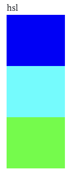
4 steps (good):

5 steps (bad again):
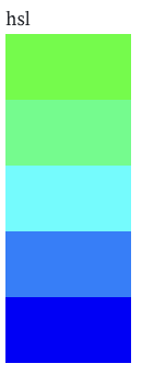
6 steps (good again):
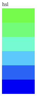
and so on...
@bbkr I don't think this can possibly be true in the general case, as the steps between 3 colors would be the same as the first 3 steps between 4 colors that were 1 1/3 as far apart.
To take a concrete example: with hsl colors, keeping saturation constant at 100 and lightness at 50, interpolating 3 steps (odd) between 0 and 60 degrees of hue would give [0, 30, 60]. Equally, interpolating 4 steps (even) between 0 and 90 degrees would give [0, 30, 60, 90]. The first 3 colors are identical.
I think it's fair to say that a small number of stops (regardless of parity) when interpolating between colors with widely different hues can yield weird results, because you're essentially walking round a segment of the color wheel. Often the color in the middle won't match with your perception of an "in-between" color at all. So HSL/HWB are best reserved for either creating a subtle effect with similar colors, or a vibrant rainbow-like effect with dissimilar ones.
I'm far from being expert here, but my intuitive explanation is: If you take two colors in HSL and connect them with a line you get an arc (because you only modify hue angle). Now map this line into 3D RGB cube and path you will get will be bent toward highly saturated merging color. Which is subjectively(!) not what most people expect. So if you make odd number of steps you will always hit peak of this bend. But if you take even steps you take values from left and right side of this bend, avoiding peak.
So i fully agree this depends of perception of "in-between". HLS middle point is 100% correct from algorithmical point of view but it "pops out" as overly saturated. Taking even gradient steps (or a lot of steps) helps to avoid this effect.
BTW: Thanks for the tool. Bookmarked!
Again, the parity of steps is immaterial. With HSL, we're either walking around a color wheel (hue), which has no peaks or corners, being a smooth wheel; or we're walking along a straight line (saturation or lightness), which again, has no peaks or corners. "Bent toward a highly saturated merging color" doesn't make sense, because the saturation of the color that lies n% of the way between color A and color B will always be n% of B.saturation / 2 + (100 - n)% of A.saturation / 2. It's impossible for that result to be higher than max(A.saturation, B.saturation).
Here's a forked version of my earlier notebook to demonstrate that parity makes no difference:
observablehq.com/@lionel-rowe/hsl-...
As you can see, 3 steps between #ff0000 and #ffff00 (odd) starts exactly the same as 4 steps (even) between #ff0000 and #7fff00 or 5 (odd again) between #ff0000 and #00ff00. Similarly, 5 steps (odd) between #ff0000 and #00ff00 ends identically to 4 (even) between #ff7f00 and #00ff00 or 3 (odd again) between #ffff00 and #00ff00.
Subjectively, I'd argue that the break between #ff7f00 and #ffff00 is the most visually jarring, irrespective of parity or where it falls in the sequence. That's probably because of the big drop in perceptual "brightness" between red and yellow hues, which HSL interpolation doesn't account for — nor does sRGB, for that matter. The perceptual brightness problem is what color spaces like LAB/OKLAB/LCH/OKLCH try to solve.
I bow to your knowledge. And I have a feeling we are talking about same thing but in different words. That in hue traversing you have perceptual brightness peaks when going for example through yellow or cyan. All I was saying is that our brain can be "magically" hacked to consider given HSL gradient better if we adjust amount of steps to avoid hitting specific spot in merging color. Thanks for sharing your knowledge and thanks again for the tool.
Good idea Pawel, thanks :)
A gradient between complementary colors will never be smooth. Because they are opposites on the color "circle".
If you want a smoother gradient, take colors which are closer to each other.
Red and green are totally opposite. Green and blue will be smoother.
Depends what you mean by "smooth", and again, it also depends in which color space if you're talking about subjective pleasantness. IMO
oklchgives the most pleasant results for #f00->#0f0, but it doesn't look very even (orange doesn't seem like a suitable midpoint between red and green). Meanwhile, HSL/HWB give pleasant enough results when applied with a smooth gradient. SRGB-linear gives a reasonable tradeoff between pleasantness and expectedness (all the colors are roughly what you'd intuitively "expect" them to be).I deliberately chose #f00 and #0f0 to best illustrate the differences between color spaces, but there are still noticeable differences even if you choose colors that are closer or more harmonious together.
Of course @lionelrowe, I understand the differences between different color spaces and their differences when calculating color interpolations.
Don't get me wrong, I'm not being negative : the tool you built is interesting, well designed and addresses a problem well known by artists, painters, designers and other people who use color often.
I just wanted to remind some color principles. Even if the process used here to make the gradients looks smoother is clever, we should still keep in mind that some color pairs are better for fluid gradients and some other pairs are more adapted for creating contrast.
If you take away, or avoid the "muddy" tones in a gradient made of 2 opposite colors, this also implies that you are not dealing anymore with subtractive synthesis. Therefore, you are producing a different effect on the human eye. And this is an important point.
Thanks for your suggestion, Lionel 🙌
I'm genuinely impressed. This tool is a real game-changer for anyone involved in digital design, be it web design, digital art, or even interior decorating.
Thanks Melissa 😊
Thanks for sharing! This is very helpful!
You are welcome Gloria 🤗
Such a helpful tool!
✌
Congratulations! I will save this for later.
☺
Thank you for sharing
This is a really cool and useful tool! Thanks! 😊
You are welcome Francesco (: