
This was originally published on codinhood.com
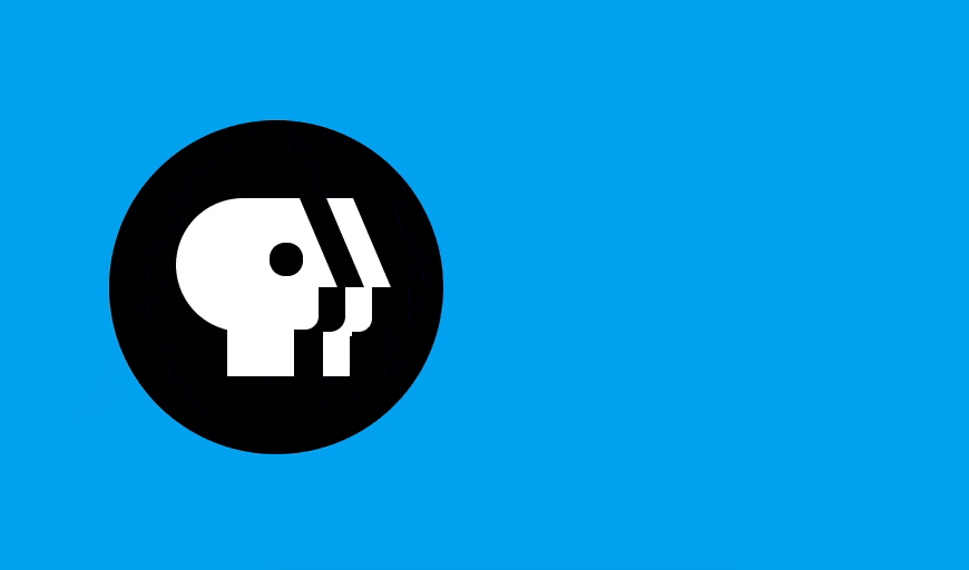
Whether they grew up watching Mister Rogers, learned to paint with Bob Ross, or just settle in every night to watch the news, the iconic PBS logo is a familiar and comforting sight to many Americans. The logo is successful, in part, due to the measures PBS makes to ensure that their branding is clean, unique, and consistent. In 2019, PBS redesigned their logo with a new official color and custom PBS font that can be found on their brand guidelines page. The newest design is sleek and modern, but to keep things simple (and because of my overwhelming nostalgia-driven biases) I'm going to show you how to create the PBS logo from 2002-2019 with CSS. Click the Rerun button at the bottom to see the animation again.
Background and Font
The blue background, #00acf1, used to be the blue background for the official PBS app and other media. The background needs to take up the whole page, so we can use 100vh to set the height to be 100% of the viewport height. The font from that era was Caecilia 75 Heavy, but since this is not available on Google Fonts, we'll use Bree Serif. Finally, let's center the logo on the page using flexbox.
@import url("https://fonts.googleapis.com/css?family=Bree+Serif");

body {
  background: #00acf1;
  display: flex;
  justify-content: center;
  align-items: center;
  height: 100vh;
  overflow: hidden;
}
.PBS {
  display: flex;
  flex-direction: row;
  justify-content: center;
  align-items: center;
}
PBS Back Head
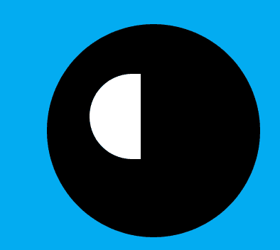
The PBS logo head is a unique shape that can be broken down into a few more basic shapes. First, create the black circle and give it a position: relative, so that we can use position: absolute to move the individual parts within the black circle easily. The back of the head is essentially a half circle. We can create a half circle in CSS a few ways, but for now, we'll create a full circle and hide the right half.
<div class="PBS__Logo">
  <div class="Logo__head"></div>
</div>
.PBS__Logo {
  height: 150px;
  width: 150px;
  border-radius: 100%;
  background: black;
  position: relative;
  z-index: 2;
}

.Logo__head {
  height: 60px;
  width: 80px;
  border-radius: 40px;
  background: white;
  position: absolute;
  left: 30px;
  top: 35px;
}

Now, hide the second half by creating a square pseudo-element and positioning it over the second half.
.Logo__head::after {
  content: "";
  position: absolute;
  right: 0;
  top: 0;
  height: 100%;
  width: 55%;
  background: red;
}

Setting that element to have a black background will give the illusion of a half circle:
.Logo__head::after {
  ... background: black;
}
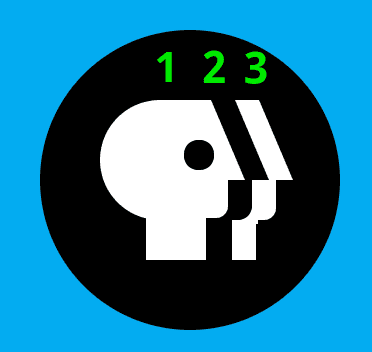
PBS Middle Head
You'll notice that this half circle isn't quite wide enough to give the illusion of a fuller circle. To remedy this, we can create a simple rectangle in the middle to give whatever width we need. We need to add large border-radius values on the right side so it does not poke out beyond either the forehead or the chin.
.Logo__tophead {
  height: 60px;
  width: 20px;
  background: white;
  position: absolute;
  left: 65px;
  top: 35px;
  border-bottom-right-radius: 20px;
  border-top-right-radius: 10px;
}

PBS Forehead
The forehead might seem difficult to recreate at first, but essentially it is simply a line at a particular angle, or a parallelogram. We can easily create parallelograms in CSS by creating a rectangle and using the CSS transform property, [skew][https://developer.mozilla.org/en-us/docs/web/css/transform-function/skew].
.Logo__forehead {
  height: 40px;
  width: 10px;
  background: white;
  position: absolute;
  left: 84px;
  top: 35px;
  transform: skewX(23deg);
}

PBS Neck
The neck is probably the most simple shape to create, it's just a white rectangle
.Logo__neck {
  height: 30px;
  width: 30px;
  background: white;
  position: absolute;
  left: 53px;
  top: 85px;
}

PBS Chin
The chin stumped me initially, but on further inspection, it's really a rectangle with a specific border-radius value.
.Logo__chin {
  height: 37px;
  width: 17px;
  background: white;
  position: absolute;
  left: 77px;
  top: 57px;
  border-bottom-right-radius: 6px;
}

PBS Eye
The eye is really simple as well, it's just a circle positioned correctly with a black background.
.Logo__eye {
  height: 15px;
  width: 15px;
  border-radius: 100px;
  background: black;
  position: absolute;
  left: 72px;
  top: 55px;
}

PBS Double Forehead
The PBS logo contains three faces: the main head face, the floating face, and the negative space face. The floating face is created by using similar shapes to the main head face, while the negative space face is created by positioning the floating face correctly to create the illusion. So, let's start by creating the floating face forehead in a similar way we created the forehead before and position it away from the main head.
.Logo__doubleForehead {
  height: 40px;
  width: 12px;
  background: white;
  position: absolute;
  left: 106px;
  top: 35px;
  transform: skewX(23deg);
}

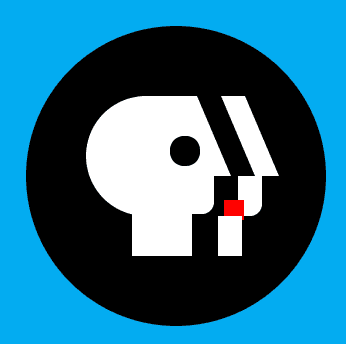
PBS Double Chin
The double chin is almost identical to the main head chin, copy the original chin and move it over to the right to align with the double forehead.
.Logo__doubleChin {
  height: 20px;
  width: 12px;
  background: white;
  position: absolute;
  left: 106px;
  top: 75px;
  border-bottom-right-radius: 6px;
}

PBS Double neck
The neck, like before, is simply a rectangle but less wide.
.Logo__doubleNeck {
  height: 20px;
  width: 12px;
  background: white;
  position: absolute;
  left: 96px;
  top: 95px;
}
But you'll notice a problem, the double chin and neck should connect on the left side more smoothly.

Creating this more rounded connection is a little tricky because the shape is inward like a parabola rather than outward like a circle. We're going to use the same technique we used for the half circle, create one element and then hide part of it with another. First, create a rectangle with the ::before pseudo-element on the double chin.
.Logo__doubleChin::before {
  content: "";
  position: absolute;
  bottom: -2px;
  left: -7px;
  background-color: white;
  height: 10px;
  width: 10px;
}
Next, create a ::after pseudo-element on the double chin that has a border-radius on the bottom right. This will be used to "take away" parts of the rectangle we just created to create an inward circle shape.
.Logo__doubleChin::after {
  content: "";
  position: absolute;
  bottom: 0px;
  left: -7px;
  background-color: blue;
  border-bottom-right-radius: 8px;
  height: 10px;
  width: 7px;
}
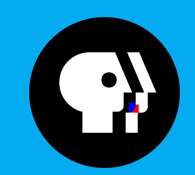
Setting the ::after element to black and the ::before element to white will create the effect we want.

PBS Letter Animation
We could add the PBS letters by simply creating a <p> element and adding the letters in, but we want to animate the letters individually. So put each letter into a different <span> element. Additionally, the copyright symbol can be created using the HTML character entity ®
<div class="PBS__text">
<span class="PBS__letter">P</span>
<span class="PBS__letter">B</span>
<span class="PBS__letter">S</span>
<span class="PBS__registration">®</span>
</div>
Set the letter container to have position: relative so we can position the letters and move them around in a boundary box. Additionally, define the styles for the registered trademark.
.PBS__text {
  font-family: "Bree Serif";
  font-size: 68px;
  color: white;
  margin-left: 15px;
  white-space: discard;
  display: flex;
  width: 120px;
  height: 92.92px;
  position: relative;
}
.PBS__registration {
  font-family: "Arial";
  margin-top: 64px;
  margin-left: 0px;
  display: inline-block;
  color: white;
  font-size: 10px;
  font-weight: 200;
  left: 120px;
  position: absolute;
}
Since all of the text moves together as a group, we need to animate the whole block of text, PBS__text. Create a slideIn animation that starts the whole block well within the black circle.
.PBS__text {
  ... animation: 500ms ease-in-out 0ms forwards slideIn;
}
@keyframes slideIn {
  0% {
    transform: translateX(-150px);
  }
  80% {
    transform: translateX(10px);
  }
  100% {
    transform: translateX(0px);
  }
}
Animate Individual Letters
We want the letters to be scrunched up like they came as a group thrown at the right side of the logo, and then have the P and B animate backwards to their rightful positions. Add position:absolute to each so we can set the correct positions throughout the animation. Additionally, add an animation property for the P and B letter separately, because they need to end up at different spots.
.PBS__letter {
  position: absolute;
}
.PBS__letter:nth-child(1) {
  left: 80px;
  animation: 650ms ease-in-out 200ms forwards pLetter;
}
.PBS__letter:nth-child(2) {
  left: 40px;
  animation: 500ms ease-in-out 200ms forwards bLetter;
}
.PBS__letter:nth-child(3) {
  left: 80px;
}
You'll notice that the letters are not completely overlapping, but more scrunched up together. Getting this animation to look smooth takes a little practice and experimentation, but play around with the left values here to see where the letters will end up.
@keyframes pLetter {
  0% {
    left: 40px;
  }
  80% {
    left: -2px;
  }
  100% {
    left: 0px;
  }
}
@keyframes bLetter {
  0% {
    left: 60px;
  }
  80% {
    left: 38px;
  }
  100% {
    left: 40px;
  }
}
Check out the codepen above for the full animation.
Conclusion
Breaking complex images down into basic shapes that can be recreated with CSS is a fun and powerful technique to create CSS art. I'm a big fan of PBS and their logo, so I hope creating this logo was as much fun for me as it was for you.


Top comments (0)