
Building custom radio/checkbox buttons is not an easy task. They need to be accessible, easy-to-customize, and perfectly aligned to their labels.
Here's how we do it at CodyHouse.
Final result
Here's a preview of the final result (or download the CodyHouse UI component):
HTML
An important rule I try to stick to when building components is to start with the simplest structure and add more elements (e.g., wrapping parents) only if necessary.
For radio and checkbox buttons, here is all we need:
<!-- radio button -->
<div>
  <input class="radio" type="radio" name="radio-button" id="radio-1">
  <label for="radio-1">Choice 1</label>
</div>

<!-- checkbox button -->
<div>
  <input class="checkbox" type="checkbox" id="checkbox-1">
  <label for="checkbox-1">Option 1</label>
</div>
The HTML structure is identical to the one we'd use with native buttons, except we're adding a .radio/.checkbox class to the input.
CSS
Step 1 is to visually hide the native buttons:
// hide native buttons
.radio,
.checkbox {
  position: absolute;
  margin: 0 !important;
  padding: 0 !important;
  opacity: 0;
  height: 0;
  width: 0;
  pointer-events: none;
}
If you don't set top/right/bottom/left values for absolute position elements, they're removed from the flow, but they don't move. It's important because otherwise, their position would be unpredictable and may cause a scroll to the top of the page when the buttons are clicked.
Next, we're going to use the + (adjacent sibling combinator) to target and stylize the labels and their ::before pseudo elements (the custom buttons):
// label
.radio + label,
.checkbox + label {
  user-select: none;
  cursor: pointer;
  line-height: 1.4;
}

// custom buttons - basic style
.radio + label::before,
.checkbox + label::before {
  content: '';
  display: inline-block;
  width: 18px;
  height: 18px;
  background-color: var(--color-bg);
  border: 2px solid var(--color-contrast-low);
  margin-right: var(--space-xxxs); // gap between custom input and label
  transition: .2s;
}

// radio only style
.radio + label::before {
  border-radius: 50%;
}

// checkbox only style
.checkbox + label::before {
  border-radius: 4px;
}
At this point, we can create some CSS custom properties. The advantage of doing so is that customization will be much easier later on if we decide to modify the buttons: we can look at and update the variables as opposed to inspecting all the CSS.
:root {
  // radios and checkboxes
  --checkbox-radio-size: 18px;
  --checkbox-radio-gap: var(--space-xxxs); // gap between button and label
  --checkbox-radio-border-width: 2px;
  --checkbox-radio-line-height: var(--body-line-height);

  // radio buttons
  --radio-marker-size: 8px;

  // checkboxes
  --checkbox-marker-size: 12px;
  --checkbox-radius: 4px;
}

// replace fixed values with variables - example 👇
.checkbox + label::before {
  border-radius: var(--checkbox-radius);
}
We're going to target the inputs' checked status and apply the style to the labels pseudo-elements:
// :checked
.radio:checked + label::before,
.checkbox:checked + label::before {
  background-color: var(--color-primary);
  border-color: var(--color-primary);
}

// radio button :checked
.radio:checked + label::before {
  background-image: url("data:image/svg+xml;charset=utf8,%3Csvg xmlns='http://www.w3.org/2000/svg' viewBox='0 0 16 16'%3E%3Cg class='nc-icon-wrapper' fill='%23ffffff'%3E%3Ccircle cx='8' cy='8' r='8' fill='%23ffffff'%3E%3C/circle%3E%3C/g%3E%3C/svg%3E");
  background-size: var(--radio-marker-size);
}

// checkbox button :checked
.checkbox:checked + label::before {
  background-image: url("data:image/svg+xml,%3Csvg xmlns='http://www.w3.org/2000/svg' width='12' height='12' viewBox='0 0 12 12'%3E%3Cpolyline points='1 6.5 4 9.5 11 2.5' fill='none' stroke='%23FFFFFF' stroke-linecap='round' stroke-linejoin='round' stroke-width='2'/%3E%3C/svg%3E");
  background-size: var(--checkbox-marker-size);
}
We're using the background-image property to add the SVG markers (via data URI). The advantage of this technique is that you can customize the thickness of the icon (stroke-width='2') and its color (stroke='%23FFFFFF') in CSS.
What we have so far:

Alignment
Here comes the most challenging part: aligning the radio/checkbox buttons with their labels.
First, set the label's display property equal to inline-flex and align-items equal to flex-start:
:root {
  // ...
  --checkbox-radio-gap: var(--space-xxxs);
  --checkbox-radio-line-height: var(--body-line-height);
}

// label
.radio + label,
.checkbox + label {
  display: inline-flex;
  align-items: flex-start; // align button and label to top
  line-height: var(--checkbox-radio-line-height);
  // ...
}

// custom buttons - basic style
.radio + label::before,
.checkbox + label::before {
  flex-shrink: 0; // prevent the button from shrinking
  margin-right: var(--checkbox-radio-gap); // gap
  // ...
}
By doing so, we've fixed the left alignment issue visible when the label breaks in multiple lines, and we've vertically aligned buttons and labels to the top:

To vertically align buttons and labels, we need to calculate the label's height, which is equal to its font size multiplied by the line-height.
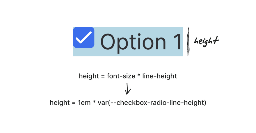
The line-height is stored in the var(--checkbox-radio-line-height) custom property. The font-size computed value of the label is unpredictable (e.g., we could change it using utility classes), but for its label::before pseudo-element that font-size is always going to be equal to 1em!
By knowing the height, we can use a formula to push down the custom radio/checkbox buttons of a very specific amount that aligns them with the label's first line. 🤯
.radio + label::before,
.checkbox + label::before {
  // ..
  position: relative;
  top: calc((1em * var(--checkbox-radio-line-height) - var(--checkbox-radio-size)) / 2);
}
This formula is compatible with any font-size and font-family values.
No more casual, unpredictable negative margin tricks! 🎉
Accessibility
Because we haven't created any custom element, the component is accessible, and screen readers properly announce it.

However, don't forget to include a :focus effect (the native buttons aren't visible):
// :focus
.radio:focus + label::before,
.checkbox:focus + label::before {
  border-color: var(--color-primary);
  box-shadow: 0 0 0 3px alpha(var(--color-primary), 0.2);
}
Final Result
Here's the final result! You can download this component in our UI Framework.
Originally published at CodyHouse.co


Top comments (2)
Very meticulous job. Keep it up. Looking more from you. Thanks guys.
Thanks :)
Some comments may only be visible to logged-in visitors. Sign in to view all comments.