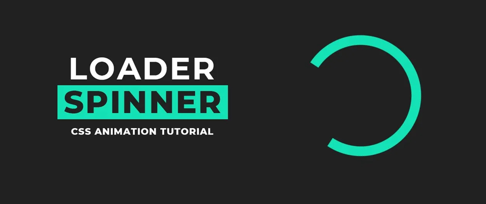
The animations we see before loading the page content of a website are called website loader animations. Loader animations are especially helpful in situations where a webpage may take a few moments to load due to large files or videos. Today we will design a simple loader spinner with only HTML and CSS. Below is the video tutorial to make this loader spinner.
Loader animation is an important part of the website design process because it improves the overall user experience. A user can understand that the page is not broken or unresponsive through the loader animation. Due to the content of the website, sometimes the website takes time to load. Users are more likely to tolerate waiting if they have an attractive and engaging visual indication that progress is being made.
You May Also Like:
A visually appealing loader animation can reduce the frustration of website loading times and make waiting times more tolerable. A loading spinner, we designed here is also a loader of many kinds of loaders we use in the web design process. This loading spinner is basically a circular type and this animated graphic keeps spinning while the webpage is loading.
<!DOCTYPE html>
<html lang="en">
  <!-- codingflicks.com -->
<head>
  <meta charset="UTF-8">
  <meta name="viewport" content="width=device-width, initial-scale=1.0">
  <title>Pure CSS Loader Spinner</title>
  <link rel="stylesheet" href="style.css">
</head>
<body>
  <div class="wrapper">
    <div class="loader"></div>
  </div>
</body>
</html>
*{
  margin: 0;
  padding: 0;
  box-sizing: border-box;
}
.wrapper{
  width: 100%;
  height: 100vh;
  display: flex;
  align-items: center;
  justify-content: center;
  background: #212121;
}
.loader{
  width: 250px;
  height: 250px;
  border: 20px solid #14e2b6;
  border-top-color: transparent;
  border-radius: 50%;
  animation: animate 1s linear infinite;
}
@keyframes animate{
    to{
      transform: rotate(-360deg);
    }
}
For the Original Post CLICK HERE


Top comments (0)