
CSS gradients, a topic which doesn't seem of much importance at once. There is so much you can do with gradients in CSS I am honestly blown away. Before writing this article the only thing I knew was how to create basic two-colored gradients, (I sometimes forgot how to do that too), but now I realize how much more CSS gradients have to offer!
Table Of Contents
- What Are CSS Gradients And How Do They Work?
- Working with Linear Gradients
- Creating Gradients with Multiple Colors
- Using Radial Gradients
- Working with Conic Gradients
- Creating Repeating Gradients
- Advanced Techniques
- Online Resources
- Final Thoughts
Gradient Magic: Elevate Your Web Design With CSS Gradients
What Are CSS Gradients And How Do They Work?
You can set boring solid colors in CSS pretty easily, it's one of the first things we learn when learning CSS, however, you can also create smooth color gradients with CSS. Before writing this article, I honestly had no idea that you could do so much with gradients, I only knew how to make two-colored gradients; turns out, that gradients can do a lot more than that.

Colors gradients in CSS are defined with the CSS image data type, meaning they can be used anywhere you can use the image data type. They are made by smoothly transitioning between two or multiple colors. There are three main types of gradients:
- Linear Gradients (goes directions: up, down, left, right, and diagonally),
- Radial Gradients (defined by their center point, then expands from that point),
- Conic Gradients (rotated around a center point)
However, you can also make some pretty cool patterns by repeating gradients using the functions: reapting-linear-gradient(), reapting-radial-gradient(), and reapting-conical-gradient() respectfully.
Basic syntax example:
<gradient-type>-gradient(direction, color1, color2, color3, ...);
CSS gradients are rendered by the browser, meaning that they can be resized without any noticeable delay loss of quality, unlike traditional raster images.
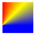
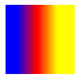
Working with Linear Gradients
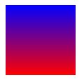
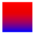
Let's start with the basics, then work our way up. Linear gradients, you've probably used them. They create progress in a straight line. You need at least two colors to define a linear gradient, which will be shown in a top-down direction if no direction or angle is specified.
Linear gradient syntax:
linear-gradient(<direction-angle>, first-color, ..., last-color)
Here's a basic example:
.gradient {
background-color: purple; // For browsers that do not support gradients, which shouldn't be a problem, will be treated as a fallback
background-image: linear-gradient(red, blue); // Will be shown if browser does support
}
```
{% endraw %}
### Changing Gradient Directions
By default, gradients progress from top to bottom, you can change this by writing the desired direction before specifying your colors, like this:
{% raw %}
```CSS
.gradient {
background-color: purple;
background-image: linear-gradient(to right, red, blue);
}

Easy enough, right?
Here are some other direction options for linear gradients:
- (default)
to bottom- sets the direction of colors to be north to south. -
to top- sets the direction of colors to be north to south. -
to right- sets the direction of colors to be west to east. -
to left- sets the direction of colors to be east to west.
You can also define diagonal angles using directions:
-
to bottom right- sets the direction of colors to be northwest to southeast. -
to bottom left- sets the direction of colors to be northeast to south-est. -
to top right- sets the direction of colors to be southeast to northwest. -
to top left- sets the direction of colors to be southwest to south-east.
Simple example using to bottom right:
  .gradient {
        background-color: purple;

      background-image: linear-gradient(to bottom right, red, blue);
  }

Using Angles
Accustomed to over-engineering things like the typical programmer? (JK, you can also use angles to achieve more specific angles) Don't worry, you can also use angles to define directions, like this:
  .gradient {
        background-color: purple;

      background-image: linear-gradient(110deg, red, blue);
  }

Angles can be confusing. Here's a quick but very useful to use when working with angles, thanks mdn web docks!

Creating Gradients with Multiple Colors
You can also create gradients with multiple color stops too, you don't have to limit yourself to only two. You can specify where you want your color stops to be, however, by default, they will be spaced evenly.
Here's an example of a rainbow (7 colors) gradient with no direction or angle specified (top-down):
  .gradient {
        background-color: purple;

      background-image: linear-gradient(red,orange,yellow,green,cyan,blue,violet);

  }

However, you can also use directions:
  .gradient {
        background-color: purple;

      background-image: linear-gradient(to right, red,orange,yellow,green,cyan,blue,violet);

  }

Or angles:
  .gradient {
        background-color: purple;

      background-image: linear-gradient(70deg, red,orange,yellow,green,cyan,blue,violet);

  }

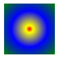
Using Radial Gradients
Radial gradients are similar to linear gradients except, unlike linear gradients, they don't progress in a straight line but instead are defined by their center point and then expand from that point.
Radial gradient syntax:
radial-gradient(<shape size> at <position>, color1, color2, color3, ...);
Like linear gradients, to create a simple radial gradient, you only need two colors. By default, the colors will be evenly distributed, and the shape will match the aspect ratio of its container, by default elliptical.
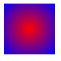
A simple radial gradient can be defined like this:
  .gradient {
        background-color: purple;

      background-image: radial-gradient(red, blue);
  }
Positioning The Center of a Gradient
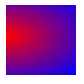
Radial gradients are defined by their center, however, you can also specify the center of the gradient using keywords (similar to how we position linear-gradients), percentages, or absolute values.
  .gradient {
        background-color: purple;

      background: radial-gradient(at 0% 45%, red, blue);
  }
Radial Gradient Shape
Radial gradients can have the shape of either a circle or ellipse; ellipse being the default value.
Here's an example of a circle radial gradient
  .gradient {
        background-color: purple;

      background-image: radial-gradient(circle, red, blue);
  }

Sizing Radial Gradients
You can also specify the size of radial gradients, kind of like how you would specify the position of a linear-gradient.
There are 4 total keywords you could use to specify the size of a gradient:
- (default)
farthest-corner -
closest-corner, -
closest-side, farthest-side
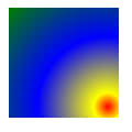
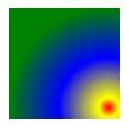
farthest-corner (default) example:
Makes the gradient reach the farthest corner of its container. This means it will extend from the center to the point where it is farthest from the center.
  .gradient {
        background-color: purple;

  background-image: radial-gradient(
    ellipse farthest-corner at 90% 90%,
    red,
    yellow 10%,
    blue 50%,
    green
  );
}
farthest-side example
Makes the gradient reach the farthest side of its container. Meaning that it will extend from the center to the point where it's at the farthest point of the center, reaching the edge of its container.
I found this one a little confusing at first, as well as the difference between farthest-corner and farthest-side; the example demonstrates the difference as well as what it does a little bit easier:
  .gradient {
        background-color: purple;

      background-image: radial-gradient(
        ellipse farthest-side at 90% 90%,
        red,
        yellow 10%,
        blue 50%,
        green
      );
}
closest-corner example:
This makes the gradient reach the closest corner of its container. Meaning that it will extend from the center to the point where it's closest to the center.
  .gradient {
        background-color: purple;

      background-image: radial-gradient(
        ellipse closest-corner,
        red,
        yellow 10%,
        blue 50%,
        green
      );
}
closest-side example:
Makes the gradient reach the closest side of its container. This means that if you're using radial-gradient as a background, it will extend from the center, to the point where it's closest to the center making it stop before it reaches the edge of the container.
Similar to farthest-side, the difference between the closest-corner and closest-side is more evident in an example:
  .gradient {
        background-color: purple;

      background-image: radial-gradient(
        ellipse closest-side,
        red,
        yellow 10%,
        blue 50%,
        green
      );
}

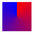
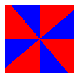
Working with Conic Gradients
In my opinion, the most fun of the three, the conic gradient creates a gradient that rotates around a center point. Which leads to different fun effects. When used with the right colors and the right angle, it might look just like a cone (hence the name, "conic").
Like the linear-gradient and radial-gradient, they require at least two colors. A conic gradient will not accept an absolute value for the color stops, but instead degrees or percentages. Color stops are start at the top, and then progress in a clockwise direction.
Syntax:
conic-gradient(from <angle> at <position>, firstColor <degree>, ..., finalColor <degree>)
By default, the angle is set to 0deg and the position is centered. If no angle is specified, if no degree is specified in a color stop, they will be spread equally.
RELATED: ⭐️ Five Underated CSS Properties You NEED to Try Out!
Basic Example:
  .gradient {
        background-color: purple;

      background-image: conical-gradient(red, blue);
  }
Positioning The Center of a Conic Gradient
Similar to radial gradients, you can position the center point that a gradient will rotate around using key terms, percentages, or absolute values using the keyword at.
  .gradient {
        background-color: purple;

          background-image: conical-gradient(at 0%, 75%, red, blue);
  }
Using Angles
from <angle>, specifies the starting angle by which the conic gradient will be rotated. You can also define the angle for specific color stops by including a degree after it.
  .gradient {
        background-color: purple;

        background-image: conic-gradient(from 90deg, red, yellow, blue);
  }

In this example, we specified from 90deg, meaning that our gradient will run through the colors red, yellow, and blue starting at 90 degrees.
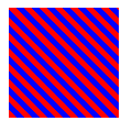
Creating Repeating Gradients
By default, we can't repeat the color stops in a linear-gradient, radial-gradient, or conical-gradient. However, we have the equivalent repeating-linear-gradient, repeating-radial-gradient, and repeating-conical-gradient functions that do allow this type of functionality.
Repeating gradients allows us to create cool and interesting patterns using only CSS and the power of gradients.
Repeating Linear Gradients
In the following example, we have a repeated linear gradient at 45 degrees. It starts in red, then we have another red color stop at 5px then we have a blue color stop at 5px, and a final blue color stop at 10px. The different reds and blues color stops create the repeating striped pattern.
  .gradient {
        background-color: purple;

        background-image: repeating-linear-gradient(
        45deg,
        red,
        red 5px,
        blue 5px,
        blue 10px
  );
  }
Repeating Radial Gradients
Here, we have a similar example, except with a radial gradient, meaning it will expand from the center point outward, and not progress in a linear line.
  .gradient {
        background-color: purple;

      background: repeating-radial-gradient(
        red,
        red 5px,
        blue 5px,
        blue 10px
      );
  }
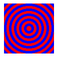
Repeating Conic Gradients
In this example, we have a repeated conic gradient that starts with red at 0 degrees (at the top of a circle) until it reaches 50 degrees. Then we have a final blue color stop that starts from blue until we reach 90 degrees. This is then repeated.
  .gradient {
        background-color: purple;

      background: repeating-conic-gradient(
          red 0deg 50deg,
          blue 50deg 90deg
      );
  }
Advanced Techniques
Specifying Color Positions
By default, color-stop positions will range from 0% to 100%, however, we can specify where we want to position each of our color stops using absolute values, and percentages.
  .gradient {
        background-color: purple;

      background: linear-gradient(to right, blue 16px, red, yellow 75%);
  }
Create Harsh Lines
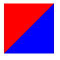
However, we may also want to create harsh or more abrupt lines with no gradual transitioning between. In this example, where we have two colors, we have our first color stop, red, which goes through it reaches 50% of the container's height, after that, we have an abrupt change to blue with no gradual transition between the two.
  .gradient {
        background-color: purple;

      background: linear-gradient(to bottom right, red 50%, blue 50%);
  }
Create Gradient Hints
Gradient hints allow you to transition from one color to another in specific percentages, or absolute values of a gradient. Here's an example comparing a default linear gradient with a gradient that has a color hint.
Gradient hint:
  .gradient {
        background-color: purple;

        background-image: linear-gradient(red, 10%, blue);
  }
Basic linear gradient, with no hint.

Create Stacked Gradients
Opacity and Overlays
Gradients can even be stacked on top of one another. The gradients will still be visible as long as the top ones aren't fully opaque.
This is better understood with an example:
  .gradient {
        background-color: purple;

      background:
        linear-gradient(
            217deg,
            rgba(255, 0, 0, 0.8),
            rgba(255, 0, 0, 0) 70.71%
         ),
        linear-gradient(
          127deg,
          rgba(0, 255, 0, 0.8),
          rgba(0, 255, 0, 0)
          70.71%
        ),
          linear-gradient(
          336deg,
          rgba(0, 0, 255, 0.8),
          rgba(0, 0, 255, 0) 70.71%
        );
  }

In this example, we're combining three different gradients to create a singular image. Our first gradient starts at 217 degrees (or a more-or-less to bottom-left direction), with the first color stop being red with an alpha value of 0.8. Then our second color stop is also red, except we have no alpha value (alpha values are needed to get an overlaying gradient) but instead, we specify the color stop's position to end at 70.71%. This is repeated with each gradient, with the only thing that changes being the color (the second gradient uses green, and the third one uses blue), as well as the degree of the gradient.
To understand how these are overlayed, here are the three gradients put separately:
Gradient one:

Gradient two:
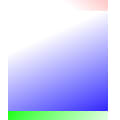
Gradient three:
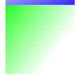
Due to them having an alpha value, when combined we see a mixture of these three gradients.
Online Resources
Before we end, I want to mention a few online resources that have helped me understand CSS gradients better, as well as provide some online resources that make the creation of these complicated creatures easier, if you have read through this article (which btw, I admire you if you did and appreciate it very much), you might have noticed that they might not be the most fun thing to work with.
- The MDN Web Docs: Using CSS Gradients have been a huge help in the creation of this article, their docs are well-written (and open-source).
- w3school's docs on CSS gradients are appropriate for beginners
- Both CSS gradients (Chris Coyier) and A Complete Guide to CSS Gradients (Geoff Graham) from CSSTricks are awesome articles that are worth the read! ## Final Thoughts This has been the longest article I've written (characters). So I help it's of much help for you to understand gradients. My idea to write an article about gradients was actually to teach web developers and designers how to effectively use gradients to enhance their users' web experience, but it kind of turned out looking kind of like a documentation : / (which btw, if you're stuck choosing colors, this article about color psychology might be the way to create effective and engaging designs and logos).
🔥 Color Psychology for Web Developers Enhance User Experience and Engagement

Top comments (0)