
After reading this article, you’ll understand how animations in React work. Know all the available tools and libraries we have at our disposal, but most importantly, you’ll be able to start animating your own React application.
There are multiple tools you can use to animate React applications:
- Plain CSS
- React Transition Group
- React Spring
- Framer Motion
- Animated SVGs
We’ll go over real-life examples and showcase how they can be used to animate React applications. So without any further ado, let’s get started!
All code examples are available on Github.
Plain CSS
Imagine we have a sidebar. We want it to smoothly slide in when it’s opened. And slide out when closed. It would look something like this.

Let’s break down how can we achieve this. For this simple example, we don’t have to worry about importing any external libraries. All we need is CSS Transition. As the good people from MDN would say! 🤲
CSS transitions provide a way to control animation speed when changing CSS properties.
CSS Transitions are a very powerful tool and can animate many CSS properties, but opacity and transformperform the best. To achieve maximum smoothness, we should thrive to transition only them.
Now, let’s get back to our example. The sidebar component can be implemented in React using the following fashion.
import React, { useState } from "react";
import cn from "classnames";
import Typography from "@material-ui/core/Typography";
import IconButton from "@material-ui/core/IconButton";
import MenuOpen from "@material-ui/icons/MenuOpen";

import beers from "../../assets/beers.png";

import "./Sidebar.css";

const Sidebar = () => {
  const [open, setOpen] = useState(false);

  const toggleOpen = () => setOpen(!open);

  return (
    <>
      <aside className={cn({ open })}>
        <div className="content">
          <img className="beers-img" src={beers} alt="beers img" />
          <Typography align="center" variant="h3">
            It works!
          </Typography>
        </div>
      </aside>
      <div className={cn("toggle-button", { open })}>
        <IconButton onClick={toggleOpen}>
          <MenuOpen />
        </IconButton>
      </div>
    </>
  );
};

export default Sidebar;
And the CSS
:root {
    --sidebar-width: 300px;
}

aside {
    /* Style and position the sidebar */
    width: var(--sidebar-width);
    position: fixed;
    display: grid;
    place-items: center;
    border-right: 1px solid #d1d8e0;
    box-shadow: 0 0 15px #d1d8e0;
    left: calc(var(--sidebar-width) * -1);
    top: 0;
    bottom: 0;

    /* This will hide the shadow */
    transform: translateX(-15px);

    /* Animate transform to achieve 60fps */
    transition: transform .6s ease-in-out;
}

aside.open {
    transform: translateX(var(--sidebar-width));
}

.toggle-button {
    position: fixed;
    top: 20px;
    left: 15px;
    transition: transform .6s ease-in-out;
}

.toggle-button.open {
    transform: translateX(var(--sidebar-width));
}
This approach is very simple and it actually is enough for most situations. The big advantage is that it doesn’t rely on any external packages, keeping our final bundle size very small. 📦
But what about more complex examples? How can we solve them? And what tools can we use to make our life much easier? Well, let’s find out!
React Transition Group
Let’s say we have a list of items. Every time a new item is added, we want it to smoothly fade in. And when it’s deleted, fade out.
Just so we don’t have to rely on one’s imagination. Here is how it should look like. 👇
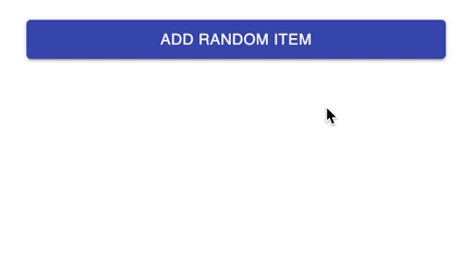
I know you can’t wait to see how it’s done, so I won’t even bother stalling. Let’s break it down into pieces. The first part is React itself. Here, we’re making use of the awesome library called react-transition-group, taken from the book of creators themselves. 🦸
React transition group exposes simple components useful for defining entering and exiting transitions. It exposes transition stages, manages classes and group elements and manipulates the DOM in useful ways, making the implementation of actual visual transitions much easier.
In other words, we just wrap our React components and the library handles the management of items in DOM. Our React code will look like this. 👇
import React, { useState } from "react";
import { CSSTransition, TransitionGroup } from "react-transition-group";
import Button from "@material-ui/core/Button";
import IconButton from "@material-ui/core/IconButton";
import Delete from "@material-ui/icons/Delete";
import randomWords from "random-words";

import "./List.css";

const List = () => {
  const [items, setItems] = useState([]);

  const addItem = () =>
    setItems([...items, randomWords({ exactly: 2, join: " " })]);

  const deleteItem = ({ currentTarget }) =>
    setItems(items.filter((item) => item !== currentTarget.dataset.id));

  return (
    <div className="list-container">
      <Button
        fullWidth
        variant="contained"
        color="primary"
        className="add-button"
        onClick={addItem}
      >
        Add Random Item
      </Button>
      <TransitionGroup component="ul">
        {items.map((word) => (
          <CSSTransition key={word} timeout={600} classNames="item">
            <li key={word}>
              <span>{word}</span>
              <IconButton size="small" data-id={word} onClick={deleteItem}>
                <Delete />
              </IconButton>
            </li>
          </CSSTransition>
        ))}
      </TransitionGroup>
    </div>
  );
};

export default List;
In the CSS, we just need t to specify the transitions between individual stages. Notice the use of item-enter item-enter-active and other item-enter-* classes. All of them were added by react-transition-group. I think the creators deserve a big Thank You! 🙏
.list-container {
    width: 385px;
    padding: 24px;
}

.list-container ul {
    list-style: none;
    margin: 0;
    padding: 0;
}

.list-container ul li button {
    margin-left: auto;
}

.list-container ul li {
    display: flex;
    align-items: center;
    margin: 16px 0;
    padding: 4px 16px;
    border: 1px solid #dedede;
    border-radius: 4px;
    text-transform: capitalize;
    transition: opacity 600ms, transform 600ms;
}

.item-enter {
    opacity: 0;
    transform: scale(0);
}

.item-enter-active, .item-enter-done, .item-exit {
    opacity: 1;
    transform: scale(1);
}

.item-exit-active {
    opacity: 0;
    transform: scale(1) translateY(50px);
}
I’d say we’re starting to have some fun, so let’s kick it up a notch and try to solve an even bigger animation challenge. With the use of another library and this is where things start to get really serious. 🕵️
React Spring
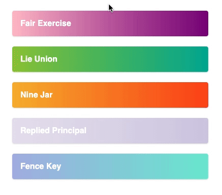
Let’s stick with our list from the previous example. But now, we want to enhance it. We want to move the order of the items. And of course, we want to do it in style. 🤘
So how can we achieve this? With a little… or maybe a lot of help from the library called react-spring.
react-spring is a spring-physics based animation library that should cover most of your UI related animation needs. It gives you tools flexible enough to confidently cast your ideas into moving interfaces.
This library comes with a set of utility functions that will make our UI dance like never before. And you want to hear the best part? It uses a declarative approach to handle animations which happens to be the React way of building UI interfaces. 👍
But enough, blabbering! Let’s see how can we implement this draggable list. This time, we’re gonna handle everything in React and use CSS just to provide additional styling. ✏️
import React, { useRef } from "react";
import clamp from "ramda/src/clamp";
import move from "ramda/src/move";
import { useDrag } from "react-use-gesture";
import { useSprings, animated, interpolate } from "react-spring";

import "./DraggableList.css";

const itemHeight = 70;

// Returns style for the item based on its draggin state
const fn = (order, down, originalIndex, curIndex, y) => (index) =>
  // Is item being dragged? If so, bring it top and make it little bigger
  down && index === originalIndex
    ? {
        y: curIndex * itemHeight + y,
        scale: 1.1,
        zIndex: "1",
        shadow: 15,
        immediate: (n) => n === "y" || n === "zIndex",
      }
    : {
        y: order.indexOf(index) * itemHeight,
        scale: 1,
        zIndex: "0",
        shadow: 1,
        immediate: false,
      };

const items = [
  "Lie Union",
  "Replied Principal",
  "Fair Exercise",
  "Nine Jar",
  "Fence Key",
];

export default function DraggableList() {
  // This will keep the order of the items
  // Ref is used so it doesn't trigger rerendering
  const order = useRef(items.map((_, index) => index));
  // Spings will handle all the animations
  const [springs, setSprings] = useSprings(items.length, fn(order.current));

  // This function is periodically called while element is dragged
  // Calculating new order of the items
  const bind = useDrag(({ args: [originalIndex], active, movement: [, y] }) => {
    const curIndex = order.current.indexOf(originalIndex);
    const curRow = clamp(
      0,
      items.length - 1,
      Math.round((curIndex * itemHeight + y) / itemHeight)
    );
    const newOrder = move(curIndex, curRow, order.current);
    setSprings(fn(newOrder, active, originalIndex, curIndex, y));
    if (!active) order.current = newOrder;
  });

  return (
    <div className="drag-list-container">
      <ul>
        {springs.map(({ zIndex, shadow, y, scale }, i) => (
          <animated.li
            {...bind(i)}
            key={i}
            style={{
              zIndex,
              boxShadow: shadow.interpolate(
                (s) => `rgba(0, 0, 0, 0.15) 0px ${s}px ${2 * s}px 0px`
              ),
              transform: interpolate(
                [y, scale],
                (y, s) => `translate3d(0,${y}px,0) scale(${s})`
              ),
            }}
          >
            {items[i]}
          </animated.li>
        ))}
      </ul>
    </div>
  );
}
The most important is the bind function. It’s called while an item is being dragged calculating the new order of the items. The other important part is fn. The function that returns style for the item. Depending on if it’s being dragged or not, all the remaining magic is handled by react-spring itself.
As you can see, there is no mention of animation in the CSS itself. 👇
.drag-list-container {
    width: 385px;
    padding: 24px;
}

.drag-list-container ul {
    margin-top: 24px;
    list-style: none;
    margin: 0;
    padding: 0;
    position: relative;
}

.drag-list-container ul li button {
    margin-left: auto;
}

.drag-list-container ul li {
    display: flex;
    align-items: center;
    padding: 16px 16px;
    border-radius: 4px;
    color: #fff;
    font-weight: bold;
    font-family: sans-serif;
    font-size: 16px;
    text-transform: capitalize;
    user-select: none;
    position: absolute;
    left: 0;
    right: 0;
    cursor: grab;
}

.drag-list-container ul li:nth-child(1) {
    background: #00b09b;
    background: -webkit-linear-gradient(to right, #96c93d, #00b09b);
    background: linear-gradient(to right, #96c93d, #00b09b);
}

.drag-list-container ul li:nth-child(2) {
    background: #D3CCE3;
    background: -webkit-linear-gradient(to right, #E9E4F0, #D3CCE3);
    background: linear-gradient(to right, #E9E4F0, #D3CCE3);
}

.drag-list-container ul li:nth-child(3) {
    background: #800080;
    background: -webkit-linear-gradient(to right, #ffc0cb, #800080);
    background: linear-gradient(to right, #ffc0cb, #800080);
}

.drag-list-container ul li:nth-child(4) {
    background: #fc4a1a;
    background: -webkit-linear-gradient(to right, #f7b733, #fc4a1a);
    background: linear-gradient(to right, #f7b733, #fc4a1a);

}

.drag-list-container ul li:nth-child(5) {
    background: #74ebd5;
    background: -webkit-linear-gradient(to right, #ACB6E5, #74ebd5);
    background: linear-gradient(to right, #ACB6E5, #74ebd5);
}
That’s the beauty of this library. As I mentioned before, it contains a lot of useful functions, and covering all of them is beyond the scope of this article. I highly encourage you to explore them. Or if you’d like me to do that for you. Let me know in the comments. 💬
I sense you’re getting tired of the list examples. It’s time to move on to another page. And while we’re at it, let’s make the transition between different pages animated. 🎉
Framer Motion
Not sure about you, but I just really enjoy when websites have really thought out their transitions. Everything is just so smooth and fits together. It just makes me want to transition between pages all day. 🤭
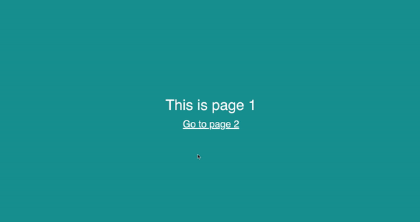
The good thing is that we don’t have to go too crazy and spend hours trying to figure out fade-in and fade-out effects. Just a simple opacity change can immediately freshen up the look of your site. The example above is implemented using a library called framer-motion.
Framer Motion is an open source, production-ready library that’s designed for all creative developers.
So how do we use it to make our pages bounce left and right? Let’s find out! The first thing is to wrap our Router with AnimatePresence. This will make the whole transition effect possible.
import React from "react";
import { Switch, Route, useLocation } from "react-router-dom";
import { AnimatePresence } from "framer-motion";

import PageTransition from "./components/PageTransition";

const App = () => {
  const location = useLocation();
  return (
    <div className="app">
      <AnimatePresence exitBeforeEnter initial={false}>
        <Switch location={location} key={location.pathname}>
          <Route
            exact
            path="/page-transition/:pageNumber"
            component={PageTransition}
          />
        </Switch>
      </AnimatePresence>
    </div>
  );
};

export default App;
And to finish things off and define how we want our pages to transition. We just implement it in the motion component by specifying different stages. In the example below, we define initial animate and exit states. And voila, our page transitions are working. ⚙️
import React from "react";
import { motion } from "framer-motion";
import { Link, useParams } from "react-router-dom";

import "./PageTransition.css";

const PageTransition = () => {
  const { pageNumber } = useParams();

  const background = `#${Math.floor(
    (Number(pageNumber) / 10) * 16777215
  ).toString(16)}`;

  return (
    <motion.div
      initial={{ scaleY: 0.9, translateX: 150, opacity: 0 }}
      animate={{ scaleY: 1, translateX: 0, opacity: 1 }}
      exit={{ scale: 0.9, translateX: -150, opacity: 0 }}
      transition={{ duration: 0.5 }}
    >
      <div style={{ background }} className="page-transition-container">
        <div className="page-transition-content">
          {`This is page ${pageNumber}`}
          <Link
            to={`/page-transition/${Number(pageNumber) + 1}`}
          >{`Go to page ${Number(pageNumber) + 1}`}</Link>
        </div>
      </div>
    </motion.div>
  );
};

export default PageTransition;
I know what you’re probably asking — can we even take this any further? Well of course. Let’s see how can we animate SVGs. Or in other words…bringing images to life.
Animated SVGs
I’m pretty sure we’ve all heard and work with SVGs. They’re easy to scale. And they look awesome. But did you know we can also animate them? Well, let’s try it! 🤓

Someone looks at this picture and sees a cat looking at the leaves. Being calm and collected. What I see is a collection of vectors. And with a little bit of editing and creative thinking. We can make them bounce. 🕺

Let’s break it down once again. The thing about SVGs is that they’re simply DOM elements. And hence, we can animate them. We can also group them using g tag. This enables us to group leaves and the cat into separate groups. And animate them separately.
Utilizing Animate.css, we can quickly make the whole image do what we want. By simply adding class names.
Animate.css is a library of ready-to-use, cross-browser animations for use in your web projects. Great for emphasis, home pages, sliders, and attention-guiding hints.
Just to give you a better idea, by simply adding classes animate __animated and animate__ shakeX to a g element, we can make all leaves shake along the X-axis.
<g className="animate __animated animate__ shakeX animate __infinite animate__ fast">
  <path
    id="e6d48fe3-12d5-4a4a-b92a-b78b486fac3b"
    data-name="Path 438"
    d="M309.28694,475.45315a52.15479,52.15479,0,0,0,50.36294-8.87123c17.63958-14.80651,23.17124-39.19162,27.67-61.7767L400.63007,338l-27.86593,19.18733c-20.04088,13.79849-40.53183,28.04032-54.40665,48.02636s-19.928,47.27083-8.78325,68.89757"
    transform="translate(-207.5 -319.57902)"
    fill="#6c63ff"
  />
  <path
    id="a99fcdd9-ae8f-4ca7-ba44-ef69baf9e145"
    data-name="Path 439"
    d="M313.58973,560.984c-3.50732-25.55267-7.11595-51.43577-4.64984-77.26241,2.18545-22.9371,9.18347-45.33609,23.43031-63.70971a105.98258,105.98258,0,0,1,27.1917-24.64095c2.71849-1.7155,5.22114,2.59225,2.51425,4.30116a100.75623,100.75623,0,0,0-39.85592,48.08616c-8.677,22.06856-10.07026,46.12659-8.57567,69.57019.90341,14.17706,2.82315,28.26118,4.75115,42.32867a2.5807,2.5807,0,0,1-1.74039,3.06388,2.506,2.506,0,0,1-3.06392-1.74033Z"
    transform="translate(-207.5 -319.57902)"
    fill="#3f3d56"
  />
  <path
    id="bbeda2f4-be86-4904-b4b0-963c2a3b729b"
    data-name="Path 442"
    d="M338.83512,519.9822a38.39278,38.39278,0,0,0,33.45243,17.27094c16.93879-.80377,31.05443-12.621,43.76017-23.84376l37.58913-33.18833-24.87676-1.19066c-17.89034-.85689-36.24233-1.66067-53.28237,3.86268s-32.75493,18.79538-35.87034,36.43334"
    transform="translate(-207.5 -319.57902)"
    fill="#6c63ff"
  />
  <path
    id="a6e93fc3-3616-4120-bc87-b7b79f9b3178"
    data-name="Path 443"
    d="M303.67556,575.67259c16.88563-29.877,36.46983-63.082,71.46666-73.69528a79.74859,79.74859,0,0,1,30.058-3.10382c3.19179.2757,2.39465,5.19454-.7905,4.92057a74.08893,74.08893,0,0,0-47.9699,12.69084c-13.52609,9.20673-24.058,22.00714-32.97082,35.57969-5.46025,8.315-10.35092,16.982-15.24158,25.63731C306.66474,580.46859,302.09462,578.47081,303.67556,575.67259Z"
    transform="translate(-207.5 -319.57902)"
    fill="#3f3d56"
  />
  <path
    id="e252ff7a-4a4a-4da8-9d61-47808c761739"
    data-name="Path 438"
    d="M469.91119,534.32478a22.51,22.51,0,0,0,21.73664-3.82882c7.61324-6.39049,10.00071-16.91511,11.94235-26.66283L509.33488,475,497.308,483.28125c-8.64965,5.95543-17.49354,12.10221-23.48191,20.72818s-8.60091,20.40209-3.79085,29.73619"
    transform="translate(-207.5 -319.57902)"
    fill="#6c63ff"
  />
  <path
    id="ef525daa-216d-438f-b057-809f99c83d16"
    data-name="Path 439"
    d="M471.76827,571.23989c-1.51376-11.02854-3.07125-22.19968-2.00687-33.34646.94324-9.89965,3.96358-19.56706,10.11252-27.49712a45.74208,45.74208,0,0,1,11.73594-10.635c1.1733-.74041,2.25344,1.11882,1.08515,1.85638a43.48643,43.48643,0,0,0-17.20182,20.754c-3.745,9.52479-4.34632,19.90824-3.70125,30.02649.38991,6.11883,1.21847,12.19753,2.05059,18.26906a1.11382,1.11382,0,0,1-.75115,1.32237,1.08157,1.08157,0,0,1-1.32239-.75113Z"
    transform="translate(-207.5 -319.57902)"
    fill="#3f3d56"
  />
  <path
    id="f74a7d99-3259-4264-a03b-1567597bdebf"
    data-name="Path 442"
    d="M482.66418,553.54352a16.57033,16.57033,0,0,0,14.43807,7.45414c7.31078-.34691,13.40309-5.44722,18.88689-10.291l16.22347-14.32408-10.73681-.51389c-7.72147-.36984-15.64219-.71674-22.99667,1.66713s-14.137,8.11209-15.48164,15.72463"
    transform="translate(-207.5 -319.57902)"
    fill="#6c63ff"
  />
  <path
    id="a42fcbb9-6e6a-4d65-b4bb-1afcb6d22e9b"
    data-name="Path 443"
    d="M467.48932,577.5795c7.28783-12.89494,15.74037-27.2262,30.845-31.80689a34.41945,34.41945,0,0,1,12.973-1.33961c1.37757.119,1.03353,2.242-.34118,2.12372a31.97674,31.97674,0,0,0-20.70381,5.47737c-5.83786,3.97362-10.38345,9.49828-14.23021,15.35619-2.35664,3.58875-4.46745,7.32942-6.57827,11.06506C468.77944,579.64945,466.807,578.7872,467.48932,577.5795Z"
    transform="translate(-207.5 -319.57902)"
    fill="#3f3d56"
  />
  <path
    id="bcabba70-d0f3-473d-b335-0d566e9784d7"
    data-name="Path 438"
    d="M909.08881,542.32478c-33.66813,9.666-34.06661-37.91416-39.42369-59.32478,19.03,12.95794,51.11625,31.43174,39.29969,58.74562"
    transform="translate(-207.5 -319.57902)"
    fill="#6c63ff"
  />
  <path
    id="ba478ea8-fb83-4c8b-9ab3-cf7979187684"
    data-name="Path 439"
    d="M907.23173,579.23989c4.42251-25.01354,4.70166-56.69462-19.84253-71.47844-1.17236-.74058-2.2525,1.11865-1.08421,1.85621,23.69653,14.33251,22.99265,44.93874,18.85159,69.04967a1.07647,1.07647,0,0,0,2.07443.57111Z"
    transform="translate(-207.5 -319.57902)"
    fill="#3f3d56"
  />
  <path
    id="fd385cca-8359-4008-938e-478bfe5bb8f2"
    data-name="Path 442"
    d="M812.33582,553.54352c-15.40686,20.68145-36.86161-7.01067-49.54843-17.16091,16.92307-.89964,43.95541-4.38779,49.21512,16.87787"
    transform="translate(-207.5 -319.57902)"
    fill="#6c63ff"
  />
  <path
    id="b59fa0dc-1c02-46f1-977b-f71e7fc9587c"
    data-name="Path 443"
    d="M827.51068,577.5795c-8.70881-16.672-22.61667-35.52669-43.81854-33.1459-1.37708.11839-1.033,2.24137.34167,2.12312,20.13906-2.08412,33.24227,16.0282,41.51183,31.8991C826.22056,579.64945,828.193,578.7872,827.51068,577.5795Z"
    transform="translate(-207.5 -319.57902)"
    fill="#3f3d56"
  />
</g>;
This method does not have to rely on any external tools and libraries. Surely, we’ve used Animate.css in this example, but you can simply just define your own animations. It takes time and effort, but with a little bit of both. You can achieve really astonishing results. 😎
Conclusion
There are plenty of tools and libraries you can use to animate React applications. In this article, I picked the ones I personally use. And I picked the ones that manipulate the DOM in the same way React does. ⚛️
Where you go from here is entirely up to you. You can choose the one you enjoy the most. You can combine multiple methods at the same time. Or you can keep researching other tools and libraries. 🔎

Top comments (0)