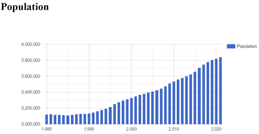
In this article I will show how you can use the Google charts JavaScript API to create a simple chart quickly. You can use the Google charts JavaScript API to create a lot of different charts, but this article is a quick introduction on how to get started using the API for creating a simple column chart.
The google charts visualization API can be loaded from the Google CDN URL: https://www.gstatic.com/charts/loader.js
Then we need to load the chart visualization api and set a callback function to be called when the api has been loaded. This is done by these two lines of code.
google.charts.load('current', {'packages':['corechart']});
google.charts.setOnLoadCallback(drawChart);
The drawChart(...) callback function creates a DataTable from an array of population data for each year from 1980 to 2021.
Then a ColumnChart object is created and then added to the populationChart div together with the data table.
Below is the entire example code for the html page that creates a column chart of some population data.
<html>
<head>
    <script type="text/javascript" src="https://www.gstatic.com/charts/loader.js"></script>
</head>
<body>
    <h1>Population</h1>
    <div id="populationChart"></div>
    <script type="text/javascript">
        // Load the Visualization API and the corechart package.
        google.charts.load('current', {'packages':['corechart']});
        google.charts.setOnLoadCallback(drawChart);

        function drawChart() {
            const populationData = google.visualization.arrayToDataTable([
                ['Year', 'Population'],
                [1980, 5122065],[1981, 5123989],[1982, 5119155],
                [1983, 5116464],[1984, 5112130],[1985, 5111108],
                [1986, 5116273],[1987, 5124794],[1988, 5129254],
                [1989, 5129778],[1990, 5135409],[1991, 5146469],
                [1992, 5162126],[1993, 5180614],[1994, 5196642],
                [1995, 5215718],[1996, 5251027],[1997, 5275121],
                [1998, 5294860],[1999, 5313577],[2000, 5330020],
                [2001, 5349212],[2002, 5368354],[2003, 5383507],
                [2004, 5397640],[2005, 5411405],[2006, 5427459],
                [2007, 5447084],[2008, 5475791],[2009, 5511451],
                [2010, 5534738],[2011, 5560628],[2012, 5580516],
                [2013, 5602628],[2014, 5627235],[2015, 5659715],
                [2016, 5707251],[2017, 5748769],[2018, 5781190],
                [2019, 5806081],[2020, 5822763],[2021, 5840045]
            ], false);
            const options = {
                width: 820,
                height: 400
            };
            var populationChart = new google.visualization.ColumnChart(document.getElementById('populationChart'));
            populationChart.draw(populationData, options);
        }
    </script>
</body>
</html>
This is how the chart looks in the browser:

The Google Charts visualization api is very well documented with lots of examples here: https://developers.google.com/chart/interactive/docs


Top comments (0)