I've been working on the web since 1997 and one thing I realised early on is a big basic idea of the web:
You do not control how your web product is consumed by your users - it is up to you to make sure people can change it to their needs.
As advocates of a usable web by everybody this was and still is the most misunderstood concept. I don't know if it is because web design originated from print design. Or it may be because Flash promised to allow you to convert any design to the web. Or it just is because people don't feel like looking past their own experiences. Or it is pragmatism, people know they don't have time to make a product that adapts to users needs, so they build what they can. Or it is arrogance and a lack of repercussion. We keep telling people that they can be sued if their product "isn't accessible". But the reality is that there aren't many successful court cases with real repercussions or fatal brand impact. Most ended up settled outside of court.
It doesn't matter though, as the fact remains that people have to and will change the way your product looks to make it available to them. And it is a terrible thing to do to block someone out, although they already took a lot of steps to try to consume what you have to offer.
So here are a few things you can do to spot check if what you build works for as many people as possible.
- Resize the font to 300% (Ctrl + Plus) and see if you can still use your product
- Don't use a mouse, try to navigate with keyboard alone
- Blur the screen (or squint) and see if the most important bits of interaction are still obvious.
- Play with the accessibility features of your OS and see what people user (Screen magnifier, high contrast mode, screen reader)
- Check your web site in reader mode of the browser and see if all the features it ripped out are actually that important, or if you could get rid of them for all your users
- Use the emulation in developer tools of your browser to spot-check how different users may experience your product
I wrote a detailed article on the DevTools for Edge documentation site on how to do that. There is also a cross-reference to tell you what tool you can use to test for which accessibility issue.
And there's a whole course on Skillshare about Product Management: Tools for Improving Product Accessibility if you like videos better.
It is annoying that the accessibility emulation features are scattered amongst different tools in Developer Tools right now (Issues, Elements, Rendering…) and we're working on a better way to do that. The DevTools for VS Code extension tried to do a better job with that by showing accessibility issues right in your source code:
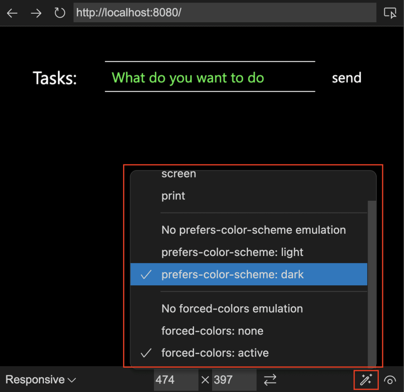
The embedded browser also offers mode emulation and visual deficiencies emulation as a toolbar on the bottom rather than only part of the main tools drawer.
First is the device list. You can select from a wide range of different emulated devices.
The magic wand menu allows you to simulate various CSS media queries, like print mode, dark/light mode or even simulate a forced colours (high contrast) environment. If you want to know more about forced colours, check this incredible article
The last menu (currently using the eye icon) allows you to simulate different visual impairments, like seeing the page in a blurred fashion or in different "colour blindness" emulations.
We'd love to get more feedback on that and see if rolling that out in the main browser would also help you get a better understanding of what could be necessary for people to do to your product to make it accessible to them.


Top comments (0)