
What is Flexbox?
Flexbox is a layout model that allows you to design complex layouts more easily in React Native. It provides a more efficient way to distribute space and align items in a container, even when the size of the items is unknown or dynamic. Flexbox is designed to provide a consistent layout on different screen sizes and orientations.
We will be using expo to create a new React Native project by running the following commands:
npx create-expo-app flexbox
cd flexbox
npm start
You should see the Expo DevTools open in your browser, and you can run the project on an emulator or a physical device. I will be using my physical device to run the project.
We will be using the following example to understand the core concepts of Flexbox:
import { StatusBar } from "expo-status-bar";
import { StyleSheet, Text, View } from "react-native";

export default function App() {
  return (
    <View style={styles.container}>
      <View style={styles.pink} />
      <View style={styles.blue} />
      <View style={styles.yellow} />
      <StatusBar style="auto" />
    </View>
  );
}

const styles = StyleSheet.create({
  container: {
    flex: 1,
    backgroundColor: "#495057",
    justifyContent: "center",
    alignItems: "center",
  },

  pink: {
    width: 100,
    height: 100,
    backgroundColor: "#ea638c",
    margin: 5,
  },

  blue: {
    width: 100,
    height: 100,
    backgroundColor: "#47ebff",
    margin: 5,
  },

  yellow: {
    width: 100,
    height: 100,
    backgroundColor: "#ffd670",
    margin: 5,
  },
});
This code snippet creates a simple layout with three colored boxes (pink, blue, and yellow), which are aligned in a column format, inside a grayish container as shown below:
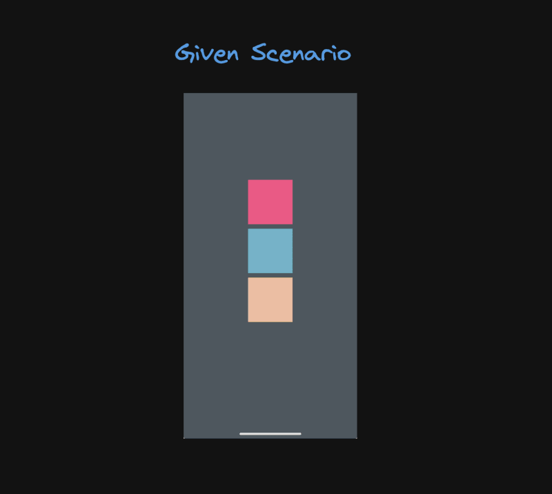
Initially for a better visibility of the boxes, I have set the flex property of the container to 1. This will make the container occupy the entire screen space. The justifyContent and alignItems properties are set to center to center the items along the main and cross axes respectively.
Flexbox Concepts
1. Flex Container
The parent element containing the flex items is known as the flex container. To create a flex container, you need to set the display property to flex or inline-flex. The flex container can have multiple flex items.
In our example, the View component with the container style acts as the flex container.
2. Flex Items
The children of a flex container are known as flex items. These items can be aligned and distributed within the flex container using various properties.
In our example, the View components with the pink, blue, and yellow styles are the flex items inside the flex container.
3. Main Axis and Cross Axis
Flexbox uses two axes to position and align items within the flex container:
Main Axis: The primary axis along which the flex items are laid out. It can be horizontal (row) or vertical (column).
Cross Axis: The perpendicular axis to the main axis. It is used to align items across the main axis.
In our example, the main axis is vertical (column) as defined by the flexDirection: 'column' property in the flex container style and the cross axis is horizontal.
4. Flex Direction
The flexDirection property defines the direction in which the flex items are laid out within the flex container. It can be set to row, row-reverse, column, or column-reverse.
For achieving a column layout, we set the flexDirection property to the container style.
flexDirection: 'row',
The directions are as follows:
-
row: Items are laid out in a row from left to right. -
row-reverse: Items are laid out in a row from right to left. -
column: Items are laid out in a column from top to bottom. -
column-reverse: Items are laid out in a column from bottom to top.

5. Justify Content
The justifyContent property aligns the flex items along the main axis of the flex container. It can be used to distribute space between, around, or even inside the flex items.
To center the items along the main axis, we set the justifyContent property to the container style.
justifyContent: 'center',
The possible values for justifyContent are:
-
flex-start: Items are aligned at the start of the main axis. -
flex-end: Items are aligned at the end of the main axis. -
center: Items are centered along the main axis. -
space-between: Items are evenly distributed with space between them. -
space-around: Items are evenly distributed with space around them.

We have already been using the center value for the justifyContent property in our example. Here I have also kept the alignItems property to center to center the items along the cross axis.
6. Align Items
The alignItems property aligns the flex items along the cross axis of the flex container. It can be used to align items at the start, center, end, or stretch them to fill the container.
To center the items along the cross axis, we set the alignItems property to the container style.
alignItems: 'center',

7. Flex
The flex property specifies how a flex item grows or shrinks to fill the available space within the flex container. It is a shorthand property for flex-grow, flex-shrink, and flex-basis.
Flexbox practice
There are a lot of websites and tools available to practice Flexbox which can help you understand the concepts better. Here are a few resources to get you started:
- Flexbox Froggy: A game that teaches Flexbox concepts by positioning frogs on lily pads.
- Flexbox Defense: Another fun game where you use Flexbox to position towers and defend against attacks.
- Flexbox.io: A free video course by Wes Bos that includes detailed lectures and coding challenges.
Conclusion
Flexbox is a powerful layout model that simplifies the process of creating responsive and dynamic layouts in React Native. By understanding the core concepts of Flexbox and how to apply them in your projects, you can design more flexible and consistent UIs across different devices and screen sizes. Experiment with different Flexbox properties and configurations to create custom layouts that meet your specific design requirements.


Top comments (1)
Great article, I especially like the Flexbox practice section with the games!