
The spread of the Corona Virus has been rapid and absolutely devastating for countries that have been hard hit. Due to the virus’ exponential growth and how wholly unprepared many countries were to handle this crisis, we saw the number of cases particularly skyrocket in China, Italy, and the U.S. in the beginning of 2020. The sudden rise became so fast that at one point, the doubling times for new cases was as short as 2-6 days in late March in the U.S. alone according to NPR.
To help us better understand what was happening, I created a tool that easily allows for comparing the growth trends between countries called the Corona Examiner.
Benefits
- Allows for tracking the case and death count between any set of countries.
- Since the population counts vary drastically from country to country, you can also view these metrics on a per million people basis.
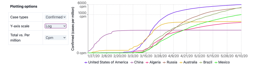
- Support for log scales so that you can tell whether the rate is slowing down or speeding up. (Exponential growth produces a straight line while a curve downward indicates that we are getting under an R0 of 1.)
The data is pulled from Johns Hopkins University CSSE dataset which gets updated hourly and published to Github, so you can always be sure that you are viewing the most up to date information.
In the interest of transparency and allowing everyone to build their own and see how it ticks, I open-sourced the entire project on Github. Let’s go through some of the details about how it works.
Tech Specs of the App
- Built using Gatsby.js and hosted on Github Pages. This turned out to be a really nice combination because Github provides free static hosting and Gatsby.js produces statically built pages built with React.js.
-
gh-pagesto publish the statically built app onto a special branch in Github calledgh-pagesthat is used to serve the app from. - Recharts for plotting. They provide gorgeous plots that will animate redrawing the lines as people switch from counts to count per million or check/uncheck different countries. As someone who has scratched their head with trying to understand d3, I'm very thankful that someone has taken the power of d3 and made it easier to use for simple cases of plotting like this.
- React Simple Maps for the maps. This was another pleasant surprise because it was almost trivial to get a stock world map up on a react app with cool features like hovering to display tooltips.
- Tailwinds CSS rather than Antd or Bootstrap for all of the styling on the app.
Data Processing
My data science chops were a little rusty but I sure had to dust them off for this project. The central problem was that we were getting data formatted a particular way. The data itself is stored on Github and by clicking on the view raw setting for both the cases and deaths dataset, you can get a URL to the actual csv that your app can fetch when you visit the Corona Examiner Website.
We use React Hooks to create a hook called useFetchTimeSeries which manages fetching the csvs, converting it into a JavaScript object and formatting it as timeseries dataset.
Here is the format for the confirmed cases object. You can see that we save off both the case counts for the cases-per-million (CPM) and the raw-case number (NORMAL). Then each of those datasets consists of an array of objects where each object represents a given day specified by its date and each country uses its ISO3 value, which is a unique standardized 3 letter code.
const allConfirmed = {
  CPM: [
    {
      date: '1/22/20',
      AFG: 0,
      ALB: 0,
      // many more countries here
      ZWE: 0,
    },
    {
      date: '1/23/20',
      AFG: 0,
      ALB: 0,
      // many more countries here
      ZWE: 0,
    },
    // many more dates here
  ],
  NORMAL: [
    {
      date: '1/22/20',
      AFG: 0,
      ALB: 0,
      // many more countries here
      ZWE: 0,
    },
    {
      date: '1/23/20',
      AFG: 0,
      ALB: 0,
      // many more countries here
      ZWE: 0,
    },
    // many more dates here
  ],
}
Standardization shall set you free
It turns out that using the ISO3 as a standardized code is critical, because the Map itself also has a set of country data and as I found out the country names didn't always agree. Sometimes things would be abbreviated, have different capitalization, or have formatting differences that would mean that if I clicked on the country South Korea on the map, it wouldn't know how to find that in a list of COVID cases where it was instead represented as Korea, South.
Instead of dealing with all of those headaches I could simply use the ISO3 figure which both the COVID and the Map data had in common and I was good to go.
Corner cases are the last set of gotchas
The last set of gotchas was how to handle cases with territories. The COVID dataset split China, US, Canada and Australia into a number of provinces but the map itself did not make that distinction. In those cases, I aggregated the population and case data on a whole country basis.
The exception to this was certain territories which were geographically distinct from the main country. Greenland is an example of this because before doing this project, I forgot that it was part of Denmark. In cases of a distinct area that you can hover over but is still part of another country, the count-per-million metrics are based on that territory without including the primary country.
How does it work?
Despite the complexity regarding all of the data-handling, the main functionality of the app is relatively straightforward. As you hover over different countries, you can see how their COVID numbers compare to the world-wide cases. A tooltip also appears which gets set by the tooltipContent state hook on the index page.

When you click on a country, it gets colored with a given color and
that country's timeseries data gets displayed on the plot with a matching color. We store the currently selected countries and their colors in a selectedCountries state hook on the index page. As you click on more countries, they get added to the plot and get colored accordingly.
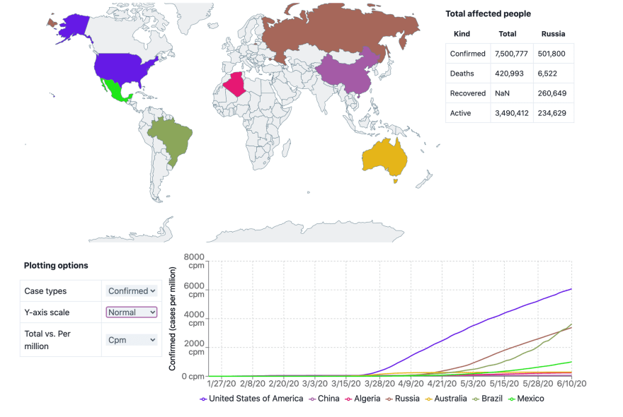
To switch between confirmed cases and deaths, total cases and cases-per-million, or normal versus log, just switch it on the right dropdown.
Takeaways
I hope you enjoy this project as much as I had with making it. Feel free to hack on it by downloading the source code and share it with all of your friends, family and co-workers. And wash those hands!
There is more where that came from!
Click here to give us your email and we'll let you know when we publish new stuff. We respect your email privacy, we will never spam you and you can unsubscribe anytime.
Originally posted at Code Mochi.

Latest comments (0)