From the desk of a brilliant weirdo #1:
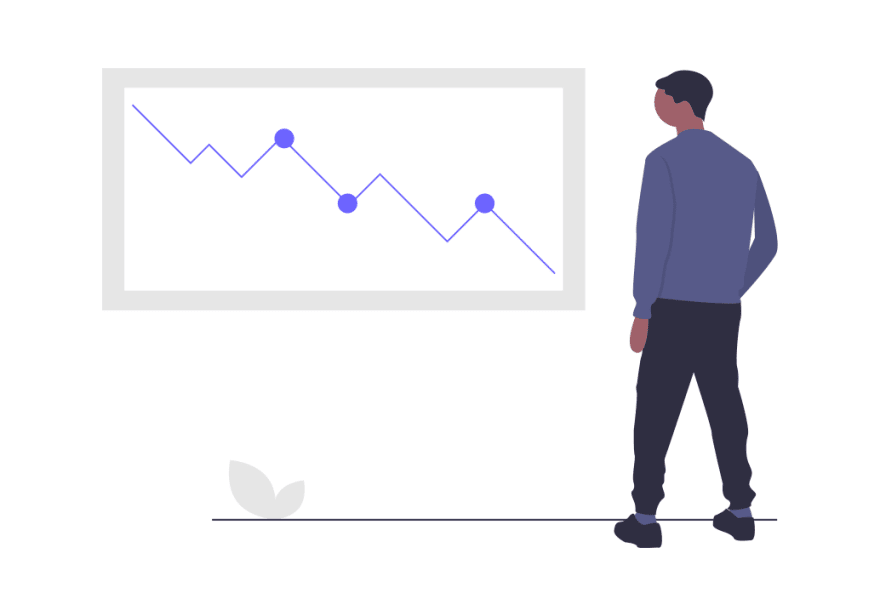
Burndown charts. We’ve all heard of them.
They are easy to understand. And make your team effective.
But what are their flaws?
What happens with a burndown chart when scope creep occurs?
What about burnup charts?
Find the answers to these questions and alike below.
Without further ado:
What is a burndown chart?
A burndown chart is a measurement tool that displays the amount of work remaining alongside the time you have to wrap it up.
The name "burndown" originates from decreasing the number of remaining tasks as you make progress.
The "burndown" creates a downward line, a slope, that shows how many tasks are left before the final deadline hits. In an ideal world, the line would be straight; no impediments would have arisen during development. That's, however, rarely the case.
A burndown chart consists of a vertical Y-axis and a horizontal X one. The latter displays the timeline whereas the previous shows the amount of work. Typically, the slope starts at the top of the chart glued to the Y-axis and "burns down" until it hits the ground, and all tasks are finished.
Two types of burndown charts are available: a sprint burndown chart, focused on the iteration, and a product burndown one, showing the remaining work for the entire project.
During a sprint planning session, all tasks are defined and put onto the sprint burndown chart's vertical axis. Instead of tasks, you can inject story points or work hours as well.
On the other hand, if you use a product burndown chart, you'll have product backlog items displayed on the Y-axis and the number of sprints on the X-axis.
A key reason for using burndown charts among agile teams is that it clearly illustrates work velocity.
Velocity means the team's work efforts associated with the user stories or assigned tasks completed during the iteration.
To calculate the team's work velocity, simply divide the amount of work completed by the number of days. To improve your work velocity, encourage the team to attend every scrum meeting; it brings team members on the same page.
How to read a burndown chart?
Step 1: Look at the X-axis
Identify whether you have days, weeks, or months shown on the X-axis.
Step 2: Now, consider the Y-axis
Does it show tasks? Story points? Or work hours?
Step 3: Identify the ideal line
The ideal line is a projected slope that depicts how the team progress would look like in a perfect world. It acts as a guideline.
Step 4: Follow the actual effort line
Based on the ideal line, you can tell whether you are moving behind or ahead of schedule by comparing it to the actual effort line.
Here are some sprint burndown chart examples:
Ideal scenario
Such a scenario illustrates a perfectly-organized team. The team isn’t behind schedule nor ahead of it. It wraps up the final task just in time. No adjustments are needed in this case.
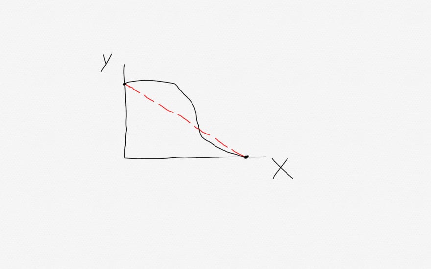
Still, a good scenario
This is quite a common scenario with experienced agile teams. It shows that the team started slowly but eventually caught up. During the scrum retrospective, the team should come up with a solution to the late start so the burndown chart can look more like in the first scenario.
Decent scenario
This one indicates that the team started slowly and was moving behind schedule. Yet, it managed to finish the sprint in time. During the scrum retrospective, adjustments should be made... be it moving low-priority tasks to future sprints or back to the product backlog.
Sh*t. Missed it again.
The team has missed the deadline. In this case, the next sprint's capacity should be "burned down" or decreased, so the team can have time to complete tasks or story points from the previous sprint.
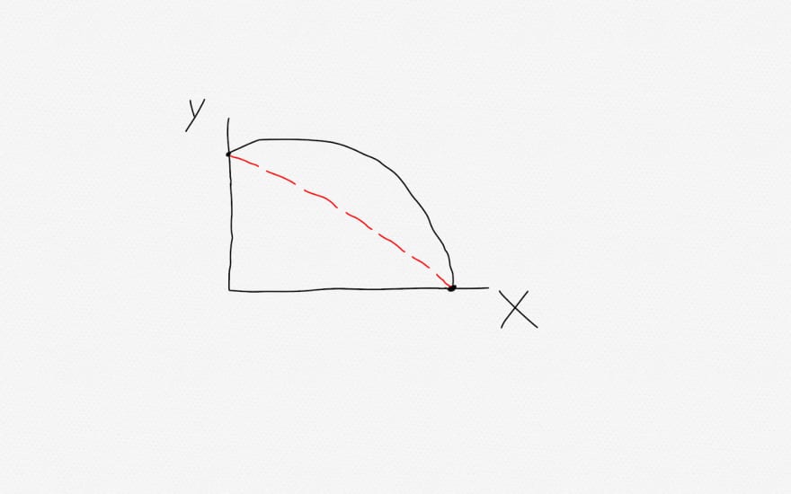
There’s something wrong...
In this scenario, the team might have overestimated the project’s timeline. The scrum master should help the team fix the estimations.
That’s odd...
This can be quite a tricky scenario. The team’s commitment has either decreased or the PO (product owner) has provided fewer stories than usual. The scrum master plays a vital role here and continually monitors the team’s dedication to the project and asks the PO to add more tasks to the sprint backlog if signs of slacking off appear.
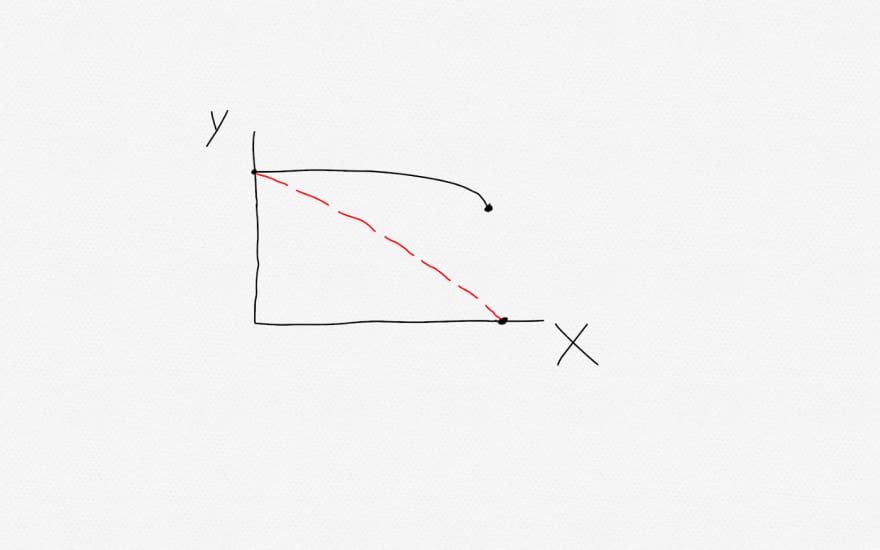
Ops, forgot about it.
The team is working hard towards meeting the deadline but isn’t updating the burndown chart throughout the process, only at the end. Or perhaps the PO has added an amount of work equal to the completed; therefore the line has stayed flat.
What is the average burndown rate?
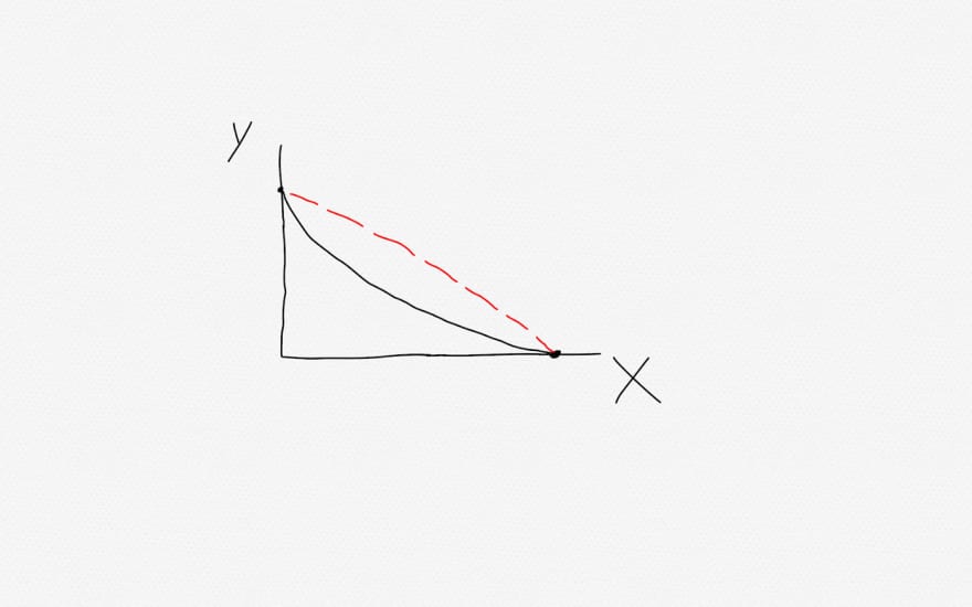
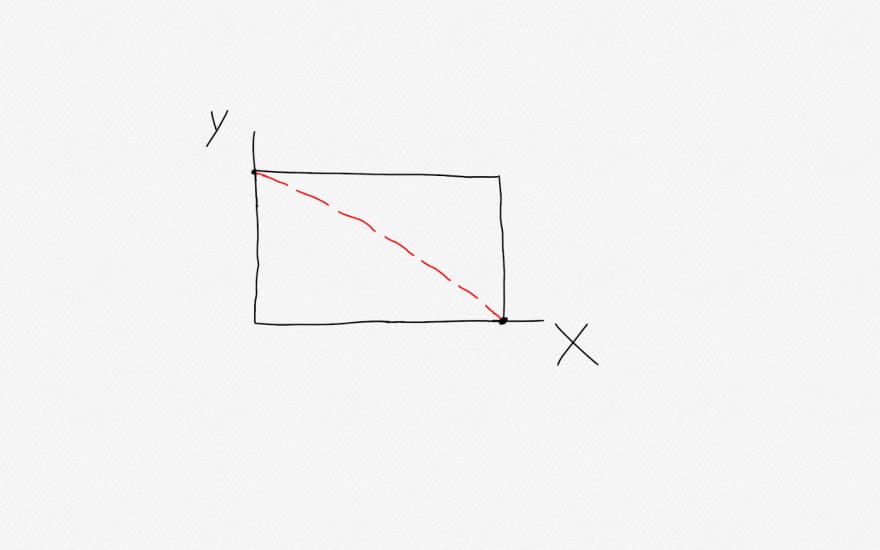
The average burndown rate, also known as the ideal line, guides the team throughout project development. It starts at the top of the Y-axis and ends at the right-most point of the X-axis.
It’s worth mentioning that not all tasks might be known at the start of the sprint. The backlog schedule may change, which will reflect the burndown chart as well. Nevertheless, the team should focus on how much they deliver rather than how much work they’ve done. Scenarios exist where teams are only spinning their wheels; try to avoid such.
Benefits of burndown charts
Burndown charts are easy to understand. You can track your team’s progress only with a glance; no need to delve into complex math-driven scrum diagrams.
The burndown chart is updated daily which means the SM (Scrum Master) can identify bottlenecks before they occur and prevent them from happening altogether. Product issues can also be addressed during scrum meetings so they don’t transform into bigger problems.
“Being a problem solver, for me a burndown chart's main benefit is that it quickly alerts our teams about any potential bottleneck situations and problems.” - Rorie Devine, Founder and CEO at GRO.TEAM.
Burndown charts can keep the team motivated as well. Seeing progress on a daily basis will keep the team dedicated to the project’s success.
You can keep clients in the loop without having to chat over novel-long performance reports.
Limitations of burndown charts
Burndown charts rely heavily on accurate sprint planning. If estimates aren’t accurate, then the progress you make will be nothing short of spurious measurement. That is, if you’ve underestimated time requirements, you’ll constantly be behind schedule. On the other hand, if you’ve overestimated, the team will feel like they are ahead of schedule, even if that’s not the case.
“The disadvantage of a burndown chart is that it often distracts teams from understanding what is going on under the surface as they focus on improving the chart itself. It leads to wrongly-prioritized backlog, unclear requirements, unrealistic expectations, and deadlines.” - Thierry Tremblay, CEO & Founder at Kohezion.
A burndown chart can use any Y-axis units like work hours, story points, and tasks. It was initially designed with work hours. A tracking system of work hours can be useful but not much. It mostly measures activity rather than accomplishment.
Team members don’t like recording their hours of remaining work. It feels like someone is always watching over their shoulder, which adds extra pressure to the already existing.
Sometimes, putting stories on the Y-axis instead of tasks can turn out to be quite an ineffective practice. The reason is simple. Each story is different from the others; it requires different amounts of effort to be completed. Therefore, one story can take as twice the time as another story, but the burndown chart won’t indicate it; it’ll leave management confused as to why the team isn’t making any visible progress.
Stories are typically larger than tasks and take longer to complete. Try to break your stories into smaller tasks and put those on the burndown chart. Big stories lead to a stair-shaped line that is inaccurate and ugly.
“if a developer has a 10-hour task, and has burned 8 hours they might only be 20% complete but the burndown chart will show 80% complete. It gives the project manager an inaccurate view of progress." - Logan Speights, CTO at Proxxy.
We know that backlogs change, work gets added, plans rarely go as planned, and teams get discombobulated.
As a result, burndown charts fluctuate. They might trend upwards when extra tasks or story points are added, or stay flat. The downside is that management may construe it as slacking off.
To avoid such situations, the scrum master needs to bring everybody on the same page by clearly communicating requirements and progress beforehand.
Or you can use a burnup chart...
What is a burnup chart?
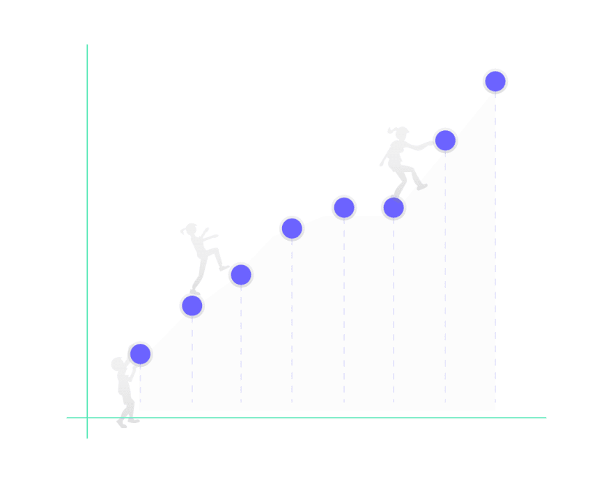
A burnup chart scales upward, and it's useful because it shows when more items are added to the sprint backlog whereas a burndown chart doesn't.
A burnup chart illustrates the team's completed work compared to the total scope. It also tells whether you are behind or ahead of schedule, or whether any potential impediments are likely to cross your path.
The burnup chart's vertical axis shows the amount of work, be it story points or work hours. And the horizontal axis represents the timeline in days, weeks, or months.
Besides the ideal and the actual effort line, there's a third one, the scope line, which is flat except when more work is added to the backlog; then it trends upward.
The difference between burndown and burnup charts
The main difference between a burnup and a burndown chart is that the latter shows you how much work is remaining. In contrast, the previous tells how much work you've completed so far.
When, in a burndown chart, scope creep occurs, the actual effort line may stay flat; thus, the client may question whether the team is actually working or idling. A burnup chart won't make clients doubt your team.
Yet, if there are no changes in the scope, the simplicity of burndown charts is preferable.
Burndown charts are better suited for sprint level projects, whereas burnup charts make more sense for long-term objectives, showing all the work completed so far.
Burndown chart software
Codegiant
Codegiant is a simply-designed project management software, mainly advertised to developers due to its extra features such as git repositories, built-in CI/CD, and robust documentation.
Codegiant’s issue tracker offers both Kanban and Scrum boards.
What’s more, it has a free plan for up to 5 team members.
Here are some of the features you can explore with Codegiant:
- Burndown charts + templates.
- Task status chart breakdown (complete, waiting for review, in progress, open).
- Task type chart breakdown (feature, hot fix, bug, improvement, blocker)
- Roadmaps.
- Sprints.
- Epics.
- Analyze your tasks’ performance.
- Tasks and subtasks.
- Tags, mentions, and comments.
- Time estimates.
- Import projects from Jira with our one-click Jira importer.
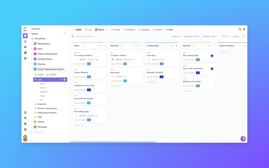
ClickUp
ClickUp is another great project management tool that boasts a myriad of features. It recently raised $35 million in Series A which means it’ll be adding more features and refining existing ones.
ClickUp lets you create powerful burndown charts to track and communicate project progress clearly.
ClickUp’s burndown charts illustrate a third line, a project progress line highlighting how your progress would look like if you were to continue at the same working pace.
Some other features that ClickUp includes are:
- Burndown chart examples and templates.
- Sprints.
- Docs.
- Tables.
- Conversations.
- And more!
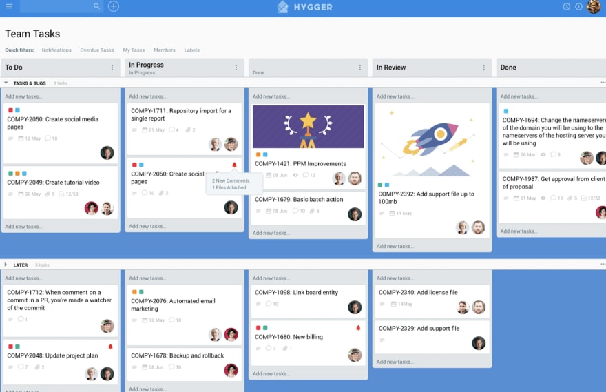
Hygger
Hygger deserves a place on this list due to its simplicity and a vast amount of features.
Hygger’s kanban boards come with time tracking, swimlanes, work in progress limits, burndown reports & charts.
More importantly, Hygger is designed with burndown charts and velocity reports. With them, you can keep your team on the same page so it can work unwaveringly and unflinchingly towards completion of the project.
And here are other features Hygger brings to the table:
- Burndown templates and metrics.
- Timeline.
- Task lists.
- Kanban boards.
- Sprint boards.
- Swimlanes.
- WIP limits.
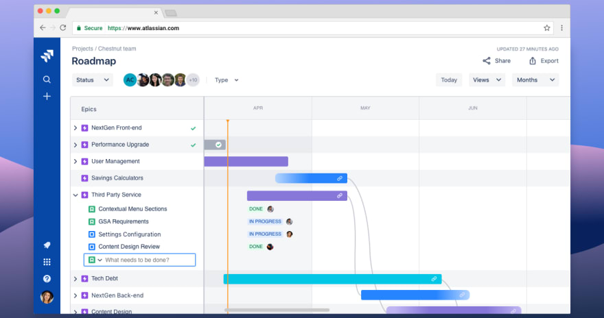
Jira
And, of course, Jira. Dating back to circa 2002, Jira is one of the most recognized project management tools among developers. Due to its initial bug-tracking design, however, it isn’t quite suitable for non-tech folk.
Jira comes with robust reports and burndown charts.
It’s trusted by more than 65,000 teams across the world. Here are some other features that you may find useful:
- Risk and release burndown charts.
- Dashboards.
- Roadmaps.
- Customizable workflows.
- Kanban and scrum boards.
- 3 Jira versions - Jira Align, suited for enterprises, along with Jira Core and Jira Software, mainly suited for smaller businesses.
- Mobile version is available as well.
Craft
If Jira seems a bit heavy for you, a great simplistic alternative to fill you with joy would be Craft.
Craft can put your team on the same page as it helps you visualize clearly milestones ahead of you so no second guessing happens in your head.
You can create new stories, add story points, custom fields, and effort to plan and prioritize.
Other features that Craft offers:
- Burndown charts.
- Velocity charts.
- Learn tabs for user feedback.
- Roadmaps.
- User story templates.
- Product roadmap examples.
“With Craft, everyone stays on the same page with clear milestones and sprint backlogs.” - Sam Cohen, CEO at Gold Tree Way.
Yet, if you are the kind of person to relish his creations, you can create an Excel burndown chart yourself.
Here you can find burndown chart templates for Excel and steps to follow to create one yourself.
Conclusion
Burndown charts are one of the best ways to track your team progress and make workflow adjustments when needed.
You can also use burnup charts if scope creep happens frequently - burnup charts will keep your clients in the loop.
Now that you know some cool software tools designed with burndown charts, go sign up for free and tell me what you think.
Stay unparalleled

![Cover image for Burndown Charts: Types, Examples, Benefits, Limitations [2020]](https://media2.dev.to/dynamic/image/width=1000,height=420,fit=cover,gravity=auto,format=auto/https%3A%2F%2Fdev-to-uploads.s3.amazonaws.com%2Fi%2Fvgzd9x3umxqf1ystau73.png)









Top comments (0)