Hey guys,
Today, I'm feeling so grateful for this DEV community. From the last few months this community gave me lot's of support. So in return I wanted to share something.
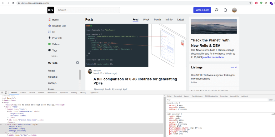
I have build this clone of this Dev.to. (Home page only)
Demo Link: https://devto-clone.vercel.app/
This clone has lot's of good features like in the dev,
Such as,
- Infinite Loading
- Skeleton UI etc.. It is mobile responsive.
Things that I have used to build this clone,
-- ReactJS (React hooks)
-- react-icons package
-- Sass for styling
I have also created tutorial, You can find it here:
Follow whole tutorial and you can learn lot's of things like,
-- Setting Layout
-- Creating Hamburger Menu
-- Getting data from API
-- Creating Skeleton UI
-- Infinite Loading
-- Mobile Responsive
-- React Hooks
-- Sass styling
-- Advanced Conditional Rendering etc.
You can find Full-Code from here.
Please share your valuable review!
All suggestions are welcome!
Thanks For Reading and Supporting.😄
Feel free to visit my youtube channel:
@CodeBucks
Follow me on Twitter where I'm sharing lot's of useful resources!
@code.bucks 😉
Note: This clone is for educational purpose only.


Top comments (24)
Nice work, is cool!!
One problem, your dropdown-menu It is misaligned:
Besides, it's perfect!! Congrats!!
Hey. Thanks for pointing that out! I will fix it. ^_^
Hii,
The site looks awesome,
Great Job,
A small changes from my end.
A small Minimal CSS changes will make the things look good.
margin: 0 auto; // This will make your container be in center
Adding this both in proper order or adding it in Inline Styling will help u achieve the below results.

Hey, Thanks for the suggestions! ^_^
This is cool!
Do you have any plans to refractor dev.to's code to react?
Good one.
Wow ! Very good work, thanks for sharing
You're welcome! 😇
Great Effort
Wow thanks Sir . This good reference
You're welcome! 😇
Great thanks
Good job!
Nice work!