
Exploratory data analysis (EDA) is an essential step in any data analysis project. It involves examining and analyzing data to uncover patterns, relationships, and insights.EDA is an iterative process that begins with simple data exploration and progresses to more complex analysis.
The main objective of EDA is to gain a deeper understanding of the data and use this understanding to guide further analysis and modeling. EDA can help in making informed decisions and generating new hypotheses, which can lead to new insights and discoveries.
Steps of EDA
1. Understanding your variables
Before beginning data cleaning, it is important first to understand the variables in your dataset. Understanding the variables will help you identify potential data quality issues and determine the appropriate cleaning techniques to use.
Reading data
We will use the IT Salary Survey for EU region(2018-2020) dataset
data = pd.read_csv("./Data/IT Salary Survey EU  2020.csv")

# get first five rows
data.head()

# get the last five columns
data.tail()

data.shape
This will return the number of rows by the number of columns for my dataset. The putput is (1253, 23) meaning our dataset has 1253 rows and 23 columns
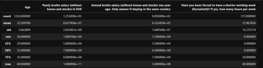
data.describe()
It summarizes the count, mean, standard deviation, min, and max for numeric variables.
# get the name of all the columns in our dataset
data.columns

# check for unique values
data.nunique()

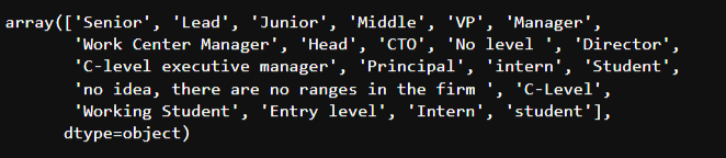
# check unique value for specific values
data['Seniority'].unique()
2. Cleaning the data
Before you start exploring your data, it's essential to clean and preprocess the data. Data cleaning involves identifying and correcting errors and inconsistencies in the data, such as missing values, duplicate records and incorrect data types.
By doing so, we can ensure that our analysis is based on high-quality data and that any insights or conclusions drawn from the data are accurate and reliable.
Renaming columns
First, we rename our columns with shorter, more relevant names.
data.columns = ["Year", "Age", "Gender","City","Position","Experience","German_Experience","Seniority","Main_language","Other_Language","Yearly_salary","Yearly_bonus","Last_year_salary","Last_year_bonus","Vacation_days","Employment_status","Сontract_duration","Language","Company_size","Company_type","Job_loss_COVID","Kurzarbeit","Monetary_Support"]
Remove any columns we might don't need
data.drop([
        'German_Experience', # analysis focuses on only German
        'Last_year_salary', # analysis covers only 2020
        'Last_year_bonus',  # analysis covers only 2020
        'Job_loss_COVID', # analysis isn't related to covid
        'Kurzarbeit', # analysis isn't related to covid
        'Monetary_Support', # analysis isn't related to covid
        ], axis=1, inplace=True)
Dealing with missing and duplicate values
Duplicates are records that are identical in all variables. Duplicates and missing values can affect the statistical analysis and visualization. One approach to handling this is to remove them from the dataset.
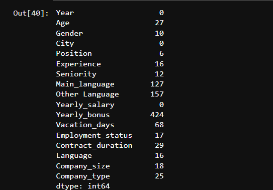
# check for missing values
data.isna().sum()
# Drop missing and duplicate values
data=data.dropna(subset=['Age','Gender','Position','Experience','Seniority','Main_language', 'Сontract_duration', 'Yearly_bonus'])
data=data.drop_duplicates()
We can use data.isna().sum() to confirm if there are any missing values left
Handling data type issues
Data type issues can arise from errors in data collection or data entry. For example, a variable may be stored as a string instead of a numerical value. One approach to handling data type issues is to convert the variable to the appropriate data type. In our case, we will convert datetime to date
#  changing datetime to date
data['Year'] = pd.to_datetime(data['Year']).dt.year
3. Analyzing relationships between variables
Correlation Matrix
The correlation is a measurement that describes the relationship between two variables. Therefore, a correlation matrix is a table that shows the correlation coefficients between many variables.
# calculate correlation matrix
corelation = data.corr()
we will use sns.heatmap() to plot a correlation matrix of all of the variables in our dataset.
# plot the heatmap
sns.heatmap(corelation,xticklabels=corelation.columns,yticklabels=corelation.columns, annot=True)

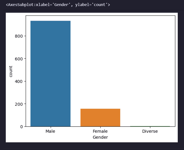
Countplot
A countplot is a type of visualization in which the frequency of categorical data is plotted.
It is a bar plot where the bars represent the number (or count) of occurrences of each category in a categorical variable.
Countplots are a useful tool for exploring the distribution of categorical data and identifying patterns or trends.
sns.countplot(x='Gender', data=data)
The hue parameter
The hue parameter is used to display the frequency of the data based on a second categorical variable. In our case, Contract_duration.
sns.countplot(x='Gender', hue='Сontract_duration', data=data)
The resulting plot shows the frequency of gender, grouped by the contract duration.

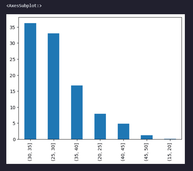
Histogram
A histogram is a graphical representation of the distribution of a continuous variable, typically showing the frequencies of values in intervals or "bins" along a numerical range.
bins = [15,20,25,30,35,40,45,50]
pd.cut(data['Age'],bins=bins).value_counts(normalize=True).mul(100).round(1).plot(kind='bar')
Conclusion
EDA is a critical step in any data analysis project. It allows you to understand the data, identify patterns and relationships, and extract insights that can help you make informed decisions.
There are several other types of visualizations that we didn't cover that you can use depending on the dataset, but by following the steps outlined in this article, you can conduct an effective EDA and extract valuable insights from your data.
The rest of the code where I perform more EDA on this dataset can be found on GitHub.
Till next time, Happy coding!✌️

Top comments (0)