Color is an integral element of any design because color influences the target audience’s thoughts and determines how they interact or use the design. Color also determines whether a design is able to deliver the right message to the audience and whether they are able to understand it. Color is not just a decorative element, but color is a key determinant of user experience. Say, for example, you have recently completed a website design project and other people in your team have appreciated the work. However, you find that your client does not like the look and feel of it, but he/ she is not able to explain why he/she can’t like the website that you have created.
If you analyze deeply, you may find that color may be the reason why your work is not getting approved. Different colors are associated with different emotions and they generate different types of reactions in people. The reactions that colors invoke are based on personal preferences, psychologies, and even social norms. When you make an attempt to understand user preferences, you actually take a step towards impacting user experience.
Here’s what you should take into account while choosing colors for UX:
Preferences and Expectations of the Users
What type of users is the website meant for? The users’ perception of your design may vary depending on their gender or the country/ region where they reside. It is quite interesting to note that gender is a critical consideration in deciding on the right set of colors for UX design. Research suggests that men and women demonstrate a preset pattern to like to dislike particular types of color. It has been observed that men have a tendency to prefer designs that are based on darker and more saturated colors whereas women love exploring websites that are based on subtle color palettes and lighter design themes. Some men would show strong reactions against websites that are based on feminine color schemes such as combinations of different shades of purple and pink. On the other hand, many women would dislike harsh color schemes that are based on dark backgrounds and saturated red accents. Men and women generally prefer mid-tone palettes.
Meanings that Colors Convey
Colors are associated with different emotional responses. Some colors invoke extreme reactions and such colors can be combined to create an overall theme. When an individual sees a color or a color combination, a certain type of response gets triggered in his mind.
Here’s what different colors convey:
*Red: Red symbolizes passion, danger, power, and love.
*Yellow: Yellow sends out a message of warmth, light, happiness, and approachability.
*Orange: Orange denotes encouragement, determination, creativity, and stimulation.
*Green: Green is symbolical of nature, freshness, growth, and harmony.
*Blue: Blue invokes feelings of calmness, serenity, trust, and confidence.
*Purple: Purple is associated with ambition, magic, royalty, and independence.
Color Establishes Brand Recognition
Colors become elements of identification for the brand. We always relate Coca Cola with the red color of its logo. The color is an instant identification for the brand and is often termed as “Coke Red”. If you change the color to something else, the brand would lose its identity. This would prevent Coca Cola’s fans from reacting in the expected manner. This might generate such a strong reaction that people might think the drink to be tasting different. In a nutshell, color can change people’s perceptions of a brand in both positive and negative ways. Color is an integral component of design because it establishes a distinct connection between the brand and its customers. Color gives an idea about the brand and tells users what they should expect from it. When you change the color of the brand or you use colors that do not resonate with the brand’s identity, you will end up generating negative user experience. Your website’s visitors would no longer be able to relate to the brand that they thought they felt connected with.

Color Associates with User Patterns
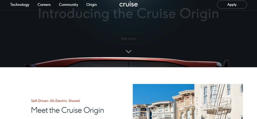
Color enhances user engagements. Did you ever get attracted to red or orange colored buttons on websites? As a matter of fact, bright colored buttons that are used against a lighter or darker background can generate immediate interest among the target audience. Brighter colored buttons invite clicks by allowing users to understand if they should engage with a certain visual element. A major part of ensuring satisfactory user experience is by providing users several opportunities to smoothly explore and interact with the website. For example, we would see a ghost-style button in Cruise’s website; the button features red hovering text over it. This is a different way how the button is designed, but it is this style that catches the attention of the visitors and makes them hit it. In simple terms, your website should feature Call-to-Action buttons that can invoke immediate, positive reactions in your target audience.
Color can Boost Sales Conversion
You should consider experimenting with different colors to find out the best possible color or color combinations for your website. You will be surprised to note that one color would bring higher sales conversion rate than the other colors. And interestingly, it may not be the color that you liked the most. You will improve your sales conversion rate when you have buttons that would prominently show up against the background. When you decide on your brand’s color palette, it is a good idea to go for contrast colors that can immediately invoke a positive response in your website’s visitors.

Color Ensures Smooth Accessibility
It is rather interesting to note that color does not produce only emotional or psychological impacts, but it has practical implications too. Color boosts a user’s experience by making a design appear more accessible and understandable. A design can promote customer engagement when customers are able to understand the design completely, interpret its meaning easily, and remember it for a long term. Your color choices should be in line with your website- visitors’ expectations and you should make sure that you are using appropriate color contrast ratios. You might consider making use of a color-bind filter to get an idea of what others might feel when they visit your website.
So what’s the final takeaway?
Color, in its core essence, is a vital tool to capture the attention of your target audience. With the use of the appropriate colors, you can make your target audience interact with your website in a more enthusiastic manner and engage with your content better. This would create a long lasting impact on their minds and promote brand awareness and recall. Appropriate color combinations impact users from both emotional and usability point of view. Make sure that you pay attention to details and experiment with colors to understand if your website’s color palette is producing the desired UX impact.

Top comments (0)