
Like most things in the world, there are different levels of risk for the current pandemic, depending on what is going on in your life, who you are, and who surrounds you.
Today I am showing off a couple of data models I created to show what risks you may or may not have to keep in mind during these weird times.
COVID Risk ER Diagram:
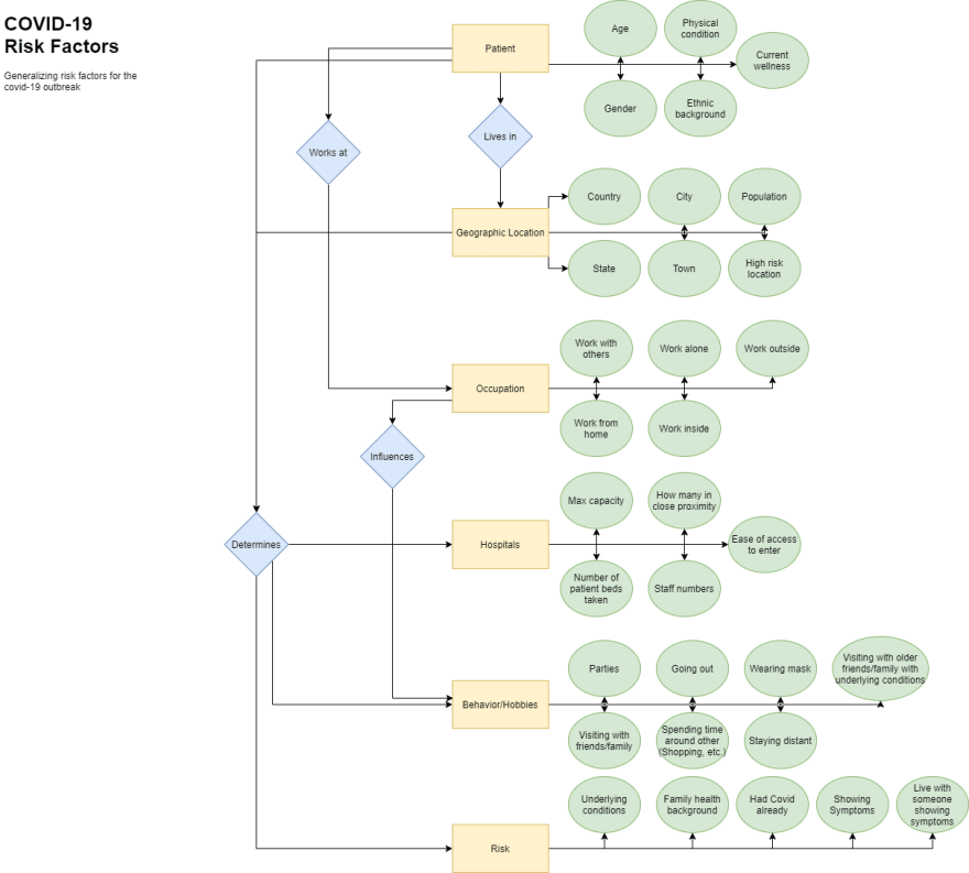
ER Explanation:
Patient, Hospitals, Geographic Location, Risk, Occupation, Behavior/Hobbies. These are all the things I have decided would be important to look out for when it comes to the risk of COVID. Each of these entities connects in a way that makes it easy to see that if you are relating to many of the attributes (Green ovals) in one of the entities you show a risk even without relating to any of the others.
Example Tuples:

Connecting the Diagram with the Tuple:
The ER Diagram directly correlates with the Tuples which will hold the data and information about each subject when data is collected. In theory, there could be an algorithm that takes all the data for each entity and spits out the risk for each subject depending on their personal information.
When designing this diagram I had almost the thought of a flowchart in mind, so if you follow the arrows you should be able to self judge your own risks. I tried to make my diagram in a way that I would be able to understand without too much background of the subject, so hopefully, it makes it simple to understand for you in this format.

Top comments (0)