I'm doing it, I'm learning Typescript. This post is the first of a series of where I'll be #LearningInPublic. As of right now, I have almost zero experience with Typescript, aside from some messing around with Angular. But after listening to Daria Caroway on React Podcast, I think I have a better understanding of how Typescript can be used to build component APIs that are, as she puts it, more "compassionate". The UX Designer side of me is very much attracted to this idea, While some developers are continuously looking for opportunities to optimize their code for efficiency, performance, or "clean code", I find myself trying to focus on the DX.
Where to begin?
If you're like me, lessons or tutorials can feel a little theoretical or contrived. This is one reason I find Gatsby starters to be so useful for starting out with a new technology. You can get hands-on with a new concept almost immediately. If you don't already have Gatsby CLI installed, you can install it with:
npm install -g gatsby-cli
The starter we'll be using is "gastby-starter-typescript-plus" which can be installed with:
gatsby new gatsby-starter-typescript-plus https://github.com/resir014/gatsby-starter-typescript-plus
Let's take a look at the structure of the project out-of-the-box:
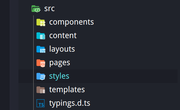
So far everything looks pretty familiar (assuming you're familiar with Gatsby). The one item within the /src/ directory that stands out is the typings.d.ts file. The file extension of .ts is intuitive enough, but what about the "d"? The contents of the file are as follows:
interface CSSModule {
  [className: string]: string
}

// type shims for CSS modules

declare module '*.module.scss' {
  const cssModule: CSSModule
  export = cssModule
}

declare module '*.module.css' {
  const cssModule: CSSModule
  export = cssModule
}
Thanks to some helpful commenting, it looks like this adds type support for CSS modules. We'll leave this as-is for now.
Let's move on to the /components/ directory. It should hopefully provide us with some decent templates to build upon:
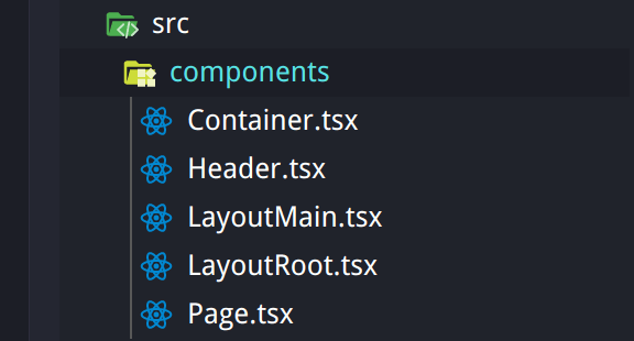
Starting at the top we have Container.tsx:
import * as React from 'react'
import styled from '@emotion/styled'

import { widths } from '../styles/variables'
import { getEmSize } from '../styles/mixins'

const StyledContainer = styled.div`
  position: relative;
  margin-left: auto;
  margin-right: auto;
  width: auto;
  max-width: ${getEmSize(widths.lg)}em;
`

interface ContainerProps {
  className?: string
}

const Container: React.FC<ContainerProps> = ({ children, className }) => <StyledContainer className={className}>{children}</StyledContainer>

export default Container
I'm sensing a theme emerging here. So far, this whole Typescript thing looks pretty straightforward. There are only a couple of differences here from a normal JSX component:
...

interface ContainerProps {
  className?: string
}

const Container: React.FC<ContainerProps> = ({ children, className }) => <StyledContainer className={className}>{children}</StyledContainer>

...
It looks like we have a new kind of declaration; an interface. Which is later invoked as part of the React functional component expression with a syntax of SomeComponent: React.FC<ContainerProps>. Now is a good time to jump into the Typescript documentation to find out what exactly we're dealing with here.
Interface
What is an interface? According to the documentation, interfaces allow us to define objects by their "shape". Personally, I really like this syntax, especially for typing props. It feels somewhat similar to writing PropTypes. And indeed you can include TSDoc (i.e. JSDoc) annotations, just as you would in a PropTypes declaration, which will show up in your VSCode autocomplete suggestions.
interface ContainerProps {
  /** className is a stand-in for HTML's class in JSX */
  className?: string
}
Let's take a closer look at how to define an interface.
First, we have the TypeScript keyword interface followed by the name of the interface we are creating:
interface ContainerProps
What follows next is a list of name/value pairs for each variable (specifically the props in this instance):
{
  className?: string
}
You've likely noticed the peculiar ?: syntax. This is used to specify the type for an optional property, as in this component may, or may not, pass a className prop. If it does, it must be a string.
Continuing on to the component declaration, we come across an FC type:
const Container: React.FC<ContainerProps> = ({ children, className }) => <StyledContainer className={className}>{children}</StyledContainer>
The React + Typescript CheatSheet notes that React.FC (which is synonymous with React.FunctionComponent)...
... provides typechecking and autocomplete for static properties like displayName, propTypes, and defaultProps
but also that there a numerous issues that you could run into by using it and that...
In most cases, it makes very little difference in which syntax is used, but the React.FC syntax is slightly more verbose without providing clear advantage, so precedence [is] given to the "normal function" syntax.
As a new user of Typescript, I'm not a fan of the extra verbosity. So in the interest of making the components as readable as possible, and to give us some practice lets convert these to the "normal function" syntax:
interface ContainerProps {
  children: React.ReactNode
  className?: string
}

const Container = ({ children, className }: ContainerProps) => <StyledContainer className={className}>{children}</StyledContainer>
As you can see this change is actually pretty minor, but I do think it makes the code easier to reason about, especially at first glance. Since we're no longer receiving the implicit definition for children, we'll need to be explicit in our interface. Once again, the cheat-sheet provides some guidance, suggesting that we use the type React.ReactNode. As we come across other component declarations, we can also update those to this syntax. If you'd like to skip doing this, the project files for this post contain the final code.
Now that we have a good handle on how to provide some basic typing to a component, let's take a stab at building our first component using Typescript.
Our First Component
Since my motivation for learning typescript is to build better APIs for my components, let's build a (basic) radio button group. Radio buttons can be tricky to style, and typically require a specific structure to even be able to style properly.
Let's start with what we'd like the end-state of our API to be:
<RadioGroup label="Do you like JavaScript?">
  <Radio value="true">
    Yes
  </Radio>
  <Radio value="false">
    No
  </Radio>
<RadioGroup>
This API removes a lot of the boilerplate typically required for an HTML form and replaces it with a structure that is consistent with more basic HTML elements (e.g. divs and spans).
With the goal defined, we can now begin to build our components.
Let's start with the parent component RadioGroup.
This is what we will end up with. Don't try to make sense of it now. We'll walk through it step-by-step:
interface GroupProps {
  /** The label for the set of radio buttons (e.g. a question) */
  label: string
  /** A unique id for the group */
  groupId: string
  /** Should be a Radio component */
  children: React.ReactElement<RadioProps> | React.ReactElement<RadioProps>[]
}

export const RadioGroup = ({ label, groupId, children }: GroupProps) => {
  const [selected, setSelected] = useState('')

  const handleChange = (event: React.FormEvent<HTMLInputElement>) => {
    setSelected(event.currentTarget.value)
  }
  return (
    <div>
      {label}
      {React.Children.map(children, (child, index) => {
        return React.cloneElement(child, { groupId, optionId: index, handleChange, selected })
      })}
    </div>
  )
}
Handling the Props
Since we know how we'd like the API to work, and what props we will have available, we can start by typing the props.
The three props the RadioGroup component expects are label, groupId, and children.
The label will be the question displayed along with the radio options. Since we are humans who read sentences made up of words and not robots that read 1's and 0's, we'll need this prop to be a string type.
Next, we have groupId. It will be used to group the inputs so the browser understands that only one option within a group can be selected. We'll use a string type here as well.
And finally, we have children. Things get a little tricky here, the built-in generic types like string and number won't help us in this situation. We need a more powerful type definition.
React Types
When we pass props as children, React does a lot under the hood. Suffice it to say, we want to use a definition that addresses all the various shapes children can be. Thankfully, the Definitely Typed project maintains a vast repository of type libraries. The Gatsby starter we're using comes pre-installed with the React specific libraries. If you were starting your project from scratch, you would need to follow the documentation here.
What we are looking for is a type that will ensure that the children that are passed are components (i.e. they include props) and that their props adhere to the interface that we define with RadioProps (we'll get to that later).
To be honest I've found it pretty difficult to know which React types are available and which is most appropriate. It took quite a bit of digging but I eventually came across this StackOverflow answer. Based on this I think ReactElement is the way to go.
What we are saying here...
children: React.ReactElement<RadioProps> | React.ReactElement<RadioProps>[]
...is that children can be either a single React element or an array of React elements. The shape of the element(s) must adhere to interface defined in <RadioProps>.
Moving on to the component body we declare the props that the component expects:
export const RadioGroup = ({ label, groupId, children }: GroupProps) => {
...
}
This is where we actually apply the interface that we just defined. The :GroupProps syntax used here is saying that the props destructured using the curly braces should adhere to the types defined in GroupProps.
The rest of the component is not too different from regular JSX:
export const RadioGroup = ({ label, groupId, children }: GroupProps) => {
  const [selected, setSelected] = useState('')

  const handleChange = (event: React.FormEvent<HTMLInputElement>) => {
    setSelected(event.currentTarget.value)
  }
  return (
    <div>
      {label}
      {React.Children.map(children, (child, index) => {
        return React.cloneElement(child, { groupId, optionId: index, handleChange, selected })
      })}
    </div>
  )
}
There are a couple of details I'd like to focus on...
handleChange()
The first is the handleChange() function. The event argument looks a bit strange. Since this project is using Typescript's "strict mode" as set in the tsconfig.json config file, implicit types of any are not allowed. If we don't explicitly define the event type we will see a warning that Parameter 'event' implicitly has an 'any' type.ts(7006). To get rid of this warning and satisfy the compiler, we'll define event as React.FormEvent<HTMLInputElement>.
React.cloneElement
The second detail I'd like address is the React.cloneElement method used inside of the React.Children.map method. This is only tangentially related to what we are doing with Typescript in this project, but understanding what is going on here will help address some questions you might otherwise have once we move on to the Radio component.
If we go back to take look at how we intend our components to be used, you'll notice that they are used in conjunction with each other:
<RadioGroup label="Do you like JavaScript?">
  <Radio value="true">
    Yes
  </Radio>
  <Radio value="false">
    No
  </Radio>
<RadioGroup>
We could have chosen to use Radio components as the children here, and then mapped them to entirely different components once they have been passed into the RadioGroup component. But, for the time being, I've decided to not obfuscate what is happening behind the scenes to the Radio component. This way when you hover the <Radio> component in your editor, you will see the full definition of the component:
(alias) const Radio: ({ children, className, groupId, optionId, value, handleChange, selected }: RadioProps) => JSX.Element
import Radio
The only props which are required to be set by the consumer of the component are value and children. The rest are set by the parent component (RadioGroup) by way of cloneElement:
React.cloneElement(child, { groupId, optionId: index, handleChange, selected })
To briefly summarize what cloneElement does:
- it takes three arguments
- a React element (
childin this case) - props to merge with the existing props
- new children to replace the existing ones (we're no using this argument)
- a React element (
Our Second Component
Well, look at that! We've successfully as built our first component and are ready to move on to another.
Once again, we'll focus on the details specific to Typescript.
interface RadioProps
interface RadioProps {
  /** label for radio button option */
  children: string
  /** additional classes */
  className?: string
  /** Input value */
  value: string
  /** Automatic */
  optionId?: number
  /** Automatic */
  groupId?: string
  /** Automatic */
  selected?: string
  /** Automatic */
  handleChange?: (event: React.FormEvent<HTMLInputElement>) => void
}
Most of this should look familiar when compared to the last interface we defined, although, there are a few differences.
The Children
The first difference is the type of children. You would think that they should be the same. However, there is a subtle difference. In our Radio component, we only want plain text (i.e. a string) to use as the label for the radio button. In the RadioGroup we want children who adhere to the GroupProps interface (which Radio components just-so-happen to).
The handleChange Prop
This time around we have a higher-order function that needs dealing with. We define this similarly to how we defined it in the context of the RadioGroup. The cheatsheet is once again a very useful resource.
Optional Properties
If you refer back to the cloneElement method in the Radiogroup component, you'll see these same props. They are marked as optional since they will always receive them from their parent. If they were marked as required. They would need to be provided when we invoke the component.
One Last Thing
export const Radio = ({ children, className, groupId, optionId, value, handleChange, selected }: RadioProps) => {
  return (
    <label className={className} htmlFor={`${groupId}_${optionId}`}>
      {children}
      <input
        type="radio"
        id={`${groupId}_${optionId}`}
        value={value}
        onChange={event => {
          // Since handleChange is an "optional" prop we need to check that it exists before invoking
          return handleChange && handleChange(event)
        }}
        checked={selected === value}
      />
    </label>
  )
}
The structure of this component is much more straightforward. The only difference is worth noting is the check for handleChange before we invoke it. That's it!
In Conclusion
We've covered a lot here (or at least it feels that way to me). This post was written in real-time as I've learned. Consequently, take anything I've said here with a grain of salt. I'm not covering this subject as a professional on the topic. My hope is that by learning along with you, we will run into the same questions. I'll share the answers I've found. If you find those answers are wrong please let me know!
Resources
https://www.gatsbyjs.org/starters/resir014/gatsby-starter-typescript-plus/
https://github.com/DefinitelyTyped/DefinitelyTyped
https://www.typescriptlang.org/docs/handbook/interfaces.html
https://stackoverflow.com/questions/58123398/when-to-use-jsx-element-vs-reactnode-vs-reactelement

Top comments (0)