
In recent years there's been a rise in what some people call utility-first CSS frameworks: Taking an atomic approach to CSS by combining single-purpose classes straight onto your HTML. It's easy to see why this format has taken off: you can build layouts more quickly when you don't need to write custom CSS, and no need to rebuild the files every time you make a change. Utility-first frameworks can also be configured to follow a strict design system, which feels lovely when you're building a design that follows the same design systems - designers often use consistent measures of space and width, so it feels great for your CSS to be so in-line with their vision straight out of the box.
One popular framework has been rising to dominance, with many agencies and software houses making use of the fast prototyping capabilities it has to offer. It's called Tailwind, and it looks like it could be a major player in the world of frontend development in the future.
So what's the problem?
Tailwind CSS tends to be a very divisive topic between developers: a bit like Marmite, you either love it or you hate it. And I think that's a crying shame, because most of the arguments against it could be addressed with a change in mindset. It's important to keep in mind that, as with anything in life, you should always pick the right tool for the job. I won't sit and pretend Tailwind solves everything: it's only useful in the right situation.
The thing is, Tailwind and other utility-first frameworks aren't at all like traditional CSS. If you look at a methodology we're all pretty familiar with, such as BEM, there is a massive difference in the source of truth of styles.
A new source of truth
With a methodology like BEM, there's a focus on maintaining a separation of concerns between your HTML, CSS and JavaScript. The CSS is generally considered to be the source of truth when it comes to styling, whereas HTML should only concern content. This works really well for monolithic sites such as Wordpress or static HTML sites, where you would be writing HTML that may repeat itself. For example, here's a simple media object structure:
<div class="media-object">
  <div class="media-object__media">
    <img src="avatar.jpg" />
  </div>
  <div class="media-object__content">
    Hello world! Here's some content.
  </div>
</div>
$module: 'media-object';
.#{$module} {
display: flex;
flex-direction: row;
&__media {
flex-basis: 48px;
}
&__content {
flex: 1 0 auto;
}
}The HTML for this object can be copy & pasted ad infinium, as would be the case if you were building a basic HTML page. Since the CSS is stored away in its source of truth, it doesn't matter too much if we repeat the HTML so long as the structure remains the same. It's not perfect and doesn't always feel right to copy and paste in this way, but by working in this way we can keep the styling pretty consistent even if it changes later down the line. If we change .media-object later on by adding padding, the change will be reflected wherever the class is used. This is where the confusion starts when moving over to Tailwind.
The problem is that many developers will move over to Tailwind and use it in exactly the same way as they used BEM: By copy-pasting HTML structures wherever required. Since Tailwind uses class composition to create styles, your source of truth no longer lies in the CSS files. The HTML itself becomes the source of truth for the way it looks. Here's the same component built using Tailwind's utility classes:
<div class="flex flex-row">
  <div class="w-7">
    <img src="avatar.jpg" />
  </div>
  <div class="flex-grow w-auto">
    Hello world! Here's some content.
  </div>
</div>
Imagine we have this media object copy-pasted all over a website; If we want to add padding to the top element, we would have to go through the whole site and manually add the padding class to each instance. Sure, you could use a find-and-replace tool to help, but this technique could lead to mistakes if you're not careful, and will become difficult to manage as the site grows.
This is why I wouldn't recommend Tailwind if you're not using component-based framework. This is why so many people grow to hate Tailwind: because they're using the wrong tool for the job, and it's working against them. It's just not designed to be used in the traditional sense.
Component-based architecture
The place where Tailwind really shines is in modern frameworks: Be it JavaScript frameworks such as React and Vue, or template systems like Twig, this approach to CSS thrives when combined with a component-based architecture.
In such systems, the source of truth for the styles can be merged with the structure of the site. In these systems, developers are encouraged to build reusable, composable components. For example here's the same media object built using React:
// MediaObject.js
export default function MediaObject({ children, img}) {
  return (
    <div class="flex flex-row">
      <div class="w-7">
        <img src={ img } />
      </div>
      <div class="flex-grow w-auto">
        { children }
      </div>
    </div>
  )
}
This file, MediaObject.js, is now the absolute source of truth for the way the component looks and feels: There's no CSS file off in the distance being relied on, no HTML that needs to be copy-pasted a gazillion times. Everything's here in this one file.
As you can see, this component doesn't care about the content it contains: both the media and the text content are props passed down when component is used anywhere. Here's an example of how MediaObject would be called on a page:
<MediaObject media="avatar.jpg">
  <h3>Person Personson</h3>
  <p>Hello world!</p>
</MediaObject>
"But what about modifiers?", I hear you ask. Well, component-based frameworks can handle that easily too, and do much cooler things while they're at it.
For example, let's say we also have a dark variant of the media object with a dark grey background. Not only does the background colour need to change, but the colour of the text inside needs to change to contract with the darker background.
`{% raw %} - please excuse these tags, I'm not used to dev.to and the page won't render without them. But if anyone knows how to hide them, please let me know!
// MediaObject.js
export default function MediaObject({ children, img, modifiers }) {
  const bgC = modifiers.isDarkBG ? 'bg-dark-grey' : 'bg-transparent';
  const textC = modifiers.isDarkBG ? 'text-white' : 'text-dark-grey';

  return (
    <div class={`flex flex-row ${ bgC }`}>
      <div class="w-7">
        <img src={ img }
      </div>
      <div class={`flex-grow w-auto ${ textC }`}>
        { children }
      </div>
    </div>
  )
}
{% endraw %}`
Now we can make use of ordinary JavaScript to control look at feel using a 'modifiers' object, which gives us far more powerful tools for building conditional styles. There's so many more ways to use this, and once you get used to working in this way it starts to feel really natural and intuitive. You can define conditions inside the component itself, or pass a string of class names directly through for extra control.
It's recommended when building components to take advantage of abstraction: You can move different levels of logic into different files for the same component. The best example of this in React is container components vs presentational components.
Abstract business logic to keep it tidy
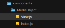
By wrapping the view of the component (the way it looks) inside a container where the business logic (the way it works) is stored, you can isolate different concerns into different files. I'll often use a folder structure where the folder name is the name of the component, and there are two files, index.js and View.js. index.js is the container component, while View.js is the presentational component.
By keeping all my presentational logic inside View.js, including any conditional styles based on the modifier prop, I can make sure any logic that doesn't concern the way the component is styles is kept in the container component, index.js. This really helps with tidiness and staying sane, as everything has a logical place to go.
`{% raw %}
// View.js
export default function MediaObjectView({ children, img, modifiers }) {
  const bgC = modifiers.isDarkBG ? 'bg-dark-grey' : 'bg-transparent';
  const textC = modifiers.isDarkBG ? 'text-white' : 'text-dark-grey';

  return (
    <div class={`flex flex-row ${ bgC }`}>
      <div class="w-7">
        <img src={ img }
      </div>
      <div class={`flex-grow w-auto ${ textC }`}>
        { children }
      </div>
    </div>
  )
}
{% endraw %}`
// index.js
export default function MediaObject({ children, img, modifiers }) {
  // any business logic can go here and be passed to MediaObjectView using props

  return <MediaObjectView {...children, img, modifiers} />
}
In theory, you could keep on abstracting components as many times as you like. It's generally recommended to stick with a max of 2, but I'm sure there's some cases where separating logic even further would be beneficial.
Is Tailwind right for me?
Well, maybe. If you're building static HTML sites, probably not. If you're building Wordpress sites with PHP, you'd be best off using some kind of templating engine to maintain your source of truth. But if you're using a modern JavaScript framework like React or Vue, I highly recommend giving it a try: It's very different and comes with its own challenges, but can be a joy to use and extremely powerful if used in the right way. Just don't expect to be able to use the same concepts you learned with BEM - it's a completely different box of frogs.
Learn more about Tailwind on the official website, and watch this great presentation for more details on how to use Tailwind in place of traditional CSS.


Top comments (3)
With component-based solutions, you lose the ability to make global changes. While you only have one place to change your media object, if your company's colour scheme changes or the site gets a holiday makeover, you're back to making changes in a million places again - and that sort of thing happens a lot.
Thanks for your comment!
In this example, I would change tailwind.config.js directly and update the colour class that was used. They work in the same way as variables, so if I had a class called bg-brand-primary, I could update the colour named brand-primary in the config, and this would be reflected everywhere brand-primary is used. In this way, your config file is where you can easily make global changes.
You could name them the same as you would regular CSS variables: css-tricks.com/what-do-you-name-co...
Hope that clears it up, let me know if I've understood you wrong.
The problem is, that if you run a takeover on your site - for instance, you have a sale in your shop and everything has little fairies waving wands at prices, and the boxes are all double the size they normally are - these are multiple changes. Yes, you could make everything a variable and put it in your config, but that's unmanageable for anything more complicated than a few simple things.