
This post was originally posted on jordanbradleyward.com
Umbraco Grid Layout Guide
Overview
In this Guide we will cover the basics of using the Grid Layout property, configuring our first Grid Layout, setting custom settings and styles, how to use them in the Content section and how to configure Content Templates. Content Templates are particularly useful with the Grid Layout. We will also have a look at a custom plugin called ‘Doc Type Grid Editor’, This allows document types to be used to populate a grid cell. To start clone the repository from this location: https://github.com/cgcgames/InitialUmbracoSite This project comes with a basic install of Umbraco and a homepage already configured.
Setting up the grid editor
On a fresh install of Umbraco there is no pre-configured Grid Layout ready to go. However, the property editor exists and has a nice GUI setup for configuring the settings effortlessly. To get started Navigate to the Umbraco back office (If you need help setting up Umbraco reference the Initial Developer Guide for guidance)
Configuring the grid editor
Let’s get started with the configuration, I will also run through what all the different settings are and how they are used.
- From the Umbraco back office navigate to the Developer section, hover over the Data Types folder and click the three dots. This will open a dialog window, select New data type:

- Select ‘Grid layout’ from the property editors in the drop down:

- The first configuration you will see is Grid Layouts, when there has yet to be any content added the editor will have a choice of layouts. You will often only need one of these. However, some designs/sites may want a Sidebar layout. For this we will leave the default layouts already defined, however we will be making a change to allowed rows after configuring a few.
- Let’s add two new row configurations, we want to add a two-col config and three-col config made up of equal parts. The column count we are using is 12, this means we want a 6,6 row and a 4,4,4 row. Click on ‘add row configuration’, give it a name of Two Column and then click the ‘+’:

- Set the width to ‘6’ and then click the plus icon again:

- The other settings can be left as default:
 Maximum Items: This defines the maxium amount of editors that can be added to this cell by the content editor. Delete: Delete allows you to delete the current cell that is selected. Allow All Editors: Uncecking this field allows you to define which editors the content editor is allowed to add to this cell.
 - Repeat above setup to create a Three Column row configuration, you should now have something that looks like this:

- Now lets go back to the Grid Layouts section, We want the 2 Column layout to only be able to add the ‘Headline’ (full width) row to the 4 column cell and to only be able to add the ‘Headline’ and ‘Two Column’ row to the 8 Column cell. Click on the 2 Column layout, select the 4 column cell and uncheck ‘Allow all row configurations’:

- Check only the headline row configuration:

- Select the 8 column cell and uncheck all row configurations. Then check the Headline and Two Column configurations. Once complete click submit.
We are using a 12-column grid in this example; however, it is possible to change the column size if desired. If this is done, the css and classes will need updating. The default grid works with Bootstrap 3, and Bootstraps default is a 12-column grid. So, we will be leaving the setting as a 12 column grid: 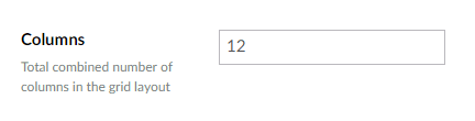 The next section we will look at setting the custom styles and settings.
Setting custom settings and styles
The custom settings and styles allows us to inject classes, attributes and styles into a containing div around a grid cell (i.e. a container div around a col-md-4 for example). Umbraco has some good documentation on what configuration settings are available here: https://our.umbraco.org/documentation/getting-started/backoffice/property-editors/built-in-property-editors/Grid-Layout/Settings-and-styles
Editing Settings
By default, the Grid Layout comes with one predefined settings already, this setting allows for the content editor to input custom classes that will be added in a wrapping div to a row or cell. To view this, click on the edit button:  You will then see this JSON configuration:
  Label: The label property is what will appear to the content editor when they look to edit this. Description: This is the description field that will appear to the content editor. Key: This is the attribute you want to add to the div container (i.e. class, data-custom, aria tags, etc) View: This is the view (editor) you want the content editor to be able to use, examples:
- textstring – allows the user to add plain text
- radiobuttonlist – allows the user to select from radio options
- imagepicker – allows the user to select an image
Let’s create a radio button list that will have some values that can be used to populate a data-custom attribute. Creating a Custom Setting From the edit settings dialog window, create a new JSON setting block, and populate it with the following code:
[
  {
    "label": "Class",
    "description": "Set a css class",
    "key": "class",
    "view": "textstring"
  },
  {
    "label": "Custom Data",
    "description": "Set a random custom data field",
    "key": "data-custom",
    "view": "radiobuttonlist",
    "prevalues": [
      {
        "label": "Important Value 1",
        "value": "value_1"
      },
      {
        "label": "Important Value 2",
        "value": "value_2"
      },
      {
        "label": "Important Value 3",
        "value": "value_3"
      }
    ]
  }
]
Important: be sure to add a comma to the end of the ‘}’ before adding your new custom setting. Key: As you can see the key has been set to “data-custom”, this means it will generate a attribute in the div container like so
. Prevalues: The other thing that is different is the addition of prevalues, this is used when certain values need to be predefined. In our case we are using the ‘radiobuttonlist’ which needs the options the content editor can select from pre-defined. After adding in the new setting click submit, if there are no errors in your JSON it should submit successfully, and you will then see the new custom setting:
Editing Styles
By default, Umbraco comes with one style already pre-defined. This style allows the content editor to ad a background image to either a row or cell. The Styles configurations allows you to add inline styles to the containing div element. To view this configuration, click the Edit button in the Styles section:  You will then see the JSON configration:
  Label: The label property is what will appear to the content editor when they look to edit this. Description: This is the description field that will appear to the content editor. Key: This is the css property you want to add (i.e. background, padding, padding-bottom, margin, etc). View: This is the view (editor) you want the content editor to be able to use Modifier: The modifier is a string formatter to modify the output of the editor to prepend or append extra values. Let’s create a padding bottom option, that will allow the user to select a padding option for rows only. Creating a Custom Style From the edit style dialog window, create a new JSON style block, and populate it with the following code:
[
  {
    "label": "Set a background image",
    "description": "Set a row background",
    "key": "background-image",
    "view": "imagepicker",
    "modifier": "url({0})"
  },
  {
    "label": "Set Bottom Padding",
    "description": "Set the bottom padding for a row",
    "key": "padding-bottom",
    "view": "radiobuttonlist",
    "applyTo": "row",
    "prevalues": [
      {
        "label": "Small",
        "value": "10px"
      },
      {
        "label": "Medium",
        "value": "25px"
      },
      {
        "label": "Large",
        "value": "50px"
      }
    ]
  }
]
You will notice the above code is very similar the class setting we created. I will not dive into all the details for this one. The only difference is we, update the label and description to be relevant. We set the key to padding-bottom and set the create values for the prevalue list, and lastly, we set the applyTo. applyTo: The apply to is used to say where you want this setting to be managed, as we only want this setting to be added at a row level, we define only row in the settings. After adding the above code, click submit. If all the JSON is formatted correctly you will now see the new style setting, we have added: 
Rich Text Editor Settings
Lastly the Rich Text Editor settings, this allows you to edit what the RTE looks like when added it to the Grid Editor, I will be leaving all this as the default settings. Its worth noting that these can be changed and updated later. I will however adjust the height of the RTE to 300 px, I find this gives a nicer editing experience. 
Content Editing
To be able to use the grid layout for content editing we will first need to add it to a document type. In this section we will look at adding the Grid Layout to a content page, and how to use it in the Content editing section. We will be using the project listed in the overview to add the Grid Layout to the Home Document type.
Adding the grid to a document type
Let’s start by adding the Grid Layout to the document type. First navigate to the settings section within Umbraco.
- From the Settings section, click on the Home document type:

- Scroll to the bottom and click add Another Tab:

- Name the tab what ever you like, in my case its ‘Grid Layout’. Then click on ‘Add Property’:

- Name the property what ever you like, I have named mine ‘Grid Content’. Then click on ‘Add Editor’:

- From the ‘Select editor’ dialog, search for the Grid layout we just created and select it:

- Click submit, and then click save:

- Lastly, let’s re order the tabs so the Grid Layout tab is the second tab. Click on Reorder from the top:

- Set the order number to 10 on the Grid Layout tab:

- Click ‘I am done reordering’ and save the document type.
Added Content to the grid
In the last section we added the Grid Layout property to the home Document type, in this section we are going to look at how we can use the Grid Layout to add content to our website. First navigate to the content section Adding first bit of content:
- From the content section click on the homepage:

- Then Click on the Grid Layout Tab:

- You will now see the initial screen for adding content, this allows you to choose the layout. For this we are going to look at the 1 Column layout, click that and continue:

- The next screen is to pick a row, select headline and continue:

- You will now see the ‘Add Content’ option, click on that will show you the content options:

Overview of Content Types:
-
Embed:
- This content type allows you to paste in a YouTube URL and embed YouTube videos, it also works with Vimeo links.
-
Headline:
- This content type allows you to place headings within the layout, the heading block renders out its content has h1’s. This can be changed in the grid.editors.config.js file, more on this later.
-
Image:
- This allows for an image to be picked from the media section and placed on the page.
-
Macro:
- This allows macros to be to be added within the grid, macros are partial views with parameters. They are created within the ‘Developer’ section of Umbraco. More information on these can be found here: https://our.umbraco.org/documentation/reference/templating/macros/
-
Quote:
- This allows a blockquote to be added to the page.
-
Rich Text Editor:
- This adds a RTE editor, that allows you to add rich content. Unlike the RTE data type, the configuration for this RTE is found in the Grid Layout data type configuration.
For this example, let’s add a heading and a rich content to a full width row.
- After clicking ‘Add Content’, select the Headline Content type:

- Populate the headline with any text you would like, I have placed ‘Heading 1’ in mine.
- Click ‘Add Content’ again and this time select ‘Rich Text Editor’:

- Populate the RTE with some dummy lorem ipsum (https://www.lipsum.com/feed/html)
- Lastly, save and publish the page.
You should now have something that looks like this:  Adding a new Row It is possible to add a new row now, let’s add the 3 column row next, to do this click on the plus icon below the Headline row:
  Then select the “Three Column” row:
  Populate the three columns with any content that you would like, you should have something that looks like this when you finish:
  Save and publish the content after adding it in. Note: The content will not be visible yet, as we will need to add a little bit of code for the homepage view to render the grid content.
Adding settings and styles
During the Grid Layout configuration, we added some custom settings and styles, let’s have a quick look at how we can set these and use them within the content editing section. Added style or settings to a row To add a style or setting to a row, first click on the row you would like to add these settings too. You will then see a cog wheel appear in the top right of the row:  Click on the cog wheel, this will then open the settings dialog. You will then see all the Custom settings and styles we configured. You should see something like this:
  Class: The Class property allows you to add a close that will wrap the wrong. You can add as many classes as you like, be sure to separate them with a space. Custom Date: This is the custom data property we created, this gives you a radio option list. Selected one of these will add the value to the data-custom attribute of the containing div. Style: The Style property allows you to set an inline style, with a background image. This will set the background image for the containing div around the row. Set Bottom Padding: This is the custom padding style we configured in the earlier step. This is a radio option list, that allows you to select how much, if any padding you want to add to the containing div that wraps the row. Input some random values and click submit. Adding style and settings to a cell To add a style or setting to a cell, first click on the cell you would like to add these settings too. You will then see a cog wheel appear in the top right of the cell:
  Click on the cog wheel, this will then open the settings dialog. You will then see all the Custom settings and styles we configured. You should see something like this:
  Notice how you can not set the Padding bottom, because we defined it to only be allows in rows. Add some random settings and save the page.
Rendering the Grid
In this section we are going to look at how you can render the grid that we have now configured and added content to. Luckily this is easy, all it takes is one line of code to render the grid to the page. As we have added the grid to the homepage, you will need to add the code to the Home.cshtml view. Navigate to the Home.cshtml file in the Visual Studio Solution, this is in the views folder: 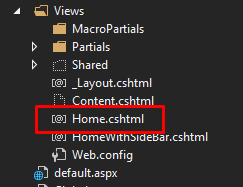 The line of code that you will need to add to render the grid is the following: @Html.GetGridHtml(Model.Content, "gridContent") “gridContent” – this is the string for the property alias. This can be found by looking at the property in the document type section:
  The full code for the template looks like this:
@inherits Umbraco.Web.Mvc.UmbracoTemplatePage<ContentModels.Home>
@using ContentModels = Umbraco.Web.PublishedContentModels;
@{
    Layout = "_Layout.cshtml";
}
<section class="@Model.Content.StyleSelector.ToString().ToLower().Replace(" ", "-")">
    <h1>@(Model.Content.Title ?? Model.Content.Name)</h1>
    @Html.Raw(Model.Content.Content)
    @Html.GetGridHtml(Model.Content, "gridContent")
</section>
Lastly, because the Umbraco grid editor is using bootstrap 3, you will want to include the CSS in the
section of the site. Go to the _Layout.cshtml view file and add this code within the tag:<link rel="stylesheet" href="https://maxcdn.bootstrapcdn.com/bootstrap/3.3.7/css/bootstrap.min.css" integrity="sha384-BVYiiSIFeK1dGmJRAkycuHAHRg32OmUcww7on3RYdg4Va+PmSTsz/K68vbdEjh4u" crossorigin="anonymous">
Save the views and navigate to the homepage. You should now see something like this on the homepage:  If you inspect the heading 1 element, in chrome that is right-click - > inspect. You should see the custom styles and settings you set against the row:
Editing basic mark-up
In this section, we will look at where the mark-up for the grid layout exists and how we can make alterations to the code. By default, rendering a grid editor will use the bootstrap3.cshtml view file, this is found in Views -> Partials -> Grid:  The editor partial views all exist in the Editors folder. There is a lot of things that can be done in this section, and I will be covering this in another guide. However, on a simpler level it is possible to make small tweaks very easily (i.e. add a class to an item or add a wrapper div). Let’s look at the Media.cshtml editor for example:
  As you can see from the above image, the partial view is doing a few things. The top part is working out if there are any crop settings configured and adding them to the image URL if needed, then the image is rendered in an
 tag. You could quite easily add a class=”” to the image tag or wrap the whole
tag in a containing div if you needed. This would then be rendered when an image is added to the grid editor. I will be making a more in-depth guide about editing the mark-up for the grid editor, and adjust the grid editor to work nicely with bootstrap 4.
Grid Editor Document Type Plugin
There is a fantastic plugin for the grid editor, this plugin allows you to add a document type as content to a cell. This allows you to make flexible content items (i.e. image carousels, accordions, custom lists etc). In this section, we will look at installing and configuring this document type. You can find the Umbraco Package page here: https://our.umbraco.org/projects/backoffice-extensions/doc-type-grid-editor/
Installing the custom plugin
This package can be installed via NuGet, open the package manage console for the solution (Tools -> NuGet Package Manager -> Package Manager Console):  in the console run the following command: Install-Package Our.Umbraco.DocTypeGridEditor
  After the installation has completed you should see this readme.txt open:
  You will need to copy the code from above and paste that into the grid.editors.config.js (config -> grid.editors.config.js):
Explanation of settings
The above settings we pasted in the grid.editors.config, tells the grid editor where to find the plugin and what settings to use. We will want to configure a few of these. So, I have outlined a basis of what the settings control below.
Name
The Name configuration option is the name that is rendered to the content editor when they click Add Content and should be something relevant and easy to understand for the content editor.
Alias
This is the alias for the that identifies the editor and should be unique.
View
This is the view to be used for the Back-office and is what is rendered to the content editor.
Render
This is the render that is used for this editor, this allows for a custom render to be used rather than the default render.
Icon
The Icon property is what defines the Icon that is used when appears in the ‘Add Content’ window. This allows you to reference any icon that is within the Umbraco Icon list. You can get the alias required by hovering over the Icon in the Icon picker in the back office. 
Config
AllowedDocTypes: An array of doc type aliases of which should be allowed to be selected in the grid editor. Strings can be REGEX patterns to allow matching groups of doc types in a single entry. Ie “Widget$” will match all doc types with an alias ending in “Widget”.
- enablePreview: Enables rendering a preview of the grid cell in the grid editor.
- viewPath: Set’s an alternative view path for where the Doc Type Grid Editor should look for views when rendering. Defaults to /Views/Partials/Grid/Editors/DocTypeGridEditor/
- previewViewPath: Set’s an alternative view path for where the Doc Type Grid Editor should look for views when rendering the preview in the back-office. Defaults to /Views/Partials/Grid/Editors/DocTypeGridEditor/Previews/
- previewCssFilePath: This allows for custom css file path to be added to render in the back-office when previewing content.
- previewJsFilePath: This allows for custom JavaScript file path to be added to render in the back-office when previewing content.
Configuring the plugin
In this section we will look at configuring the plugin to work with two editors, one that allows documents for smaller cells and one that allows documents for larger cells. We will get this to work by naming convention and configuring the grid to only allow the editor we specify for the different sizes.
Configuring the Settings
Look at the blow configuration settings we are going to use:
{
    "name": "Full Width Documents",
    "alias": "docType",
    "view": "/App_Plugins/DocTypeGridEditor/Views/doctypegrideditor.html",
    "render": "/App_Plugins/DocTypeGridEditor/Render/DocTypeGridEditor.cshtml",
    "icon": "icon-item-arrangement",
    "config": {
       "allowedDocTypes": ["BlockFull$"],
       "nameTemplate": "",
       "enablePreview": true,
       "viewPath": "/Views/Partials/Grid/Editors/DocTypeGridEditor/",
       "previewViewPath": "/Views/Partials/Grid/Editors/DocTypeGridEditor/Previews/",
       "previewCssFilePath": "",
       "previewJsFilePath": ""
    }
},
{
    "name": "Block Documents",
    "alias": "blockDocType",
    "view": "/App_Plugins/DocTypeGridEditor/Views/doctypegrideditor.html",
    "render": "/App_Plugins/DocTypeGridEditor/Render/DocTypeGridEditor.cshtml",
    "icon": "icon-item-arrangement",
    "config": {
        "allowedDocTypes": ["Block$"],
        "nameTemplate": "",
        "enablePreview": true,
        "viewPath": "/Views/Partials/Grid/Editors/DocTypeGridEditor/",
        "previewViewPath": "/Views/Partials/Grid/Editors/DocTypeGridEditor/Previews/",
        "previewCssFilePath": "",
        "previewJsFilePath": ""
    }
}
As you can see we have defined the plugin twice, each definition has its own name and alias. But the key setting to look at here is the “ allowedDocTypes ” :
- Block$ - this tells the plugin to only look for document types that end with Block.
- BlockFull$ - this tell the plugin to only for document types that end with BlockFull.
This will now let us configure document types and add either Block or BlockFull to the end of its name. Allowing it to be picked up by the correct editor. Configure the grid We will also need to configure the grid to only allow these editors on the correct grid size. To do this navigate to the Grid Layout Data type we created earlier:  You will need to adjust the settings for every row configuration and every cell in each row. To start, lets update the settings for the three-column row configuration. Click on the configuration, select the first cell, uncheck the “Allow all editors” checkbox and then select all editors apart from the “Full width Documents” editor:
  Repeat this for the other two cells for this configuration. This is done by clicking on the other cells in this configuration. Update all other row configurations to match with the following information:
- Headline
- Don’t Allow ‘Block Documents’
- Article
- Col-4: Don’t Allow ‘Full Width Documents’
- Col-8: Allow all Editors
- Two Column
- Col-6: Don’t Allow ‘Full Width Documents’
- Col-6: Don’t Allow ‘Full Width Documents’
All settings and configurations should now be set, save all these settings and continue to setting up the document types.
Configuring the document types
Navigate to the setting section and create two new folders in the document type folder. Call one folder Grid Blocks and the other Grid Full width Block: 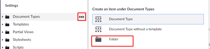 You then should have something that looks like this:
  Let’s create two new document types that can be used for the full width block and block editor types. Remember these are document types so you get the full power of using document types (i.e. nested content, content pickers, media pickers, link pickers, etc.) In this example I will be creating very basic document types, that aren’t really needed as you could create what you needed without using the document type. The document types I will be creating, will consist of just a title, content section and a content picker. Let’s start by creating a document type for the regular grid blocks, hover over the Grid Blocks folder and click the three dots, Select ‘Document Type without a template’. We will be creating these templates manually later:
  Name the new document type whatever you like but ensure that it ends with Block. I am creating one called SimpleBlock. You should end up with something that looks like this:
  Repeat this step to create another block for the Grid Blocks and then two more blocks for the Grid Full Width Blocks, creating them within the Grid Full Width Blocks folder. You should end up with something that looks like this:
  Important Note: Be that the Full Width Blocks end with the name BlockFull, otherwise they will not be picked up by the doctype editors we configured.
Using the document type
Head over to the Grid Layout on the home page. Remember we have restricted the document type editors to the respective fields. So the full width only works in cells that are 8 or 12, and the blocks are available in cells that are 4, 6, 8. Form the grid layout, click on “Add Content” for one of the 4 Cell sections:  You will now see a new editor you have access too, for this field it should be the ‘Block Documents’:
  Click on this editor type, a dialog box will then open and allow you to choose from the matched document types:
  Select one of them and populate the content. After doing so click submit, you then should see something like the following:
  As you can see, the content is not rendered. This is because we have not setup a view yet that is capable of rendering to content for this.
Rendering the content
To render content the document type plugin, looks for partial views with the name that matches the document type alias. Currently the doctype plugin is looking for partial views in this location:  It is worth noting that the plugin parses IPublishedContent to these partial views, this means it can be treated as any other template you would edit within Umbraco. This means that we will need to setup some .cshtml files that match our document type alias names in Umbraco. In my case I will need the following 4 views:
  As all these blocks are currently all the same, they will all have the same code. So, I will only show the code example for one of them. Below is the code for one of these blocks:
@*Because an IPublishedContent is parsed into this partial we can use the auto generated models to get a Typed path to our content*@
@inherits Umbraco.Web.Mvc.UmbracoTemplatePage<ContentModels.SimpleBlock>
@using ContentModels = Umbraco.Web.PublishedContentModels;
@*Render the html for this block*@
<div>
    <h2>@Model.Content.Title</h2>
    @Html.Raw(Model.Content.Content)
    <a href="@Model.Content.Link.Url">@Model.Content.Link.Name</a>
</div>
You will notice in the code above that we are inheriting from the auto generated model for the specific block we are rendering. This allows for us to have a Typed path to our content. More info can be found on generating the models in the Initial Developer Guide. After you have added the partial views with the code, go back to the homepage within the content section, notice you will now see content being rendered: 
Umbraco Content Templates
The Umbraco Content templates allows you to pre-populate a document type with content and allow the user to either select a blank page, or a page that has already been pre-populated with dummy content. This is creating for helping content editors seeing how a page should be configured, it is also a great way of adding in the custom settings and styles, that may be a little more complicated to understand for a novice content editor.
Setting up Content templates
Content templates are created and added within the ‘Settings’ section within the Umbraco back-office. Navigate there now, hover over Content Templates, click the three dots and create. Select the Content Document Type:  After clicking on “Content”, you will see a page section that looks like you are creating a new page. It has all the same tabs and settings of the document type. Let’s name the template “Article Template”, we will then configure this template as if we were going to use it for an article page. Let’s configure the grid, click on the Grid Layout tab:
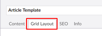
- Chose the one column layout, see section above for screenshots
- Select Headline
- Then a Headline Editor and a Rich Text Editor to the headline row.
- Click the cog wheel on the headline row and add the medium padding setting, see Adding settings and styles
- Add a new ‘Article’ Row
- Add a headline editor to the 4 cell and 8 cell sections
- Add a quote editor to the 4 cell section
- Add the custom document type with the link to the 4 cell section, see Using the document type
- Add a rich text editor to the 8 cell section
- Add a custom class of sidebar to the 4 cell section:

You should end up with a template that looks something like this: 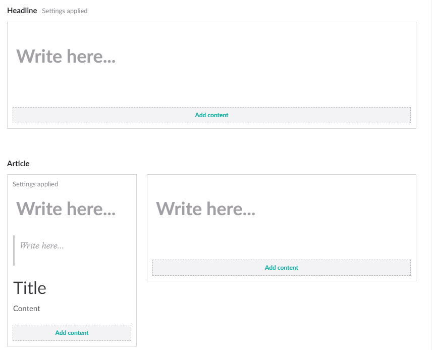 As you can see we added some custom settings, this is particularly useful if you rely on these settings. Having them pre-defined means they will not be forgotten by a content editor. Setting up a template also allows you to predefine a layout, helping to keep consistency through the site. Save the content template and continue to the next section. After saving you should see it appear in the tree:
Using the templates
In this section we will look at how to use this template when adding content. Navigate to the ‘Content’ section, hover over the Homepage, click on the three dots and select Content:  After clicking on Content, you will then see a secondary selection. This selection allows you to choose from a pre-defined content template:
  Select the Article Template we just setup in the previous step, then navigate to the Grid Layout tab. Notice how the template we configured has now pre-populated this page. Allowing you to start editing with the fields we already created:
  Happy Content Editing! 😊

Top comments (0)