
Slider control, commonly known as Carousel Slider on iOS and Android, is one of the most often used image sliders in most mobile apps such as eCommerce apps, social media apps, etc. nowadays. Slider Control is used in these mobile apps mostly for showing products, images, advertisements, and other content.
Thanks to SCADE, mobile developers can now simply implement an image slider from scratch into their app projects with ease. This alone can help improve user experience as users can easily use this interesting feature to swipe left and right to see different items of their choice.
In this article, you will learn how to use the Page Editor to implement and customize the Slider Control feature for your SCADE project.
Slider Control's Properties:
-
Items: This property contains the data we want the slider to display. We use it to store the asset images for this project. -
elementProvider: It is of typeSCDWidgetsElementProviderresponsible for mapping data to the slider's elements' visual controls. -
elements: serve as a container for the slider's visual controls. -
onSlide: It has an event handler that uses itsto-and-from propertiesto detect slide events. -
selected: used for sliding to a specific item.
Implementation
You must follow the steps below to implement this feature in your SCADE project:
Step1: Bind the slider's element to data from a defined Class
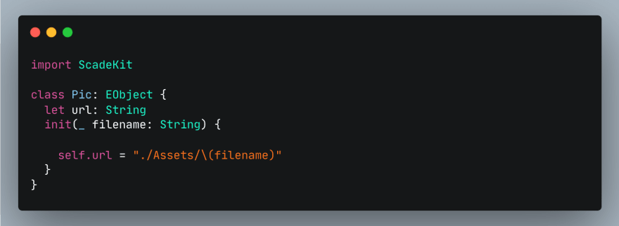
You can simply use a simpler data type or a class to describe the data container. Mind you, if you are going with the latter, you will need to make your newly created class a subclass of the EObject class.
The screenshot below shows how to achieve this with a named class called Pic created in the main.page.swift file of our project:
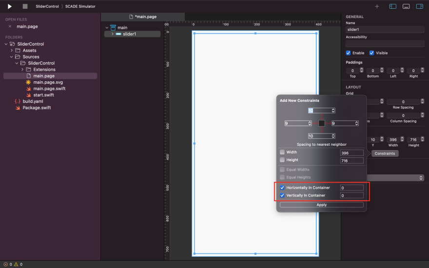
Step2: Design the Page Editor
Firstly, use the Show Widget Palette attribute of the SCADE-IDE to add (drag and drop) and center (if you want it centered on your app screen) the slider control widget to the main.page:
Step3: Define the logic for connecting data to Visual Controls
Next, use the slider's elementProvider property to define a provider object that is of type SCDWidgetsElementProvider. The defined provider object (of type SCDWidgetsElementProvider) is tasked with the duty of populating data to the slider's display element controls.
For instance, we use the provider object we created inside SCDWidgetsElementProvider to connect the image1 control that we added inside the slider control in the previous step to the data container:

Step4: Provide the Data Container with the image data
Ensure the Data Container we have created in the first step has valid access to the data we want the slider control to have an effect on.
As an illustration for this tutorial, we added the images we want the slider control to have an effect on to the Assets folder since that's what we initially provided in the Data Container to house the images to be displayed:

That’s not all, the slider's items property also needs to store the list of images (i.e. data) before the slider can get to display them.
For this tutorial, we simply used the created filename parameter (of type String) of the Pic class to collect the correct names of each image and store them as a list to the slider's items property:

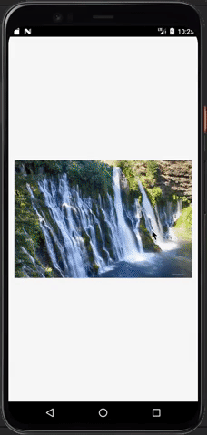
Output on iOS:

Output on Android:
Additional Features
-
Enable Slide Event
You can simply use the slider's
onSlideproperty to listen to sliding events via thetoandfromattributes of theSCDWidgetsSlideEventHandler: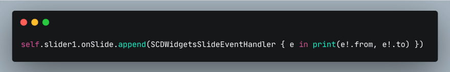
In other words, this feature enables you to determine the precise position of an item and perhaps use the information to improve your app project.
-
How to Slide to a Specific Item
Aside from achieving the above output, you can also use another slider property called
selectedto start the slide from a particular item.How do you achieve this? It’s simple, initialize the
selectedproperty to the index of the item (image) of your choice. For example, you can setselected= 1 so that the slider control can go to the 2nd item since the item count begins at 0:
Note: this can only be achieved in the
show method(and not in theload method). -
Having access to a more generic elementProvider
We have used the simpler approach of the
elementProviderin the earlier part of this tutorial to connect data to the visual control inside the slider control of our project. However, a genericelementProvidercan also accomplish the same thing and even give you access to more technical attributes that you can use to configure your slider.For example, we use the position property of this
elementProviderto connect data from the
itemsproperty of the slider to the visual control:
Conclusion
I covered how to create and use a slider control in Cross Platform Swift mobile apps in this article. We also learned how to add some new features and adjust the slider control to our liking.
The source code for this tutorial is available on GitHub: Slider Control.

Top comments (0)