There are many Font Size units to configure sizes of the fonts in CSS such as:
- em Relative to the font-size of the element (2em means 2 times the size of the current font)
- ex Relative to the x-height of the current font (rarely used)
- ch Relative to the width of the "0" (zero)
- rem Relative to font-size of the root element
- vw Relative to 1% of the width of the viewport*
- vh Relative to 1% of the height of the viewport*
- vmin Relative to 1% of viewport's* smaller dimension
- vmax Relative to 1% of viewport's* larger dimension
- % Relative to the parent element
So It's better to use a tool which can helps to easily converts REM to Pixels:
REM to PX Converter
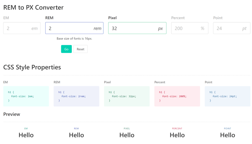
I found this tools to make UI designer's life easy.
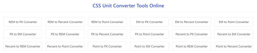
Here are more CSS Unit Converter Tools Online can be found: https://codebeautify.org/css-unit-converter-tools

Top comments (1)
Great recommendation! Another excellent tool I've found is the CSS Nexus Unit Size Converter. Unlike most converters that only handle individual values, this site allows you to input your entire CSS code and automatically converts all px values to rem (or any other unit you prefer). It's a real time-saver and ensures accuracy in your workflow. Definitely worth checking out!