Intro
div {
  width: 100px;
  height: 100px;
  background-image: linear-gradient(-45deg, peru, papayawhip);
  transition: 0.5s;
}

div:hover{
  background-image: linear-gradient(-45deg, peru, peru);
  transition: 0.5s;
}
What's wrong with this code? It should make a nice, clean, gradient animation, from a gradient to a solid fill. It should work, right?
Wrong
background-image is not animatable.
What's a developer to do? I lay in my bed and considered the possibilities. I could use Javascript DOM functions like backgroundImage and template literals to change the color. I could use a RGB to CMYK function, and call requestAnimationFrame. Or, I could look it up.
I found this.
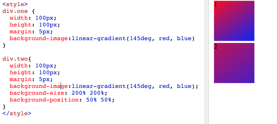
What this StackOverflow thread suggests is basically increasing the background-size to "200% 200%" (I assume double the size of the target window) and then translate it using a bunch of percentages and background-position.
Cool! After spending a while reading up on documentation, I figured out this:
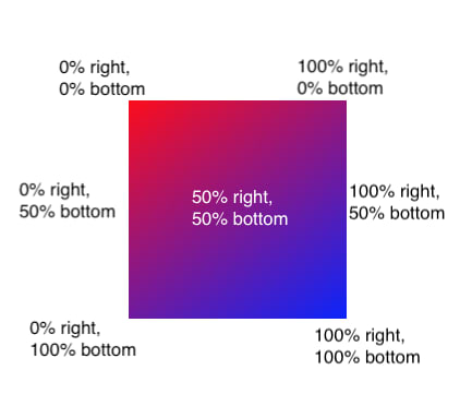
Assuming linear-gradient(145deg, red, blue), of course.
From the StackOverflow code and my newfound knowledge about background-position, I had my steps.
- Write gradient
- Increase gradient size
- Center gradient (
50% 50%) so it looked about the same - background-position is animatable, so translate either
100% 100%or0% 0%to make it look more blue or more red, respectively
Yay! Problem solved. Here's a working demo:
But, as you can probably tell, it's not perfect - 100% 100% still has some red tinge to it, and on a blue background this div will definitely stand out. Also, combining a 200% background size and 50% background position changes the gradient slightly - as you can see in this side by side comparison:
What's a perfection obsessed developer like me to do? After excessive brainstorming, I figured out these things:
-
background-sizeis animatable - Changing the gradient to
red, blue, bluemakes a completely blue portion at one corner.
So my steps now looked like this:
- Start the div with a normal gradient
*On hover, do these things:
- change background-size to 200%
- change background-position to 100% 100% (the
blue bluepart of the gradient) - use nicer colors than red and blue
While messing with the code, I found that I didn't need to change the background-size on hover; leaving it 200% to begin with actually helped differentiate the div from the same-colored background. I also added a quick box-shadow for a cool effect.
And here it is! A successfully animated linear-gradient, in pure CSS.
Helpful? Confusing? Thoughts? Please leave a comment!


Top comments (0)