The most common ways to show images in a website are using the HTML tags <img> and <picture> or using the CSS property background-image. There are attributes in the HTML tags to show different images based on the browser viewport. Or you can use media queries to show different images with background-image. You could find the article The CSS background-image property as an anti-pattern very interesting. If you are using background-image anyway, this article describe how to use it to have a responsive dynamic background images in WordPress.
Nowadays one trend is to use eye-catching images at the top of articles and news in websites to draw the attention of visitors. Downloading images in a website is one of the main factors in the speed loading. Large images increase the quantity of data to download. Most of the traffic of websites is done through mobile devices. Optimize the loading of these images is important.
WordPress has the field featured image in to link a representative image with an article. Some websites use this image in the header of the article. The next solution also works if the image is not in the featured image field but in a custom field of the article.
1. Define the CSS breakpoints
CSS breakpoints define the ranges of device screen width where the content responds in a certain way. In example, the framework Twitter Bootstrap defines 4 breakpoints and 5 ranges: extra small, small, medium, large and extra large.
- Extra small screens: <576px
- Small screens: ≥576px
- Medium screens: ≥768px
- Large screens: ≥992px
- Extra large screens: ≥1200px
2. Register image sizes for each screen width range
Each screen width range defined by the CSS breakpoints requires to define the dimensions to show the image in the range. Let’s continue with the example of Twitter Bootstrap. We are using its containers and we are displaying the image using the full width of the container, then we could define the next dimensions(WxH):
- 576×350 for containers in extra small screens
- 540×350 for containers in small screens
- 720×350 for containers in medium screens
- 960×400 for containers in large screens
- 1140×400 for containers in extra large screens
The WordPress function add_image_size registers images dimensions. WordPress creates a cropped version of the image for each registered dimension when an image is uploaded.
// register image sizes
add_image_size('header-image-xs', 576, 350);
add_image_size('header-image-sm', 540, 350);
add_image_size('header-image-md', 720, 350);
add_image_size('header-image-lg', 960, 400);
add_image_size('header-image-xl', 1140, 400);
3. Include the image in the theme template
A WordPress theme has different templates for different kind of pages. In this example, we are displaying the images for the articles. Thus we edit the single-post.php template to include the image.
// ... content before the background image

<div class="site-content">
  <div class="header-image-container">
    // ... some content over the background image
  </div>
</div>

// ... content after the background image
4. Include the media queries
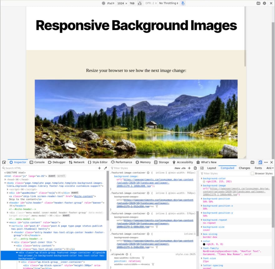
When we show the image using background-image, then we need to use CSS media queries to display the images in a responsive way. We can use the WordPress hook wp_head to include the CSS code in the head of the HTML document. In the function attached to the hook, then we get the featured image of the article and build the media queries. At this point, we have defined the HTML structure and we know the CSS selector required to point to the element where the background-image is used.
// print the background CSS rules
add_action('wp_head', function(){
  // link breakpoints and image sizes
  $images = [
    '0' => 'header-image-xs',
    '576' => 'header-image-sm',
    '768' => 'header-image-md',
    '992' => 'header-image-lg',
    '1200' => 'header-image-xl',
  ];

  // check if the post/page has a featured image
  if (has_post_thumbnail()) {
    // get the thumbnail images
    array_walk($images, function(&$item) {
        $item = get_the_post_thumbnail_url(get_the_ID(), $item);
    });
    ?>
    <style>
    <?php foreach($args['images'] as $breakpoint => $image_url): ?>
      <?php if ('0' == $breakpoint): ?>
      .site-content .header-image-container {
        background-image: url("<?= $image_url ?>");
      }
      <?php else; ?>
      @media (min-width: <?= $breakpoint ?>px) {
        .site-content .header-image-container {
          background-image: url("<?= $image_url ?>");
        }
      }
      <?php endif; ?>
    <?php endforeach; ?>
    </style>
    <?php
  }
});
And that’s all. You can find here a demo of this approach:
You might found useful the library wp-responsive-background-image. I created this library which offer an interface with a couple of methods to allow add the background rules easily. It uses the approach mentioned before to insert responsive dynamic background images in WordPress.
The post Responsive dynamic background images in WordPress appeared first on Carlos Guzman.

Top comments (0)