I'm not a native English speaker
To draw charts in a web-page, my favorite library is D3. Even if that's not the simplest library to draw charts, it's quite stable and I was always able to reach my aim with it.
But after some implementations of charts, and as D3 is not only made to draw charts, my project team has seen that some part of the implementation was quite repetitive:
- We always have to draw or clear the SVG, with a fixed ratio.
- We always have to manage a margins system.
- In Cartesian charts, we always have to set an axis system.
- We often have a title, a color, a font-size...
Also, I don't know why, I really don't know why, but it looks like that for D3, all examples are always a one-function-code. That's not handy to use nor to test it. Even if you don't mind about d3-helper, please dispatch your D3 code in multiple functions 😀
So we have decided to make this micro-library d3-helper.
The aim is to set up a base for charts easily, so then the final app can focus on the drawing relative to the data. It currently contains two classes:
- A BaseD3ChartSVG class, to select, draw and clear the SVG, with a "chart" group inside depending on a margins system.
- A CartesianChart class (that extends the BaseD3ChartSVG class), to (mainly) draw and manage axes (set scale, draw, clean) for a Cartesian chart. Supported data must be numbers, texts or dates.
Both classes define small methods that can be called independently and "summary" methods that call multiple methods (for standard uses).
Some methods were "restricted", but we finally decided to have almost everything public to maximize the flexibility. And we leave the encapsulation to the final app (and never mind for the 0.1k more of compile code).
In the examples below, I use node to install the d3-helper library and some additional D3 functions to play with my data.
I also use a static dataset "data" (an Array of Objects).
Draw a pie-chart
Directly taken from the d3-helper pie-chart example.
I start by creating a chart class that extends BaseD3ChartSVG, so this will be the BaseD3ChartSVG. That's more handy than to attach an instance of it to a variable. In the constructor, I set the path to the chart element to render the PieChart in. Also, I set a d3Pie basic function.
class PieChart extends BaseD3ChartSVG {
  constructor() {
    super('.chart');
    this.pie_ = d3Pie()
      .sort(null)
      .value(d => d.elevation);
  }
  ...
Then I want a draw function to draw my PieChart. I'll use the BaseD3ChartSVG to render the "generic part" of the chart: draw the SVG and set the margins.
  draw() {
    // Use BaseD3ChartSVG to set available space.
    this.updateSize();

    // Move pie-chart to the center of the svg.
    this.setMargins({ top: this.height / 2, left: this.width / 2 });

    // Draw the SVG.
    this.drawSVG();
    ...
The generated SVG looks like that:
<svg viewBox="0 0 439 397" preserveAspectRatio="xMinYMin" class="svg">
  <g transform="translate(80, 60)" class="chart">...</g>
</svg>
The SVG is now available with this.svg. The chart zone inside is available with this.chart.
The chart is the SVG minus the margins. It's the zone to render our chart in.
Then, I can render a pie-chart (or other kind of charts) on data in the chart group with custom code:
    ...
    // Draw a custom pie chart.
    const outerRadius = Math.min(this.width, this.height) / 2;
    const arc = d3Arc().innerRadius(outerRadius / 2).outerRadius(outerRadius)
    const pie = this.chart.selectAll()
      .data(this.pie_(data))
      .enter()
      .append("g")
      .attr('class', 'arc');
    // Draw pie slices
    pie.append('path')
      .attr('d', arc)
      .attr('fill', (d, i) => HEX_COLORS[i])
      .attr('stroke', 'white')
      .attr('stroke-width', '2px');
    // Draw text in slices
    pie.append("text")
      .attr("transform", d => `translate(${(arc.centroid(d)[0] - 12)} ${arc.centroid(d)[1]})`)
      .attr("dy", ".35em")
      .text(d => d.data.id);
  }
Then if you do:
const chart = new PieChart();
chart.draw();
It renders:

And then to refresh, you can add this function:
  Refresh() {
    this.removeSVG();
    this.updateSize();
    this.draw();
  }
Full JS here.
Draw a Cartesian chart
Directly taken from the d3-helper pie-chart example.
For Cartesian charts, it's more or less the same principle. I use the CartesianChart class that extends from BaseD3ChartSVG class to render the axes in a SVG. Then, I write custom code to draw my data in a chart.
The CartesianChart is based on the type of the data (number, text or date), and on a configuration object. The minimal configuration is the keys of the data to use to set the axes (expected data are Objects in an Array):
    const config = {
      xAxis: {
        axisColumn: 'distance',
      },
     yAxis: {
        axisColumn: 'elevation',
      },
    };
To draw the SVG with the axes, you can write:
    // Set the config for CartesianChart.
    this.setConfig(config);
    // Use BaseD3ChartSVG to draw the SVG.
    this.removeUpdateDrawSVG();
    // Already optional, use CartesianChart to get label for axis from the data (as we have no label in the config).
    this.useDataLabelAsDefaultForAxis('xAxis');
    this.useDataLabelAsDefaultForAxis('yAxis');
    // Set and draw axis using CartesianChart.
    this.setXAxis(data);
    this.setYAxis(data);
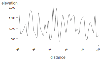
That's it. Then we can draw a line chart for instance:
    // Draw a custom line chart.
    const lineFunction = d3Line()
      .curve(d3CurveMonotoneX)
      .x((d, i) => this.xScale(this.xData[i]))
      .y(d => this.yScale(d));

    this.chart
      .append('path')
      .attr('class', 'line')
      .attr('d', lineFunction(this.yData))
      .attr('stroke', `rgb(${this.color.join(',')})`) // use the default color.
      .attr('stroke-width', '1')
      .attr('fill', 'none');
It renders:
Full JS here
Supplementary notes
- In the Cartesian chart of d3-helper, data can't cross the axis (but negative values are possible). But if it's needed it's possible to override the drawXAxis method to change this behavior.
- It is possible to have two y axes: one y axis, and one opposite y axis (look at the chart below). But it can have only one x axis.
- Take a look at the Cartesian configuration and the project examples for all possibilities.
Another Cartesian chart result with more configuration full JS here:
It renders:

More - Implementation in a project
If you have only one simple chart to draw, you can use the same implementation as in the previous examples.
In one of our projects, we had to display multiple Cartesian charts (bars, scatter plot and lines). We made a component (We use Angular in this project, but any "view-level class" can do the same) that extends an adapter, that extends this CartesianChart. This component can set an HTML class via the configuration (to set the correct chart using a unique DOM path). That allows us to have some of these components on one page, and so multiple charts on the same page.
To have cleaner code, we separate line, point, vertical bars and horizontal bars charts in four classes. These classes implement an interface (we use Typescript) ChartDrawer. Each ChartDrawer has a ctx object that is a CartesianChart class, and a draw method. Then we have a configuration to say which data must be drawn by which ChartDrawer. That allows us to have lines, points and bars on the same chart, but with clean code. Each class is responsible for its own rendering and interaction possibilities.
The final implementation looks like this:

The code is quite well organized, flexible and testable.
Notes
- It's a "half-public" library, made within a private project. We sadly don't have time to look at new issues or PR, except if we experience them directly. But don't hesitate to fork or take a look at examples to implement your charts.
- It's only tested on modern browsers with small datasets.

Top comments (0)