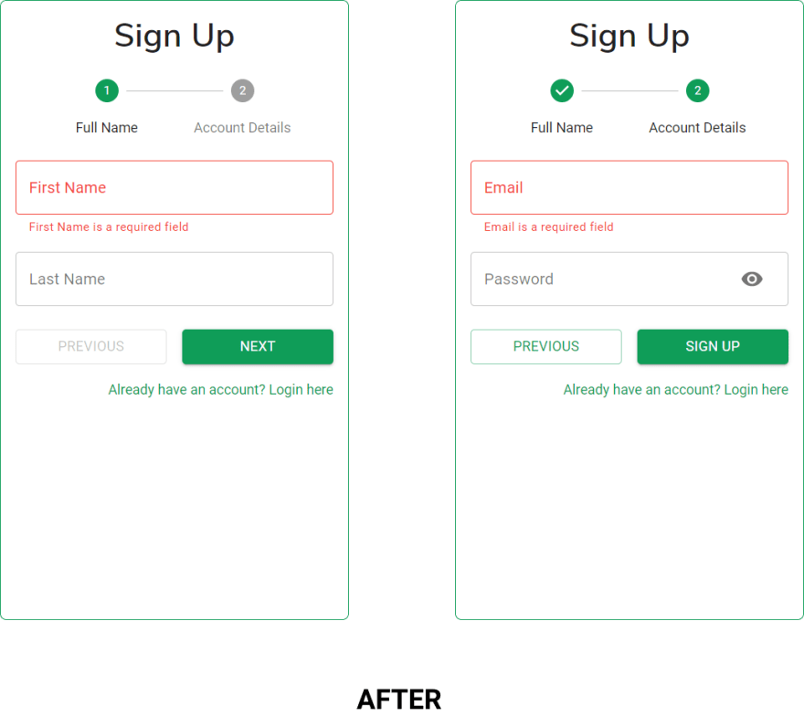
Designing forms for mobile can be a hiccup especially when it has many fields. I don’t know how many people know this; the on-screen keypad can cover your form or the submit button making it difficult for users to click thus disrupting the sign-in/sign-up flow.
What I’m Working On
I’m rebuilding an old project, a forms app. The app has so many issues; performance, bugs, inappropriate loaders and Bad forms especially on mobile. I just built something that worked but I should’ve put more work into the form’s layout on mobile. The app was responsive, yes but I didn’t know the effect of the on-screen keypad on forms. It was until I deployed and checked it on my phone before realising the bad.
Better form layout for mobile
A good lesson I learnt from web.dev (which I recommend you check out yourself), use multi-step form. You don’t have to crump everything on a single page.
The screenshots above shows before and after splitting up the form. In the second part, we ensure that the on-screen keypad doesn’t cover any part of our form.
Sure, this works but there is a caveat. Due to the differences in pixel densities among devices, this may not work for all devices as expected, specifically devices with low-density screens like the iPhone 5. This phone again 🤦♂.
A little detail
“God is in the detail”. Since we are talking about on-screen keypads on mobile phones, there’s no need for desktop users to be affected by this. Desktop users shouldn’t go through steps to complete the registration when they can just do it once even if they’re viewing the page in window mode.
This is important because we want the sign-up flow to be smooth and swift, therefore if there aren’t many fields and they can all fit into the viewport then why bother users with multiple steps.
For desktop devices, all fields go on the same page because they can

When in window mode or when resized into a really small size.
With the user-agent string, you can determine users' platform then give the multi-step form to only the mobile and tablet users. I talk about how to achieve this in my previous article.
Conclusion
A badly designed form can affect the conversion rate for your site or app; therefore, you should do your best to make the flow smooth and simple. When designing for mobile, responsive layout isn’t all. Interactions matter, therefore be sure to test your app on an actual mobile device.


Top comments (0)