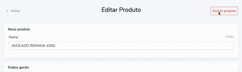
Esse custom hook foi feito para facilitar o uso da caixa de confirmação de deletar um item que se repetia bastante ao longo da aplicação.
No projeto eu usei styled-components e polished no trechos de css. Fiquem a vontade para usar suas libs preferidas.
Importante
Esse artigo não tem o código completo do componente do box. Faltaria anexar seu componente de botão preferido.
Hook
useDeleteConfirmation.js
import { useState } from "react";

import DeleteConfirmation from "~/components/DeleteConfirmation";

/**
 * Gerencia o componente de confirmação de exclusão
 *
 * @example
 *
 *  const [DeleteConfirmation, activeConfirmation, setActiveConfirmation] = useDeleteConfirmation();
 *
 *  <Button onClick={setActiveConfirmation} />
 *
 *   <DeleteConfirmation
 *      active={activeConfirmation}
 *      onDelete={handleDelete}
 *      onCancel={setActiveConfirmation}
 *      yesMsg="Sim, desejo apagar"
 *      loading={loadingDelete}
 *    >
 *      Tem certeza que deseja apagar este produto?
 *    </DeleteConfirmation>
 *
 */

const useDeleteConfirmation = (initialValue = false) => {
  const [activeConfirmation, setActiveConfirmation] = useState(initialValue);

  const handleConfirmation = () => setActiveConfirmation(!activeConfirmation);

  return [DeleteConfirmation, activeConfirmation, handleConfirmation];
};

export { useDeleteConfirmation };
Componente do box de confirmação
components/DeleteConfirmation/index.js
import React from "react";
import PropTypes from "prop-types";
import { Button } from "~/components/Buttons";
import { Container } from "./styles";

/**
 *
 *
 * @param {node} children Text for box
 * @param {boolean} active State on parent component
 * @param {function} onDelete Function to call on delete
 * @param {function} onCancel Function to call on cancel
 * @param {boolean} loading State on reducer ou parent component
 *
 */

const DeleteConfirmation = ({
  children,
  active,
  onDelete,
  onCancel,
  yesMsg,
  loading,
}) => (
  <Container active={active} className="deleteItem">
    <div className="alertBox">
      <span>{children}</span>
      <Button
        onClick={onDelete}
        type="button"
        text={yesMsg}
        template="alert"
        loading={loading}
      />
      <Button
        onClick={onCancel}
        type="button"
        template="delete"
        text="Cancelar"
        loading={loading}
      />
    </div>
  </Container>
);

export default DeleteConfirmation;

DeleteConfirmation.propTypes = {
  children: PropTypes.oneOfType([
    PropTypes.arrayOf(PropTypes.node),
    PropTypes.node,
  ]).isRequired,
  active: PropTypes.bool.isRequired,
  onDelete: PropTypes.func.isRequired,
  onCancel: PropTypes.func.isRequired,
  yesMsg: PropTypes.string,
  loading: PropTypes.bool,
};

DeleteConfirmation.defaultProps = {
  yesMsg: "Sim, quero apagar.",
  loading: false,
};
components/DeleteConfirmation/styles.js
import styled, { css } from "styled-components";
import { darken, rgba } from "polished";

export const Container = styled.div`
  z-index: 20;
  overflow: hidden;

  max-height: 0;
  padding: 0;
  width: 100%;

  display: flex;
  align-items: center;
  justify-content: center;

  border-radius: 0.25rem;
  border: 0 solid #d9534f;
  background: ${darken(0.1, rgba(#d9534f, 0.05))};

  transition: all 0.2s ease-in-out;

  ${(props) =>
    props.active &&
    css`
      max-height: 7rem;
      padding: 0.75rem 0;

      @media (min-width: 992px) {
        padding: 1rem 0;
        max-height: 4rem;
      }
      border-width: 1px;
      margin-bottom: 1.25rem;
    `}

  .alertBox {
    display: flex;
    justify-content: space-between;
    align-items: center;
    flex-flow: wrap;

    max-width: 100%;
    max-height: 100%;

    padding: 0 0.5rem;
    font-weight: 500;

    > * {
      margin: 0 0.5rem;
    }
  }

  @media (max-width: 992px) {
    .alertBox {
      > span {
        flex: 1 1 100%;
        text-align: center;
        margin-bottom: 0.5rem;
      }

      button {
        min-width: 40%;
      }
    }
  }
`;
O hook exporta:
DeleteConfirmation - Componente
activeConfirmation - Sate do componente / Ativo ou não
setActiveConfirmation - SetState do componente / Abre e fecha box
Componente
SomeComponentWithDeleteAction.js
import { useDeleteConfirmation } from "~/hooks/useDeleteConfirmation";

const [
  DeleteConfirmation,
  activeConfirmation,
  setActiveConfirmation,
] = useDeleteConfirmation();

return (
  <>
    <Button
      template="delete"
      text="Excluir local"
      customWidth="auto"
      onClick={setActiveConfirmation}
      loading={loadingDelete}
    />
    <DeleteConfirmation
      active={activeConfirmation}
      onDelete={handleDelete}
      onCancel={setActiveConfirmation}
      yesMsg="Sim, desejo apagar"
      loading={loadingDelete}
    >
      Tem certeza que deseja apagar este local?
    </DeleteConfirmation>
  </>
);

Top comments (0)