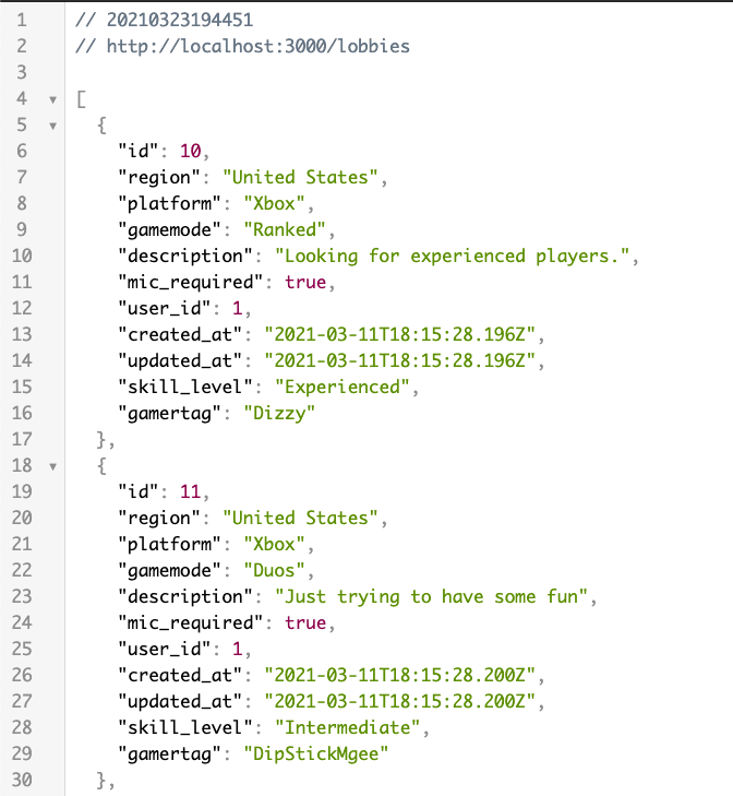
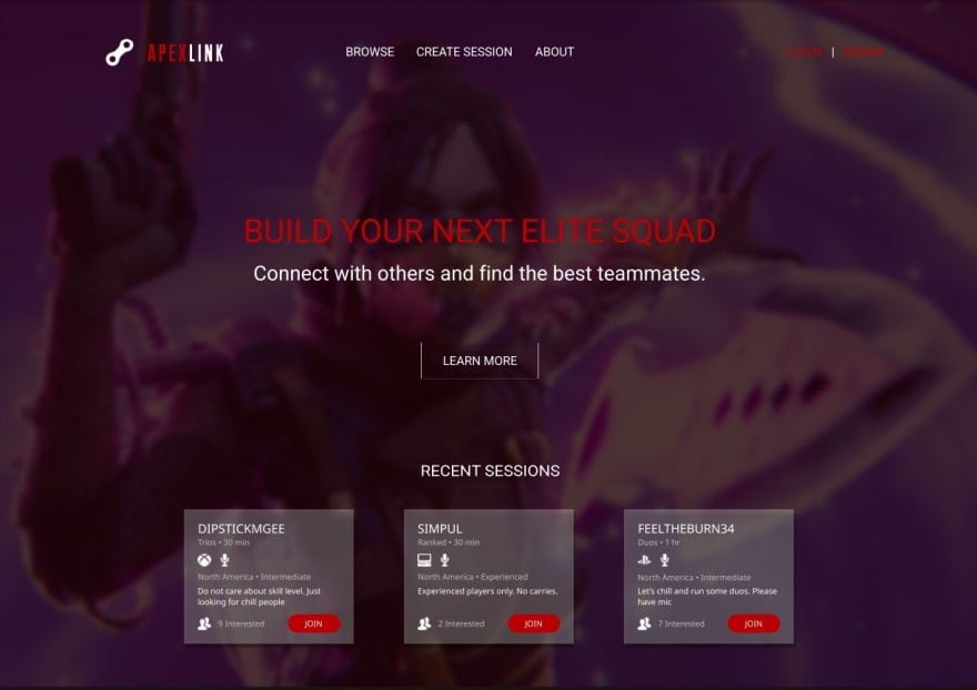
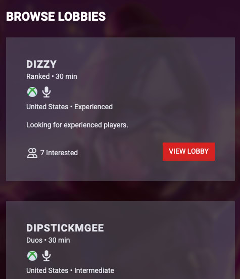
For my final project at Flatiron School, I chose to build a web application around one of my favorite video games, Apex Legends. It is a matchmaking application where players can find teammates to add to their squad. The concept is simple. A player can create, view and request to join lobbies.
Lobbies display the gamertag of the host, as well as the gamemode, relative time, platform, requirements, region, and players interested. Currently, lobbies and requests can only be created, not updated or deleted.
I plan on adding more functionality in the future versions, including, authentication, profile pages, and realtime game stats. For now, players are limited to create and view.
Rails API
The backend uses Ruby on Rails as an API. This section was fairly simple to build. I needed Rack CORS Middleware to handle my HTTP requests from the React Frontend, and the fast_jsonapi gem to filter my JSON rendering. Once my models were setup, I then created the routes for the requests.
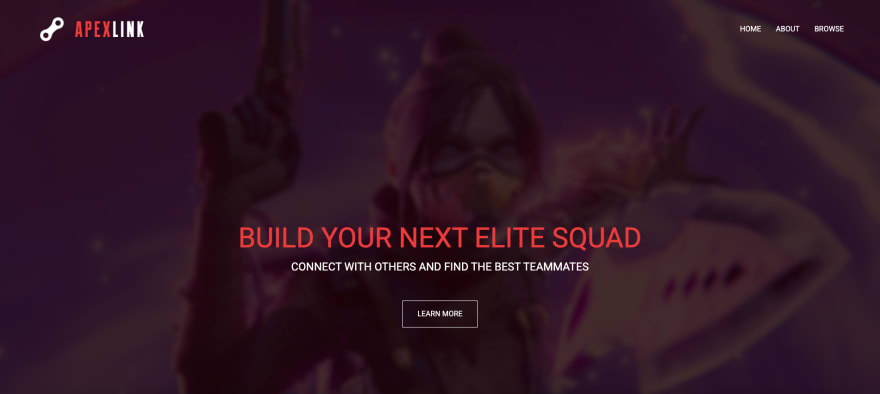
Initial Design
Before doing anything with my frontend, I created a web design using Figma. I needed a sense of direction, and having this reference was a huge benefit when getting to the ReactJS portion of the project. I had a very good idea about how many components I would need and how things would be styled. I even downloaded fonts for my theme.
Here is my design:
ReactJS
My frontend utilized the ReactJS framework. I used 'create-react-app' to jumpstart my process. There were many more moving parts for this section, especially for the initial setup. There are 2 containers and 10 components in the current state. I used a variety of packages, including, react-redux, react-router-dom, and tailwindcss.
React Redux
Redux allows your application to read data from a store, or global state. Actions can be dispatched to the store to update the data.
This was my first time configuring Redux for an application of this scale. There I hit quite a few roadblocks, and had to reference lots of material to fully understand the setup. After reviewing, I decided to split store, actions and reducers into separate files. Each model has its own reducers and actions file. This made everything easy to read and update later. Whenever I needed a particular action for a component, I imported the function from actions file.
React Router
For my application, I needed routes that referenced the appropriate components, as well as dynamic routes for individual lobbies. This allowed me to maintain a single-paged application (SPA) with multiple views. The page essentially never reloads.
Setup was very simple and easy to understand. There is a Router tag with all of your components/routes enclosed. Each route has a path and a component.
<Router>
        <div className='bg-wraith bg-center bg-top bg-cover bg-no-repeat bg-fixed pb-16'>
              <Nav />
              <Route exact path="/" component={Home} />
              <Route exact path='/about' component={About} />
              <Route exact path="/lobbies" component={LobbiesContainer} />
              <Route path="/lobbies/:id" component={Lobby} />
        </div>
</Router>
Tailwind CSS
Tailwind was the fun part, even the process of figuring it out was enjoyable. I chose Tailwind over other frameworks like Bootstrap, due to its styling flexibility. The Tailwind configuration file is easy to customize. It was like writing plain CSS, but with class attributes.
This simple setup...
<div className='card shadow-2xl bg-gray-500 bg-opacity-50 text-gray-200 p-10'>
            <div className="font-semibold text-xl tracking-wider uppercase"><h2><Link to={`/lobbies/${id}`}>{gamertag}</Link></h2></div>
            <div className="text-sm"><p>{gamemode} • 30 min</p></div>
            <div className="flex mt-2">{platformType()} {micRequired()}</div>
            <div className="text-sm mt-2"><p>{region} • {skillLevel}</p></div>
            <div className="text-sm mt-4 btext-white"><p>{description}</p></div>
            <div className="mt-8 inline-block float-left">
                <svg className="w-6 h-6 inline-block" fill="none" stroke="currentColor" viewBox="0 0 24 24" xmlns="http://www.w3.org/2000/svg"><path strokeLinecap="round" strokeLinejoin="round" strokeWidth={2} d="M12 4.354a4 4 0 110 5.292M15 21H3v-1a6 6 0 0112 0v1zm0 0h6v-1a6 6 0 00-9-5.197M13 7a4 4 0 11-8 0 4 4 0 018 0z" /></svg>

                <span className='text-sm ml-1 mt-0.5'>7 Interested</span>
            </div>
            <div className="mt-6 inline-block float-right">
                <Link to={`/lobbies/${id}`}>
                    <button className='flex bg-red-600 hover:bg-red-500 text-white hover:text-white py-2 px-3 text-sm uppercase'>
                    View Lobby
                    </button>
                </Link>
            </div>
</div>
Created these responsive cards...

The styling is nearly identical to the mock up one I created using Figma. This is probably the closest I have gotten to any mock up I have created in prior projects.
Here is a look at the final index page. Compare it to the mockup above:
Want to dive into the code? Checkout the repo here.


Top comments (0)