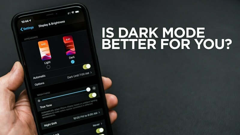
Ever felt your eyes getting tired from staring at your screen for too long? It's a common issue—a consequence of how bright most screens have become. However, there is a solution to give your eyes a break, and that's where dark mode comes in.
In this article, we'll see how Dark Mode helps with eye strain, user accessibility, and in aesthetics interface. We'll keep it simple, discussing how it works and why you should consider using it in your next website project.
Light or Regular Mode
Light mode, also known as regular mode or default mode, refers to the standard appearance or theme of a user interface (UI) where the background is predominantly light or bright, and the text and other elements are typically displayed in darker colors.
Light mode is the traditional or default setting for many applications, websites, and operating systems. It is commonly associated with a clean and crisp aesthetic, and it's often favored in well-lit environments where high contrast and visibility are key considerations.
Dark Mode
Dark mode, at its core, is a design choice that flips the traditional color scheme. Instead of light backgrounds and dark text, dark mode opts for dark backgrounds with light or contrasting text. This shift isn't merely aesthetic; it's a strategic decision that impacts how users consume content and interact with digital interfaces.
Dark mode in web design has come a long way. It started as a preference for coding environments and late-night browsing but is now a popular trend in apps and websites. Knowing how and why this change happened helps us understand its effect on user experience.

Why you should consider using Dark mode
Reduced Eye Strain: Dark mode reduces the amount of light emitted by screens, which can help alleviate eye strain, particularly in low-light conditions. This is especially beneficial for users who spend extended periods in front of screens.
Improved Visibility in Low-Light Environments: In dimly lit or nighttime environments, dark mode enhances visibility and readability by minimizing glare. Users are less likely to be blinded or disturbed by the brightness of a light background.
Energy Efficiency for OLED Screens: Dark mode is more energy-efficient on devices with OLED screens. In this mode, individual pixels are turned off to display black, saving power and potentially extending battery life on devices.
Enhanced Focus on Content: Dark mode places emphasis on the content by reducing the prominence of UI elements. This can result in a more immersive and focused user experience as users engage more directly with the information or media.
Aesthetically Pleasing Design: Many users find dark mode visually appealing. The high contrast between text and background can create a sleek and modern look. This aesthetic preference has led many applications and websites to offer dark mode as an alternative.
Reduced Blue Light Exposure: Dark mode typically reduces the amount of blue light emitted by screens. Blue light exposure, especially during nighttime use, has been associated with disruptions in circadian rhythms and can affect sleep patterns. Dark mode mitigates these concerns.
Accessibility Improvements: For users with certain visual impairments or sensitivities, dark mode can enhance accessibility by providing better contrast and reducing eye strain. Customization options, such as text size and font choice, may also be more effective in dark mode.
Suitability for Certain Content Types: Dark mode can be particularly suitable for content consumption, such as watching videos or viewing images. The dark background allows the content to stand out, creating a more engaging and enjoyable experience.
Preservation of Night Vision: Dark mode can help users maintain their night vision when transitioning from a well-lit environment to a dark one. The eyes are less likely to experience discomfort or take longer to adjust when using dark mode in low-light conditions.
Trend and User Preference: Dark mode has become a popular design trend, and many users now expect applications and websites to offer it as an option. Meeting user expectations and preferences can contribute to a positive overall user experience.
Guidelines to Follow When Converting UI Designs to Dark Mode
Step 1: Understand Dark Mode Principles
Before diving into the transformation, get familiar with the principles of dark mode design. This includes the use of a dark color palette, optimized contrast, and strategic accent placements.
Step 2: Assess Existing Color Scheme
Evaluate the colors used in your regular UI design. Identify primary, secondary, and background colors. This assessment will guide your adjustments for dark mode.
Step 3: Choose a Dark Color Palette
Select a dark color palette that complements your existing design. Consider dark grays, blues, or blacks. Ensure there's enough contrast for readability.
Step 4: Adjust Background Elements
Update background elements like the main canvas, panels, and cards to reflect the chosen dark color scheme. Consistency across different sections is crucial.
Step 5: Modify Text Colors
Adjust text colors to maintain readability against the dark background. Ensure text has sufficient contrast and consider using lighter shades for better legibility.
Step 6: Refine Icons and UI Elements
Modify icons and UI elements to fit the dark mode aesthetics. Ensure they stand out clearly against the dark background. Adjust stroke weights and fill colors accordingly.
Step 7: Implement High Contrast
Leverage high contrast to highlight interactive elements. Make buttons, links, and actionable items pop against the dark background to guide users seamlessly.
Step 8: Optimize Imagery
If your UI includes images, optimize them for dark mode. Check their appearance against the dark background and adjust brightness, contrast, or apply color filters if necessary.
Step 9: Consider Adaptive Design
Implement adaptive design principles to allow for automatic switching between light and dark modes based on user preferences or environmental conditions.
Step 10: Test for Accessibility
Ensure your dark mode design is accessible. Test for readability, especially for users with visual impairments. Evaluate color contrast ratios and consider customization options for diverse needs.
Step 11: Iterate and Gather Feedback
Iterate on your dark mode design based on feedback. Conduct usability testing to identify issues or areas for improvement. User feedback is invaluable for refining the dark mode experience.
Step 12: Consider Platform Guidelines
If your UI is for a specific platform, adhere to platform-specific dark mode guidelines for a more cohesive user experience.
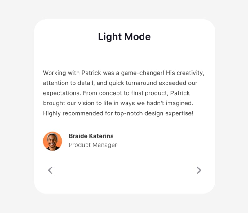
Use Case
Now, let's bring the benefits of dark mode into focus by exploring a real-world use case, i will be converting a testimonial card from a light mode to a dark mode step by step. lets get started!

Step 1: Change the background to a dark shade
Don't ever use plain black or #0000 in your dark mode except it's intentional and of necessity. For this design, lets use #13131A for the card background. it's not too dark but yet dark enough to contrast well with other shades of color.
We have;

Step 2: Brighten Up the elements within
From the look of things from the previous card design, only the avatar was contrasting well. so we need to brighten up the text elements for user accessibility. Also, it's not a good choice to use a plain white color to brighten up elements in a dark mode, any shade of white that fit best is more better. lets try #B0B0B0 for the body text and #E4E4E4 for the heading.
We have;

Final Touches
It's looking nice already, so to wrap things up. lets indicate an activeness for the navigating arrows below by adding a more brighter shade of white to the forward arrow. For this one, lets use the same shade of white we used for the header - #E4E4E4
And finally we have;

Additional Resources
For more hands on practice on how to convert your next light mode designs into dark mode, you can check out this resources.
For more understanding of the basis and principles behind dark modes, watch this
Designers: For quick conversion of your Figma UI into dark modes - watch this
Developers: To follow a simple tutorial on how to implement this - watch this
Conclusion
The adoption of dark mode goes beyond a mere stylistic choice; it actively contributes to a more comfortable, efficient, and inclusive user experience. By reducing eye strain, improving readability, and aligning with user preferences, dark mode has become a valuable tool for designers and developers seeking to elevate the overall digital experience for their audience.
As always, I would love to see what you have to say regarding this. lets chat about your experience with dark and light modes and which one you prefer in the comment box below 😊

Top comments (1)
Hi everyone please am new here