
This is a simple yet effective CSS technique to fit blocks on a webpage. In this context RAM stands for Repeat, Auto, Minmax.
The RAM is very useful when you have multiple blocks on a page with equal width and you need them to fit the whole width of the page (or page’s section).
Before browsers got full support of the grid layout developers used media queries to set the number of blocks per row for different screen resolutions.
We had to provide different CSS rules for mobiles, tablets, laptops, desktops. Sometimes even for portrait/landscape mode! The more blocks per row we have the more breakpoints we need to cover to make the blocks look good on each screen size.
@media only screen and (max-width: 30em) {
  .block {
    width: 50%;
  }
}
@media only screen and (max-width: 45em) {
  .block {
    width: 25%;
  }
}
@media only screen and (max-width: 60em) {
  .block {
    width: 20%;
  }
}
Thanks to the grid layout, we can handle it with just a few lines of CSS.
Here’s how it works with RAM:
display: grid;
grid-template-columns: repeat(auto-fit, minmax(15em, 1fr));
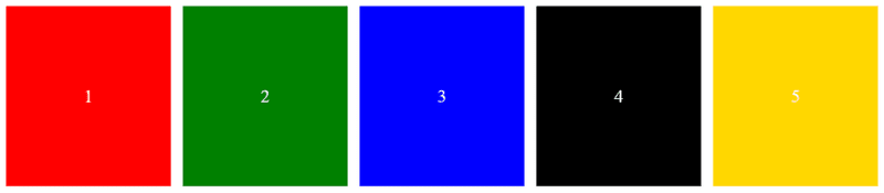
And this is what you get using that CSS code:
Try to change the width of the frame — the blocks will fit perfectly in each frame size.
What’s under the hood?
First of all we use display: grid to let the browser know we want our blocks to be displayed in a grid.
Secondly, we use the grid-template-columns property to define how exactly our grid’s elements should be displayed.
The repeat() function returns a pattern, which will be repeated for all columns in the grid.
This function accepts two arguments — repeat count and tracks.
The repeat count argument determines how many times the track list (grid elements) should be repeated. It can be either an integer number from 1 or a special keyword values auto-fill or auto-fit.
The auto-fit keyword means the grid elements will be stretched to fit all the available space in a section.
If you use the auto-fill keyword the elements will NOT be stretched out, but keep the minimal width defined in the tracks argument.
The tracks argument specifies the set of tracks (elements) which will be repeated. We use a minmax() CSS function to provide a minimum width of a block (15em) and maximum width (1fr). That means each of our blocks will not be narrower than 15em and will be equally stretched.
Read more about the fr unit here: https://developer.mozilla.org/en-US/docs/Web/CSS/CSS_grid_layout/Basic_concepts_of_grid_layout#the_fr_unit
With modern CSS properties you can handle your layouts with less code and in a more efficient way.
Check my other CSS related articles:
If you find this article helpful — don’t hesitate to like, subscribe and leave your thoughts in the comments 😊
Read more posts on my Medium blog
Thanks for reading!
Stay safe and peace be with you!


Top comments (0)